|
|
| Image |
Comment |
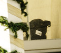
| 08/29/2012 04:10:29 PM | scan that doggie in the windowby posthumousComment: Hi Posthmous, we meet again in the Critique Zone!
Hmmm. Normally I am a fan, but this one doesn't grab me. I like the dog although I am a little mystified by the barcode through the nose. I am just not sure what the blur adds to this, it doesn't seem to me to need a sense of movement or dynamism. The flat, desert beige colours tell me that everything there should be still, beaten down by the heat. Perhaps I am wrong and it is heat haze not motion blur?
I think what really leaves me cold is just the overall balance of the composition. The tilted angle, the extra space at the top. I guess I just don't get it! Having seen plenty of your work, I'm sure you had something in mind here but this time, I'm not sure what it is.
I'm going to head back to predictability and over-sharpening now!
Happy hunting,
Frank. |  Photographer found comment helpful. Photographer found comment helpful. |
| 08/22/2012 05:35:57 PM | The Pinnacleby JamesDowningComment: Hi James, welcome to the other side of the Critique Zone!
This is a bit wierd - I was just looking at some of your critiques, and here you are on the other side of the wall... anyway...
Overall, I really like this shot - so did the voters although I would have thought that they would like it a little more? Genuinely not sure why this did not break the 7.0 barrier.
Technically, there is nothing that I can fault here - even being nitpicky. f3.5 seems like a pretty wide aperture - perhaps not necessary given the amount of light? But it doesn't seem to have affected your DOF, so no problem there. The lighting, as commented on elsewhere, is excellent and focus is very well controlled.
Artistically, it is on the nail for the rule of thirds in every direction / dimension, and is very visually pleasing as a result. The leading lines, sunbursts and clouds all add great texture. If it were my shot, I might try seeing what it would look like a little darker? Of course I haven't tried that and it might not work.
Like I said, I don't think there is anything to fault here. This is definitely one for the album!
Happy hunting,
Frank.
| | Photographer found comment helpful. |
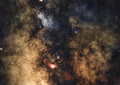
| 08/14/2012 02:32:56 PM | Towards the Galactic Centerby PascalComment: Hi Paschalis, and welcome to the Critique Zone!
This is a challenge - I have no experience of astro-photography so how to critique this? Hell, I couldn't take it, although I am inspire to learn how. Where is a good place to learn the techniques and how is your 1000D modified?
It is a lovely shot - not as clear as some of your others and with less obvious subjects but that is the nature of your subject here.
Sorry I can't say anything useful! If it helps, I think it is pure art, stolen from science.
Happy hunting,
Frank. | | Photographer found comment helpful. |
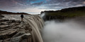
| 08/14/2012 02:01:29 PM | PROMETHEUSby GudjonottoComment: Hi Gudjón, welcome to the critique zone!
Not sure what you expect to get from me, apart from noting that the policy of deducting a full point for all photos clearly taken in Iceland has finally been agreed!
I really can't critique this much at all - what would I say? Very nice balanced composition, perhaps a little extra contrast would be nice? But that seems like a personal stylistic point. The only thing I can think of is that it all seems a little cramped but that is more of a comment on the size of the allowed picture, rather than your shot.
Nice one. Happy hunting,
Frank. |
| 08/14/2012 01:36:52 PM | Evening Gooseby MEJazzComment: Hi Mansoor, welcome to the Critique Zone!
Clearly this shot left the voters a little cold - I guess the question is why? (noting that all of this is subjective - so I hope some of it is of interest)
Technically: This is a tricky one - it is fairly sharp around the back end, but doesn't seem so sharp around the head and eyes, the traditional focal point. I suspect that this is a result of your really large aperture (f2) and a fairly small Depth of Field. Personally, with a 5DII, I would be happy going to about ISO 800, allowing an aperture of at least f7.1 without compromising your shutter speed. That would probably give you razor sharp bum and head, with room for manouevre.
Artistically: It's really a taste issue, so this is just my opinion. I think that it needs to be cropped differently: either with the scale as you have it but the goose to the bottom left, giving it 'space to move into', or with a tighter crop. As it is, the goose is just too central in a vast expanse of space. I would also recommend trying to find a different perspective - in life, we look down at stuff like geese (physically!) so a photo which does the same lacks impact - perhaps vertically down (difficult) or from on a level, or even up at the goose? Something to shock the eye and show something different. Just my thoughts.
Anyway, I hope that there was something in there of use!
Happy hunting,
Frank. | | Photographer found comment helpful. |
| 08/14/2012 12:24:15 PM | Good Morning Sunshineby Ja-9Comment: HI Janine!
Great shot - but then again I would like it, they are amongst my favourite flowers...
Like I said, I like it, but it doesn't take my breath away like some of your other work. Two things I can think of (bearing in mind that it's all subjective):
Firstly the lighting doesn't seem quite right. Not sure I can put my finger on it but it's very bright and contrasty in the middle, but a little dark around the outside petals. It looks a little like on camera flash not quite delivering?
Secondly the composition - for me it is just in between two choices - really tight and detailed or a little further out and capturing the whole flower. I guess my mind sees it like the flower equivalent of cutting a human model off at the knees.
This may all sound a little harsh and for many others I would just say 'great shot' - but you have so much history of doing better.
Happy hunting!
Frank. | | Photographer found comment helpful. |
| 08/14/2012 12:17:34 PM | When spiders unite, they can tie down a lionby marvinComment: Hi Robert, welcome to the critique zone!
This is a fun shot - spiders webs are always a good subject, they are so intricate and offer the opportunity for the perfect rule of thirds... as you have!
Technically: This could be a little sharper - they are hard to focus on, especially since any tiny gust of wind takes them outside of the FOV. The shot is also a little noisy - I suspect that this is quite a tight crop? It just doesn't have a really clean look, which I suspect bothered the voters.
Artistically: I agree about the bokeh - great colours. Rule of thirds is great etc etc, but somehow it just doesn't pop. I suspect that it needs a little more life - either a subject (the spider!) or some light. Water droplets are always good - I suspect most of us have a web / water droplets shot somewhere...

So, nice pic - needs something to make it really grab the attention. Happy hunting!
Frank. |
| 07/31/2012 06:01:26 PM | PLANtMeby iy9oNComment: Interesting idea. What did you really want to say? |
| 07/31/2012 05:58:01 PM | | | Photographer found comment helpful. |
| 07/31/2012 05:54:08 PM | | | Photographer found comment helpful. |
Home -
Challenges -
Community -
League -
Photos -
Cameras -
Lenses -
Learn -
Help -
Terms of Use -
Privacy -
Top ^
DPChallenge, and website content and design, Copyright © 2001-2026 Challenging Technologies, LLC.
All digital photo copyrights belong to the photographers and may not be used without permission.
Current Server Time: 05/25/2026 09:18:36 AM EDT.
|