|
|
|
Showing 151 - 160 of ~1021 |
| Image |
Comment |
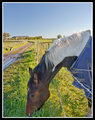
| 10/11/2010 10:58:17 AM | The Grass Is Greener On The Other Side.by Jon_HComment: Hi Jon, welcome to the 'critique zone'!
My overall impression of your photo is that it is a pleasant scene but I think you could have shown it off better. There is quite a lot going on, and changing your angle to use either the lane or the wires to lead the eye across the shot might make it easier to follow.
Technically: It's an interesting choice of settings. Your lens is not at its best at f3.5, but equally you are not using a wide aperture to isolate your main subject by throwing the background right out. As a result it sits between the camps of 'lots of blur' and 'deep depth of field'. I think that it would be better in the latter personally, so I would stand back a little, zoom in a little and throw the aperture up to about f7.1, which should bring the dog into focus. If necessary, you could boost the ISO, 400 is easily achievable on that body. For lighting, your subject is slightly backlit. I reckon a little fill flash (even from the onboard) would lighten this up a little, maybe give the eye some sparkle.
Artistically: You have used the rule of thirds well, but with all of those leading lines around, I would suggest a slight change of angle to use them to work across the diagonal of the shot. You have also used a point of view looking down on your subject, which a way we often see animals and therefore struggle to get excited about. Perhaps kneeling or lying down to get a level or even upward shot would have produced something more interesting? I would probably go for level here. The aim is to make people see a familiar thing in a new way.
PP: A little use of the shadow/highlight tool might iron out some of the balance of dark and light, and tone down the harshness of the light on the grass. It also looks a little yellow, which some hue/sat could help with. I would be tempted to boost contrast a little with curves.
In summary, this is a nice shot of a horse, but by playing with the angles, and deciding whether you want 'a horse', or 'a scene with a horse in it' and select your settings from there. |  Photographer found comment helpful. Photographer found comment helpful. |
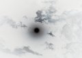
| 10/11/2010 08:45:51 AM | Black Full Moonby neakhaComment: Hi Neakha, welcome to the Critique Club.
My overall impression of your photo is that there is a lot of space in it. It doesn't really grab me or tell me a story - there is just a black mark at the centre of a white picture. That said, I think your idea was very interesting - I might have just done it a little differently.
Technically: Your choice of settings is interesting. You are clearly trying to get the fastest possible shutter speed. Personally, I would not attempt this shot without a tripod and either remote release, or using a 10 sec delay (which would work just fine here) to avoid camera shake. You can then reduce the ISO to about 400, limiting noise, and close the aperture down to maybe f7.1 where the lens can perform much better. This will give you an exposure of maybe 2 secs or so, allowing more detail to be captured, and maybe some nice movement. You could even close the aperture or drop the ISO even more until you have a ten second exposure - with those clouds I think it could be fun!
Artistically: A 55mm focal length is pretty short to be shooting the moon, but if you maximise image quality as above, you could crop quite heavily to draw the viewer in to the moon and exciting cloud shapes around it. I would also avoid placing the moon dead centre, I think about one third in from the left and a little below half way up would work for me, most of the interesting clouds are on the right hand side anyway.
Post Processing: There is not much detail about what you did here, but a simple inversion, tighter crop and some sharpening (using the unsharp mask tool maybe) would help. You could also try using curves to enhance the contrast a little, and pick up the colour saturation a little to give it more interest.
In summary, this could be a really interesting photo idea, but I would try re-shooting and experimenting with some of these ideas to make it stand out a little more. Happy hunting! | | Photographer found comment helpful. |
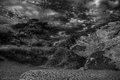
| 10/11/2010 04:41:22 AM | adams1by mgarsteckComment: That's a bit of fun! Really wild feel to it, wilderness and racing skies etc. I like your BW conversion, but you have really blurred the line between ground and sky by making it all so dark which makes the photo much harder to make out. It is more of an abstract collection of objects for me at the moment, rather than a landscape. | | Photographer found comment helpful. |
| 10/11/2010 04:37:42 AM | Neg Pictureby louinsdComment: Hi Louis, welcome to the Critique Zone!
My initial impression is that this is very colourful, and that there is a lot going on. I am drawn from the almost 80's PC game look of the top left down to the hot white of the bottom right, with plenty of contrasts along the way. It is definitely interesting. Unsurprisingly I was thinking 'abstract' before I read your comments, so it works as you intended.
Technically: This is an excellent use of a fairly specialist lens, heading right out of the box. The DOF is superb, as I would expect for such a wide angle lens, and the focus looks pretty good, although it is difficult to tell with the slightly blocky colours. The lighting is interesting - it is almost too bright at the bottom, but not quite.
Artistically: This has a proper 70's psychedelic look to it. I could see it printed on aluminium and hung in a retro bar. If it were mine, I would be tempted to crop a little off the top, to force the focus more on the cool curves of the wire frame, but that is completely subjective. There are also a couple of artefacts which you should probably clone out before selling this (!) but obviously you couldn't in basic editing.
In summary, this shot would only work in negative, so that is the challenge theme completely fulfilled. It's fun, a little crazy and very out of the box - which means it will always split the voters. I like it, as long as you do too - it's all good!
|
| 10/09/2010 06:13:24 PM | The Tuileriesby katenlowComment: Hi Kate, welcome to the 'Critique Zone'! This is all completely subjective, so please take anything useful...
Overall, I am not sure where this photo is supposed to be taking me. I love your concept with the abstract crinoline - it gives you all sorts of lines and play with the light, but I am not sure it fits with the theme, and I think your capture could be 'tinkered' with.
Technically: Using such a wide aperture was an ambitious choice - limiting your depth of field to such an extent doesn't seem to have given you the choice about what to bring into focus and what to leave out. Sticking it at ISO 1000 also seems unnecessary - to achieve a decent shutter speed you could probably have used ISO 200 here and got a lot less noise, allowing you to capture more detail in the crinoline.
Artistically: As I said before, this is subjective. That said, I am not sure that you have picked something that looks better in negative - I did not initially realise that it was negative. If you had the opportunity to arrange the crinoline into curves or allow it to lead you in and across the photo, it might have been more appealing.
In summary, this is a great, abstract, concept. I think that with a bit more focus on what you want the viewer to see / think, this could be a great shot. |
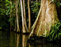
| 10/09/2010 06:03:24 PM | Florida's Back Countyby Ja-9Comment: Hi Ja-9! Welcome to the critique zone...
Overall, I would have to say that this shot does not match up to your usual standard. It doesn't communicate to me that you were trying to get something specific across and the technicals distract from the photos aesthetic appeal.
Technically: Your smallish depth of field focuses the eye on the right, but the actual focus isn't as tight as I would expect - or very possibly you have a little shake from being in the canoe at such a relatively slow shutter for the focal length - can the D80 not push the ISO a little more? The lighting is quite stark and gives huge contrast between the trunks and the water which doesn't really appeal to me.
Artistically: There is some thirds action here, but not knowing what I am supposed to be seeing, it is difficult to use this effectively. I also suspect that the theme being 'country life', the voters were expecting something more dynamic.
Overall, it is a pleasant enough scene, but I am very confident of your ability to represent it more strongly. | | Photographer found comment helpful. |
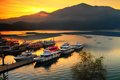
| 10/07/2010 08:00:55 AM | Sun Moon Lakeby finch1979Comment: Hi Michael, greetings from the Critique Club! I hope you find something useful in this.
My overall impression is that this is a very pleasant photograph of a beautiful spot. You have chosen a good time of day and the composition is very structured. The post processing seems a little heavy-handed though.
Technically: You have achieved a good depth of field, and the focus is pretty sharp - although at this size (800px) the detail suffers - that is not something that you can do much about. I am interested in your choice of aperture - f13 seems unnecessarily tight to achieve this - I would have thought f8 or even f7.1 would be enough. That would have allowed you to have a faster shutter - your current shutter speed is (for me) an odd choice: too slow to guarantee sharpness if windy, too fast to give the glassy effect on the water.
Artistically: It is a very well composed shot, clearly utilising rule of thirds, with the sun well positioned and a nice diagonal from the boats. The trees are unfortunate, but nothing to be done about them. I would perhaps have cropped off the extreme right as the town over on the other side breaks up the peaceful line between the water and mountains.
PP: Not a lot to say, but it does seem a little over-saturated, particularly the reds. Some of the boats have started to look a little 'blocky', which I have noticed strong reds are prone to in digital, so I might have toned that down a little.
In summary, this is a very pleasant shot of a pretty scene but is processed to be a little too punchy for the peacefulness I think you are going for. | | Photographer found comment helpful. |
| 10/07/2010 04:06:50 AM | Cat Tailsby gwilton111Comment: Hi Gareth, I have been assigned your photo from the Critique Club. I will point out in advance that all of this is completely subjective, so I just hope that you find something useful here.
Overall, I think that this is a great scene, and noticing that the sun is catching the cattails was a good spot - this works well in the image. There are, however, a couple of things that I would have done differently if this was my shot.
Technically: Your depth of field is good, using f8 really hits the sweet spot of your lens. The focus is more difficult to judge - either this is a really tight crop or there is some serious PP going on which has fudged the focus. Either way, this has lost the detail which should be there. The lighting is very nicely handled, presumably from natural light only.
Artistically: The use of the backlight to give everything a golden glow is excellent, as is the positioning of the sun, and the use of those rays. The panorama style crop though, I find a little tight. I would aim to give the whole thing a little more space, ideally both at top and bottom.
PP: I believe (and the other commenters seem to agree) that there is probably too much PP here, disguising a very nice shot. You mention picking up the contrast, and it looks like you have also boosted the saturation and done some sharpening. I suspect that the shot didn't need any of those things and I would certainly aim to tone them down. You have the same look on your 'Diana's Bath' photo and it leads to a very 'in your face' image, which detracts from the natural appeal.
In summary, this was a great moment, well spotted and pretty well captured, but I think that your PP was excessive and probably didn't help the score. I hope that helps! | | Photographer found comment helpful. |
| 10/06/2010 11:33:46 AM | The Princess and the Pea...."Why is this bed so uncomfortable?!?!"by kellmak10Comment: Hi, Critique Club checking in at your request! I will say that this is all completely subjective, so I hope you find something useful in here.
Overall impression, this is a very cute take on the theme. Baby/Child shots are a marmite subject on this site, some love them and some hate them no matter how good the shot. That explains a lot of the ones and twos for me. There are a couple of things I might have done differently.
Technically: The Depth of Field is good here, which is surprising at f3.5. I'm guessing you were shooting pretty much at the wide end? Equally the focus is spot on, with your model's face nicely sharp. The lighting is tricky - with all of the white of the bed and mattress, the bottom half of the picture is a lot lighter than the top, where your subject sits and I confess to finding it a little distracting on the eye.
Artistically: This is really subjective! It is a strong basic composition, and I like your use of the pink netting to isolate the 'set' from the background. The mass of different bedding colours however I find a little 'busy' - again stealing a little impact from the superb acting you are getting from your model. Her pose is excellent, and her expression is bang on - nothing you could want to change there!
PP: For an advanced editing challenge, I would be tempted to take advantage of the freedom to dodge and burn, using that to highlight the upper half, and tone down the bottom half. I am personally not a fan of the white vignette - perhaps a little gaussian blur would have done the job there instead? And the two tone border seems a little much - for me, simple is king (I have had bad experiences with borders!) and I suspect that the voters didn't really go for it either.
In summary, this is an excellent portrait of your daughter, well within the challenge theme and I would personally be quite pleased with it, if it was mine. Nice job! | | Photographer found comment helpful. |
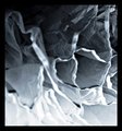
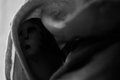
| 10/06/2010 11:17:55 AM | Thumbelinaby posthumousComment: Posthumous again? Not sure if I got lucky, or you got unlucky, but here goes with the critique...
Overall, this is a very interesting shot, but more 'art gallery' than 'DPC' which probably explains how the voters have judged it. I suspect that you knew this already so I won't dwell on it!
Technically: It strikes me that this shot is technically very accomplished. Your use of DOF and spot on focus is excellent and the way you have chosed to light this shot - while not popular - is intriguing. Instead of a thumb with a face painted on it, we have a dark icon, in which the white bits end up looking quite ghostly.
Artistically: The composition is very powerful, using the OOF leading lines of the curtain to draw the viewer in to the deep dark heart of Thumbelina, and guess what is actually there. As someone said previously, the curves and shapes are great, as is the BW conversion. If I was to criticise, it would be the brightness of the wall (?) to the left. While this does contrast with the darkness of Thumbelina, it also drags the eye away from her in a slightly distracting way - I would be tempted to tone it down, but that is obviously subjective.
In summary, this was never going to have mass appeal, but it is a wonderfully dark take on the theme which has clearly appealed to those who have taken the time to soak it up. | | Photographer found comment helpful. |
|
Showing 151 - 160 of ~1021 |
Home -
Challenges -
Community -
League -
Photos -
Cameras -
Lenses -
Learn -
Help -
Terms of Use -
Privacy -
Top ^
DPChallenge, and website content and design, Copyright © 2001-2026 Challenging Technologies, LLC.
All digital photo copyrights belong to the photographers and may not be used without permission.
Current Server Time: 04/02/2026 03:50:44 AM EDT.
|