|
|
|
Showing 721 - 730 of ~994 |
| Image |
Comment |
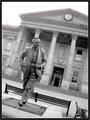
| 08/25/2003 10:43:57 PM | Lord Wilson of Rievaulxby BobsterLobsterComment: The contemporary manner (eye-level perspective / hurried determination) of the sulpture vs. the classicistic architecture alone is worth the photo. Leaving the dof large enough to include the background while concentrationg the exposure on the sculpture seems an appropiate choice. The \'tilt\' is absolutely perfect and \'works\' wonders with this otherwise fairly straightforward (no pun intended) capture. It effectively \'charges\' the subject, as if ready step out of the confines of the picture. Compositionally, the same effect seems to have also addressed a potential \'balance\' issue between sky and gables (background).
The somewhat very faint greys toward the top of the photo \'washing\' into an oblivious and white sky, still, remain a tad too undesirable, particularly since their balancing counterweights (the placque and benches, near bottom) are markedly dark.
Given the raw score of what I imagine the original shot to be, this is a very apt composition.
This remains my favourite shot in this challenge. I have found it very difficult to determine, why, exactly, I like this capture so much. I believe, it is due to a \'riveting\' but not immediately obvious tension between three elements, the gait of the subject, its facial expression and the clock. |  Photographer found comment helpful. Photographer found comment helpful. |
| 08/22/2003 03:00:27 PM | In The Beginningby togtogComment: Please refer to the previous challenge (Neg. Space) for a comment on an identical photo appearing here under a different title. |
| 08/20/2003 11:49:29 PM | Blackbear At Midnightby bruster54Comment: Redundant, imitative, clichee. It may remain, for some, mildly and very briefly at that, entertaining.
The 'manner' of this photo, however, offers hope, in a deja-vue sort of way, to those of us with an appetite for change. If the photo was inverted, this would make more sense... | | Photographer found comment helpful. |
| 08/20/2003 10:19:40 PM | "A Perfect Thanksgiving Dinner"by autoolComment: Originally posted by clues56:
This one should have been in the top three in my opinion. |
I am ashamed for the ranking it got. This is one of those rare photographs which are clearly beyond 'likes and dislikes'. The picture just 'is'.
I fail to see how so many can see less. | | Photographer found comment helpful. |
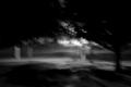
| 08/17/2003 11:34:47 PM | Silent Strollby AtlantaRockSceneComment: Spectacular, eery shot with a strong personal appeal to my tastes. Love the dancing, foggy lights and the diffuse vanishing road...
I commend the photographer for what I consider I daring submission within the context of this site! > 6 by my scale, plus one extra point to encourage similarly 'different' images (and to make up for those who will award a 1) ;-) |
| 08/17/2003 11:22:47 PM | | | Photographer found comment helpful. |
| 08/17/2003 10:52:26 PM | Obscured Perspectiveby ellamayComment: A dead-on, centred perspective, unusual considering the soft, ethereal image of the girl at the centre of this shot. What is striking here, IMO, is a balance that has been achieved between the soiled primary plane and the tender, almost fragile expression of her face. The warm range of tones here seem to be combatted by an array of errand light throught the space confining the subject. Again, the sum of the spatial effects of the light, although diffuse are sufficient to offset, even balance the \'grunge\' primary plane.
What I like about this shot is its absolutely \'unpretentious\' capture of a moment. Emotive, magical, wonderful! | | Photographer found comment helpful. |
| 08/17/2003 06:37:31 PM | Nightly Waitingby moodvilleComment: I like the overall feeling of this photograph, especially the soft luminous tonal quality and the simple and playful approach to what could be a 'trivial' challenge topic. The juxtaposition of the 'rounded' figure with the surrounding rectangularities, emphasized by both light and shadows, creates a dynamic sufficient to make this photo worthwhile beyond the challenge itself.
The two somewhat crudely cut (exactaknife/cardboard?) rectangles on the right are a little distracting, perhaps, from a capture which is otherwise quite meticulously executed. Compositionally, I could imagine the figure (left) a little higher too, covering perhaps two thirds of the height of the picture...
Nevertheless, 'ribbonesque'! | | Photographer found comment helpful. |
| 08/15/2003 06:36:45 PM | Triptychby zeuszenComment: I noted that two comments referred to the 'darkness' of this image. Both original and the submitted versions, really, are far from 'dark'. There 'is' a shadow running up approx. 2/3 of the picture, but even within this area sufficient brightness is retained to ensure the visual data remains uncompromised.
I processed the image on an 2003 eMac with Apple factory calibration, checked it on an Apple G4 Powerbook and a slot-loading iMac, without noticing any deviations.
When I viewed the picture on an older Dell computer owned by the Vancouver Public Library the other day, I could hardly believe my eyes. The image was rendered very dark, the colours were completely off and the detail, particularly in the shadowed lower section, was largely obliterated.
I'm not quite sure yet what to make of this, but I have now checked two further comments as 'helpful', since without them, I would have never found out. Thanks ttreit and timmi.
|
| 08/08/2003 07:26:00 PM | Set On Endby Firstrich1Comment: Great clarity and expanse of tone. One of my favourite shots in this challenge. Yet...
I remain reserved about the composition, particularly the very narrow crop to the left of the light blue 'wing'. I would have preferred a more generous space, perhaps a 3rd of the distance between the windows, i.e. a measure relative to any 'given' in the photo, to suggest continuity.
The lighting too is questionable, since it is obviously natural, but reflects downward, off the 'wing'. I understand the choice for standing the image on end (to further enhance the abstraction suggested by the subject) but question the credibility of the resulting impression.
To render the image horizontally (wing up) would, IMO, achieve a satisfying effect, albeit a different one. I also miss a clear definition of the 'wing' against the sky, something that could, possibly,be achieved by sharpening the edges slightly. The double border is, IMO, more than is required to anchor the image in a page.
Regarless of these (perceived) flaws, the photo is powerful and beautiful, and I'm grateful for having the opportunity to 'sink my teeth into something' I can care about. :-) | | Photographer found comment helpful. |
|
Showing 721 - 730 of ~994 |
Home -
Challenges -
Community -
League -
Photos -
Cameras -
Lenses -
Learn -
Help -
Terms of Use -
Privacy -
Top ^
DPChallenge, and website content and design, Copyright © 2001-2026 Challenging Technologies, LLC.
All digital photo copyrights belong to the photographers and may not be used without permission.
Current Server Time: 07/27/2026 12:41:39 AM EDT.
|