|
|
|
Showing 581 - 590 of ~994 |
| Image |
Comment |
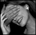
| 11/30/2003 05:50:46 PM | Guess Who? by Firstrich1Comment: Despite the fact that this capture provides several undesirable, albeit minute instances for criticism, it should strike any viewer as unassumingly beautiful, delightful and credible. The choice for b and w conveys the intimacy captured here in an aptly subtle and tasteful way. The softer focus compliments the close-up.
While the composition is a natural given derived from the perspective, the image 'weighs' slightly to the left due to a more concentrated presence of negative space (black areas). This combined with the diagonal position occupied by the subject invites a subtle counter-clockwise dynamic and viewing path.
The inclusion of redundant highlights, one to the left of the model's index finger, another on the the left near the top border, while clearly discernible, appear to provide no dramatic distraction from the essence of this image.
I do question the need or preference for the triple star-burst effect with this image. While, undoubtedly, it provides a marked point of interest and contrast in and to an essentially grayscale photo with a soft and flowing feel, it also draws an unrelenting attention to an artifact (in the sense and context of the image). The lens effect itself -dates- the photo to an era, when such effects were in fashion.
To my senses, this is a mixed blessing: on one hand, it appears to diminish the subtly intimacy of this capture, while on the other hand it adds both charm and a graphical highlight. |  Photographer found comment helpful. Photographer found comment helpful. |
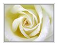
| 11/28/2003 11:57:57 PM | A Pure Scentby librodoComment: A good macro in sublte and naturel tones which radiates from the centre. The near static composition benefits this effect.
The excessively decorative border, unfortunately, diminished both the potential image size and the claim of the title. | | Photographer found comment helpful. |
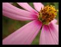
| 11/28/2003 11:39:43 PM | Hint of a Scentby NeuferlandComment: The apparent photographic skills to integrate technical precision (lighting, arrangement, colour and hues) with am aesthetic vision are clearly demonstrated with this entry.
On a more personal note, I cannot shake the feeling that such obvious talent is a little wasted on what I'd consider a not so modest, trivial splendour. :-( | | Photographer found comment helpful. |
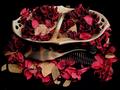
| 11/28/2003 11:29:04 PM | The Smell of Natureby qazwixComment: A good macro which, IMO, could be somewhat improved upon by extending the shallow depth of field to the precise point(s) of interest. The composition is appropiately dynamic.
The overly heavy border (somewhat reminiscent of an orbituary), however, diminishes the potential size of this capture while distracting from the subtlety of the subject. The black hairline applied here by default would, IMHO, been ideal. |
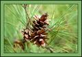
| 11/28/2003 10:12:02 PM | Pineby deemerComment: A potentialy pleasing and compositionally satisfying capture of a somewhat common subject. The tri-cluster of cones adds interest as much as the star-burst needles. The natural colours also contribute to a positive overall impression.
The focus, however, does not appear to be as crisp as one would expect, particularly within such a narrow depth of field. Although there is evidence of overexposure on parts of the cones, it is unlike to strike a casual viewer as a dominant flaw. Despite the almost central composition and because of the distant cone (near bottom left) and the curved branch intersecting the image, the distribution of available weights remains, indeed, reasonably balanced.
The sheer size and colour/line intensity/weight of what I\'d consider a redundant border takes away potential image size and, IMHO, distracts from what is essentially a very humble capture. | | Photographer found comment helpful. |
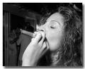
| 11/28/2003 02:44:22 PM | Puffby beachhopprComment: I quite like this b & w, and do not mind the drop shadow border, although the overall size of the image may have been somewhat diminished by it. What I would have liked to see, is a little (or big) puff of smoke - not just for topicality, but to add a lil visual jazz and, hopefully, blur the background further than it is. The savory expression on the subjects face is credible. The choice of a woman smoking a cigar, also, is more interesting than the stereotype. |
| 11/28/2003 02:18:27 PM | A Pinecone In Autumnby RefocusedComment: The shallow depth of field carries and makes this shot. The single protuding needle at the left of the image is an unfortunate distraction. The colour and hues are rendered extremely natural in an apt composition. Not a spectacular capture, but a satisfying one. | | Photographer found comment helpful. |
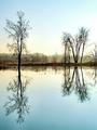
| 11/28/2003 01:55:27 PM | smells like winterby ursulaComment: A gorgeous capture with almost -bleached- hues (the near-turquoise foregound and sky above horizon). Very good contrast, given the fog, particularly in the reflection. The horizontally centered composition, of course, aids the staticity of the landscape. A photographer more passionate about his art, would have blown up the slim tower visible near the centre of the image prior to taking this shot. ;-) | | Photographer found comment helpful. |
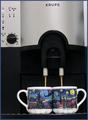
| 11/27/2003 07:25:45 PM | Good Morning!by TrinchComment: Poor Van Gogh turning in his grave at the sight of such a thing. ;-)
Not uninteresting. I enjoy the offset symmetry of shapes in this shot. A nearly balanced composition, if it weren't for a slight vertical tilt to the left, which is emphasied by either or both lens distortion and form of the coffee maker. The crop. too, is quite tight, particularly top left.
There seems to be some loss of detail in favour of some noise in the darker areas of the image. I am speculating that the ISO was above 200, instead of 100 or less, which would require the use of a tripod under darker conditions. | | Photographer found comment helpful. |
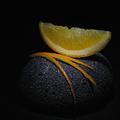
| 11/27/2003 07:07:58 PM | L'odore di un'aranciaby JC_HomolaComment: Exquisite.
The crisp finesse of the arrangement is both apt and tangibly delicious. The various technical givens in this shot demonstrate a high degree of skill and accomplishment.
For a photograph (and a studio shot at that) of this calibre I\'d prefer to see a more standard format, either vertical or horizontal, especially since there appears to be no compositional reason for the very static square.
I rate this examplary image 8 (on a personal scale, mainly because of the limited range of both subject and topic). Within the context of DPC, it is a 10, no holds barred. | | Photographer found comment helpful. |
|
Showing 581 - 590 of ~994 |
Home -
Challenges -
Community -
League -
Photos -
Cameras -
Lenses -
Learn -
Help -
Terms of Use -
Privacy -
Top ^
DPChallenge, and website content and design, Copyright © 2001-2026 Challenging Technologies, LLC.
All digital photo copyrights belong to the photographers and may not be used without permission.
Current Server Time: 07/27/2026 05:42:39 PM EDT.
|