|
|
|
Showing 471 - 480 of ~994 |
| Image |
Comment |
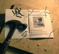
| 02/08/2004 03:36:21 PM | Avid Learnerby stickylizardComment: Ah, an Estwing hammer!
I'd love to see just a lil more light on it, greater sharpness too. The arrangement (instruction Manual! and battered particle board) is priceless. |  Photographer found comment helpful. Photographer found comment helpful. |
| 02/08/2004 03:15:29 PM | | | Photographer found comment helpful. |
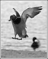
| 02/08/2004 01:05:43 PM | Duck to Waterby crabappl3Comment: I find it difficult to enjoy the excessive noise chosen (?) for this particular shot. While it would add some interest to a purely textural study or one concerned with instilling a (film-like) fleeting temporality (character portrait, journalism, possibly a candid, even a landscape, if dating it via effects would serve a purpose).
The interest here, however, lies likely stronger in the nature of flight, the details of markings, colour, pose etc, precisely those aspects which have been obscured. The inclusion of the second duck (in the water does stabilize the balance of tones within the image, but it does nothing for an easily achievable (and enjoyable) simplicity of composition, which we would have, if it were cloned out.
What remains, to me, is an image with delightful effects, textures and tones, if appiled to a more abstract (non-figurative, non-representational) piece than this one. |
| 02/08/2004 12:40:22 PM | Cookies 'n' Creamby inspzilComment: While the composition is much too tight too be able to enjoy the close perspective, this entry, IMO, is more dynamic than numerous other ones with the same subject submitted here. Despite the obvious theme, with a little more elbow room for the splash and a more subdued light (on the milk, centre image), we should have a fairly satisfying photo. |
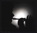
| 02/08/2004 12:00:16 AM | Hard Lives & Stories Untold.by jjbeguinComment: Very (!) harsh, in every respect, so harsh some viewers may miss any affection the photographer may have had for his subject. He is left, instead, affronted with a given reality as it is represented here.
The manner is, of course, either a deliberate choice or a direct consequence of human experience.
The image is, without question, the strongest of the bunch. Even the title is emotive to a high degree.
> 8
| | Photographer found comment helpful. |
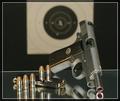
| 02/07/2004 11:49:57 PM | Guns and Bulletsby ArmadilloComment: Excellent rendering with an explicitly commercial feel to it.
Minor but critical defects:
The near-centered target (background) skews the composition by thirds (foreground).
The far edge of the glass shelf (foreground) suffers from a anti-clockwise tilt, neither strong enough to add a dynamic nor imperceptible enough to be ignored.
A little more (reflective shelf) space in front of the gun may make for a more pleasing whole.
Because of the strong mercantile presentation, particularly when associated with a gun, I cannot rate this shot as well as I might have without these obvious aspects.
> 3 in my book; 4 in the context of this challenge. |
| 02/07/2004 10:50:22 PM | Leather & Laceby rickhd13Comment: While this capture is reasonably accomplished and seductively rendered, as a photo, it is also short on -range-.
Both title and image relay the subject poignantly, yet the polished fringes of leather suggest an article of clothing and fashion rather than a material per se. The unfortunate and likely unintended effect is that someone viewing the image is reminded of catalog images, intended to sell a product.
If the article used here could have been more difficult to date and could be displayed more generically, this image would, IMHO, be an entirely different animal.
With a greater tonal range (both in the white and black areas), the photo would be transporting.
Despite my stated criteria, I consider it among the best in this challenge. | | Photographer found comment helpful. |
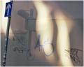
| 02/07/2004 09:48:38 PM | Light and Shade: Paint on Canvasby ImagineerComment: Despite the the very tight crop near the road sign (especially above it), its inclusion adds both dimension and balance to this soft and partly sensual chiaroscuro. A little sidelight on part of the sign would have been delightful as well. An array of shapes, tones, textures and lines juxtaposed with graffiti without any sense of clutter!
One of the most satisfying and creative images in this challenge, IMO.
| | Photographer found comment helpful. |
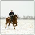
| 02/04/2004 09:03:49 PM | Shadrakby leafComment: Not much, really (to improve upon). I think this is a very decent shot. The rider, too, is not inept.
It helps to know (to be able to see) a little about horses and riding to perfect a photo like this. What I mean is that, as an equestrian, I'd like to see a greater engagement of the horse (the horses hind legs deeper under the body) and a little less of a rack (the high and unnatural left front). A looks like a good horse though, with good confirmation and a good carriage (the head slightly in front of the vertical). The rider, although a little heavy, has a good deep seat and appears to be focused.
The setting is, of course, ideal without any visible distractions. The bright, snowy ambiance provides a splendid air supportive of subject and action. I might consider a wider format, which would subordinate the two (horse and rider) to their environment, while retaining focal length and perspective (so no salient detail is lost).
This, however, is a matter of taste and philosophy (regarding the relationship between nature and man). The composition, as is, is quite simple and sensitive to the available space.
I would, however, consider dropping the double border. Even though a Western idyll appears so often adorned with redundant artifice in popular American crafts, this photo is too good for decorum, IMHO. Message edited by author 2004-02-04 21:04:29. | | Photographer found comment helpful. |
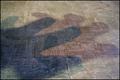
| 02/03/2004 12:28:03 AM | ... The Shadow Knows!by GeneralEComment: The pastels together with the undulating mesh textures make this a lovely juxtaposition. If the light, although well captured here, were closer to the -golden hour- the apparent narrow depth of field, I imagine, would be more dominant, and I, for one, would dance in my shirt. ;-)
Nevertheless, a very satisfying capture, and a -potential great-, a fact the present title cannot reflect. | | Photographer found comment helpful. |
|
Showing 471 - 480 of ~994 |
Home -
Challenges -
Community -
League -
Photos -
Cameras -
Lenses -
Learn -
Help -
Terms of Use -
Privacy -
Top ^
DPChallenge, and website content and design, Copyright © 2001-2026 Challenging Technologies, LLC.
All digital photo copyrights belong to the photographers and may not be used without permission.
Current Server Time: 07/27/2026 02:51:33 AM EDT.
|