|
|
|
Showing 351 - 360 of ~994 |
| Image |
Comment |
| 06/14/2005 03:11:50 PM | |  Photographer found comment helpful. Photographer found comment helpful. |
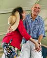
| 05/02/2005 02:07:48 PM | Dancing Happy!by wetlandComment: Sheer, infectious, Frankenstein fun! The 'formal' attire places this image firmly in the tradition of American comedy.
The complete absence of conceivable aesthetic effects and embellishments strikes me as very refreshing, appropiate and effective.
I'm appreciative of the range of emotion portrayed here. To me, it is the very 'lightness' of joy which inspires 'serious' consideration - and it does so, credibly, sans artifice and via a refreshing directness.
> 7 | | Photographer found comment helpful. |
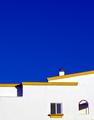
| 05/01/2005 12:32:09 PM | Colores de Andaluciaby TychoComment: Not a subtle saturation, which, IMO, works well where the paint is, less well in the expanse of sky and the shadow of the recessed wall. The geometry achieved by composition is exquisite, proving a good eye.
Both, the rich colours and the pastel visible through the arch, could not be better painted, given the pure white of canvas of the foreground subject. The open arch vs. the barred window, the clear lines vs. the shallow structural depth emphasized here present a fine contrast and, to me, a satisfying pleasure. | | Photographer found comment helpful. |
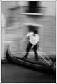
| 04/28/2005 04:59:57 PM | Brief encounterby jjbeguinComment: Far from a 'minimalist' sense, but what a fine photo!
The white's white and the black's black. Yet, on my monitor, some 3/4- (in the expanse of the lower wall on the left of the image) and midtones (sky) have turned quite solid. There appears to be also a slight (and correctable) perspective tilt (of the buildings) to the left.
All in all, the image itself does not exactly inspire such hair-splitting criticisms. It still strikes me as an excellent black and white, a marvellous photo, which when I squint a little reveals a strong composition as an abstract space.
> 7
| | Photographer found comment helpful. |
| 04/26/2005 12:15:22 AM | Impressions of Fallby NeilComment: At this size, with about 16" viewing distance, the image is too confusing to be stimulating. It is a sensory confusion, a vertigo of palette, form and shape, dimension, medium and order. When I say 'order' I think I am referring to a reality outside of the image, almost.
Many tones and colours (even the primal ones), as are shapes, are muddied - not formed, charged or blown by motion, illuminated or reflected, but muted, bled, dissolved and speckled like diseased oranges in a concrete mixer.
Yes, anyone with an appetite shall have his share of imaginable pinks, rubies and azures, but his imagination needs to be tenacious indeed to wring acorns from this endangered lily-of-the-meadow. I am, at this very moment, considering a golden brick feathered into obscure height by a grass-green geysir which, I am sure, does not exist.
Or am I, possibly, regarding a painting twice my size into which one may vanish - forever? No, not at the expense of sanity and the simple conviction that the parts must cohere before the piece can come together.
If it were a painting, yes, one could ask "Neil, why did you put this blur here and that streak there?" If you had spawned the work from the real, organically, solidly like a good, honest farmer, you would be able to show me, quickly and convincingly - if not I'd rip up your canvas and replace it with new, fresh one.
But it ain't no paintin', it's a photo. It's an accident. I expected an incident. ;-( | | Photographer found comment helpful. |
| 04/20/2005 01:38:24 PM | Window Watcherby loveComment: The worn, grainy look does much to humanize the figure. The angular lines and striations vs. the soft flow of greys and the grace of form provide a perfect poise between the nostalgic sentiment found here and a contemporary context. Despite the high-key manner, the contrast is kept conservatively contained in the shadows, which, effectively, avoids the potential impression of forced post-processing and artifice and, instead, credibly anchors the excess of light around a black point.
Given the gesture of the left arm and right-to-left gaze of the subject, the crop (centering the verticals vs. having the face further to the right) is, IMO, a plausible choice, as it likely minimizes the presence of redundant white space to the left of the niche.
The concentration of shadow toward the upper third of the picture is an oddity, which could, to my senses, be taken either as a distraction from familiar viewing habits or as a latent charm unique to the work.
This photograph has a strong personal appeal to me, probably because of the fine sensory poise and the aesthetic emphasis it affords anyone with an air for such things. | | Photographer found comment helpful. |
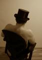
| 04/18/2005 02:24:24 PM | Restby StructorComment: Every now and then, thank god, there's someone who will not be not satisfied with the same view out of the same old window. This alone is a premise not shared by the many. To see someone, actually, 'do' something about it by actively extracting completely different reality from the familiar is a rare thing indeed.
Would this not be something akin to a miracle or, at least, serendipity? But why, for the life of me, is the wonderful craziness of idea and the blessed impulse to shoot like this restricted to the conceptual whole and not infecting its parts? Yes, the humour is preserved, but the 'seriousness' of this pure act of photography and art is, IMHO, perfectly squandered.
Why are the legs of the chair, itself a secondary subject, cut off? Could the illusion of the forward tilt into the viewer's face not have been achieved by positioning the camera a few inches higher without sacrificing any other attributes? Why is the only given baseline left add odds with the margins of the image?
The shadows (hat and back of chair) are bare of tones, but not bare enough to perceive a 'deliberate' contrast. One could, without having to strain, attribute intent to the general softness of the photo, which, combined with the depth of field chosen here, would evoke another era without digital technology, L lenses and USM. This, I think, would not be far fetched, considering the hat, the chair and the surrealism made here (the films of Fritz Lang come to mind).
Without the edge contrast (sharpness), unfortunately, the shoulders and arms, nearly fade into the wall, which displays the same colour and tones. Rendering the image pure black and white, also may have added some degree of contrast here, where it's needed.
I find myself frustrated by the, apparently, 'sloppy' treatment of this astounding photo, which is, otherwise, so bold and innovative, in a nostalgic sort of way, while inspiring a restlessness and pure energy which can neither be missed nor ignored. | | Photographer found comment helpful. |
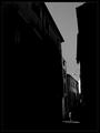
| 04/12/2005 12:19:52 AM | blkby GeocideComment: Something is in sync here. I'm happy to admit that I don't know what it is.
Everything I thought I've learnt, is off somewhere, irrelevantly afloat, sifting through lesser work it can get a handle on.
My people, look at this photo! It is so unassuming, it had to be created according to its own laws.
| | Photographer found comment helpful. |
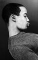
| 04/07/2005 01:40:51 PM | 162558by undieyatchComment: Perspective, the inclusive focal length, the symmetry of the three facing the viewer vs. the assymmetry of the diagonals created by light, shadow and lay of the land and sky pack quite a punch. The contrast works well, although details are sacrificed, where, IMO, they would be desirable, i.e. in the face and on the eyes of No. 1823.
The photo, as I perceive it, appears a hyperbolic part of a larger and serious narrative which is told very boldly and directly here, yet not without finesse and humour. Given this, I'd consider changing its somewhat pedestrian title to one to fit the story (whatever story may be extracted).
If it was mine, I'd coin it '1823'.
This is a remarkable image, well made and seen, André. I bow. |
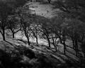
| 03/14/2005 12:04:20 PM | California Hillsideby myceliumComment: While I would appreciate some sort of a visual anchor in most images, I'm not looking for a defined focal point as a prerequisite for a good photo. The anchor, here, is clearly and amply provided by the diagonal row of shadowed trees which intersect the rounding meadow, so perfectly kempt by a full tonal range of light and detail. The contrast this paints is stark, utterly dynamic and further amplified by the depths and pitch of the slope(s).
The exposure is so dead-on, so trimmed on the texture, shape and expanse of the ground (and, to a lesser degree, on the tree crowns), that there is very little room to consider the dark verticals and diagonals the row of trunks create anything but ordering elements.
I find this image remarkable and exciting, not only because of the eye behind the camera, which recognized the extraordinary potential of this scene, but also for its disarmingly uncontrived composition.
The balance achieved here, between light and dark, is a fine poise indeed, yet there is no impression of manipulation or imposition on part of a photographer.
To me, this photograph meets the topical demands of the challenge creatively first of all. The technical accomplishments are there, but they are there quietly, subordinated to locale, subject and a photographic manner sensitive to such things.
The score it drew here is a negligible abomination, in my view. Message edited by author 2005-03-14 12:06:50. | | Photographer found comment helpful. |
|
Showing 351 - 360 of ~994 |
Home -
Challenges -
Community -
League -
Photos -
Cameras -
Lenses -
Learn -
Help -
Terms of Use -
Privacy -
Top ^
DPChallenge, and website content and design, Copyright © 2001-2026 Challenging Technologies, LLC.
All digital photo copyrights belong to the photographers and may not be used without permission.
Current Server Time: 07/26/2026 01:47:41 PM EDT.
|