| Image |
Comment |
| 08/01/2010 02:00:02 PM |
Odd Man Outby dlmoss16Comment: This is an excellent subject choice and composition. The tonality of the black and white is rather flat and lacking good contrast that might make it a truly fantastic photo :) |
| 08/01/2010 01:58:36 PM |
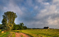
not so "cloudy and windy day around home"...by cyparisComment: Greetings from the Critique Club...
Re-shooting previous images in your collection can be an excellent way to improve your skills. Over time, you will gain an understanding of how images can be improved based on your own learning and feedback you get from others.
Landscapes are difficult images to compose... You have to find a way to connect your viewer with a scene that they aren't familiar with. This image doesn't seem to have that connection point and there is no particular subject element that draws me in as an outsider to your scene. The time of day that this photo was shot doesn't lend itself very well to intriguing lighting. Most of the interesting detail in this scene appears to be in the shadows... Maybe an alternative perspective and time of day could be chosen to create something more magical about this scape...
|
 Photographer found comment helpful. Photographer found comment helpful. |
| 07/31/2010 11:47:16 PM |
070108: Two Years + 17 Days Laterby davidwComment: Greetings from the Critique Club...
This image is rather difficult for me to critique. I don't really see anything I don't like about it. It's a decent landscape shot. It's one of those photos that might be difficult for a random viewer (such as myself) to connect with. A landscape like this one generally has some interest to the photographer who shot it... something that comes from within... Maybe this is your property or a place where you grew up or just something you see every day that feels special to you in some way or another. As an outsider, I can't really connect with much of this scene. It probably is an interesting improvement over the original as intended by the challenge though.
In my personal opinion, landscapes are some of the most difficult photographs to make successful in the public eye. You need a strong subject or anchor point in the scene that really draws an outsider into your frame of thought. In my opinion, the light is the strongest part of this theme. I'm not as much of a fan of the sky tones, whether they be natural or post processed. |
| Photographer found comment helpful. |
| 07/25/2010 10:18:01 PM |
in nature's lightby libertyComment: Very nicely done... I think that removing the potato in the lower right corner would make a perfect composition here. That one potato seems to break the continuity of the light and 'flow' in this photo.... still excellent work here... nice :) |
| Photographer found comment helpful. |
| 07/25/2010 04:25:19 PM |
Rural Decayby CreativeFlyPhotoComment: Greetings from the Critique Club...
This photo fits the challenge rather well in the subject of "Weathered" as this building is showing deterioration from its life in the great outdoors. Reading your own comment on this image, I can definitely see how this particular scene holds a place in your heart and mind. As I look at this scene, I keep asking myself how I could create an even stronger feeling of "Weathered" without losing the chosen subject...
The door to this barn appears to have a really weathered latch that might be worthy of a closer look. In my own photographic endeavors, I tend to look at any given subject in parts rather than as a whole. I always ask myself what part or parts of this object create its identity and give it the character that draws me in. When I determine those elements, I like to bring them to the foreground of a photograph as much as possible.
You might want to give this a try as well :)
Nice work...
|
| Photographer found comment helpful. |
| 09/27/2009 11:13:02 AM |
Burned landby keyzComment: Greetings from the Critique Club...
The photo meets the challenge... no issues there. Subjectively, I find very little to no interest in the subject. I guess an image like this has a limited audience. Technically I don't care for the exposure being high key and I can't see any reason that all the matches should not be in focus. There isn't really a compositional element to discuss in an image of this nature because of what it is. It's over my head :)
IMO, this photo is something put together just to have an entry into the challenge rather than having some sort of personal meaning or involvement with the subject. Sometimes these images work and sometimes they don't. Yours fell mid pack in the challenge. None of your comments received during the challenge discussed your choice of subject, so none of those viewers probably connected with it either... |
| Photographer found comment helpful. |
| 09/24/2009 12:33:22 AM |
Tree in fieldby tinkie2010Comment: Greetings from the Critique Club...
First of all, I don't like most HDR images because they simply look over-processed to me and the processing draws too much attention to that aspect of the image rather than the actual subject content, so I'm going to refrain from comment on the editing technique and just look at the image content...
The subject (tree) in this photo holds a good bit of interest for me, but compositionally, I think the image needs a little additional help. The tree intersects with the horizon on the right side. Maybe a lower camera angle would create the separation needed there to pronounce the additional layers of depth that would give this photo more visual impact. It's one of those situations here where the subject could potentially stand on its own if it is worked properly :) |
| Photographer found comment helpful. |
| 09/23/2009 08:08:22 AM |
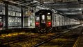
departureby DeenComment: Greetings from the Critique Club...
HDR is a subject that I'm not overly impressed with in the long run. MOST (but not all) of the HDR images I have seen simply don't look natural to me and they have a look of being over processed. I believe that the simple nature of these tools convince a lot of photographers that there is some overpowering need to make the photo have a processed rather than a natural appearance. My personal interests in photography are for a more natural appearance. I personally tend to not like a photograph when its main theme has become a processing technique rather than the normal elements of subject and composition.
That being said, your photograph scored rather well in this challenge with a score of 6.56. As I look at your image (and set aside the elements of HDR), I find myself looking around the scene trying to determine what part of it you found to be the most intriguing and what it is you wanted me, as the viewer, to see in this scene. The rear of the train seems to be the focus point of the image, and it is falling dead center in the frame. I'm also struggling with the lighting, and it may be that a selective desaturation was used in this image, but I'm not sure. The yellow cast behind the train just looks and feels strange to me when there is no other light with that tone in the scene.
I really do feel unqualified to offer reasonable critique on this image since I simply do not like the whole HDR concept for the most part... |
| Photographer found comment helpful. |
| 09/13/2009 11:29:52 PM |
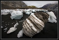
Dare to be D I F F E R E N Tby moolacoolaComment: Greetings from the Critique Club...
This is an intriguing photograph. It's a landscape that I am definitely not used to seeing and that provides a significantly higher interest level. I would have had to look at this image for quite a while to really get a grasp of what I was seeing without being able to see your own comment on the image. It's almost mystical with your description, and its very well composed. The only comment you have that has any critique is the one from ELLIPS. I'm not sure what he might not like about your composition. His comments regarding that didn't make any sense to me. I can also see detail in all your shadow area, so maybe ELLIPS just needs a monitor calibration. In fact, that brings up another point. This is a very well exposed image. When you have white and black objects in a scene, making the correct exposure can be a nightmare, and you have done very well with that.
I'm not really sure why the collective vote in this challenge didn't find this photo to be worth any more than a 5.6. I didn't vote in this challenge or look at any of the images, but in general, you gotta have something eye popping in color and subject choice to do well in any challenge. Shiny things tend to appeal to the masses :) |
| 09/10/2009 12:57:19 PM |
Linguini Pescatore con Pomodoro e Gamberetti alla Ferruzzanataby hotpastaComment: Greetings from the Critique Club...
Your score guess was pretty close, but a 6.04 is still an excellent showing in a challenge. Since you admitted to complete conceptualization, design, and execution of this image, I suppose I can be a bit harder on you :)
First of all, the food looks tasty and well executed in that department :) Compositionally, I'm not a huge fan of the perspective. I'm sure there is a reason you chose it, but this view is rather flat and two-dimensional. The application of the gaussian blur also feels a little uncomfortable to me as well around the top edges of the image.
I think this image is very well done for the purpose of stock imagery. It would also make good menu or restaurant art.
I personally find it more difficult to critique an image in a challenge like this one simply because of the topic. Some topics allow the artist to express themselves a little more than others. This is more of a commercial art assignment rather than a simple artistic endeavor...
You did well though.. Keep up the good work!
|
| Photographer found comment helpful. |
Home -
Challenges -
Community -
League -
Photos -
Cameras -
Lenses -
Learn -
Help -
Terms of Use -
Privacy -
Top ^
DPChallenge, and website content and design, Copyright © 2001-2026 Challenging Technologies, LLC.
All digital photo copyrights belong to the photographers and may not be used without permission.
Current Server Time: 07/16/2026 02:52:53 AM EDT.