| Image |
Comment |
| 07/17/2002 08:45:00 AM |
|
| 07/15/2002 06:31:00 AM |
Early Riserby lmhrComment: Interesting image... I think that shots of the sky lack impact. The moon in this particular image is too small to create a strong subject... = 5 - jmsetzler |
| 07/18/2002 01:08:00 PM |
Dock at Twilightby bdshortComment: I REALLY like this image. The mood here is excellent. The only critique i have is that the partial ring float in the lower right is a bit out of place. I believe that taking about one step to the left and one step forward would have removed the ring float and also hidden the boats on the far left edge... good work! = 8 - jmsetzler |
| 07/17/2002 08:50:00 AM |
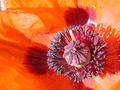
Poppyby spillerComment: nice shot! The composition here is excellent... The lighting is a little bright to suit my tastes.. I have photographed flowers in the past and found that an overcast day or some amount of shade on teh flower helps the 'punch' quite a bit :) = 7 - jmsetzler |
 Photographer found comment helpful. Photographer found comment helpful. |
| 07/15/2002 10:51:00 PM |
Le Bay de Portofinoby Photo JimComment: I love the scene in this image, but the colors lack punch... These colorful buildings don't stand out as nicely as I would like... It appears that the weather wasn't working with you on this image :( = 6 - jmsetzler |
| 07/18/2002 01:12:00 PM |
unlockedby ibewillComment: crisp.. clear.. contrast.. angles.. shadows.. composition.. this photo contains all of the elements that I think make up a good black and white... excellent shot :) = 9 - jmsetzler |
| 07/17/2002 08:43:00 AM |
Relaxingby g04tComment: This is a neat concept... The lighting is a little weak to really pronounce the subtleties in the photo.. = 7 - jmsetzler |
| 07/16/2002 06:25:00 PM |
Looking Outsideby rondajewelComment: I really like the concept on this one but the exposure is a touch too hot for me.. :) = 6 - jmsetzler |
| 07/18/2002 08:25:00 AM |
Silentby chuckComment: what can i say? this is an excellent image... great composition and subject material... I even *like* the reflection of the photographer in the snake's eye :) good shot! = 9 - jmsetzler |
| 07/15/2002 06:27:00 AM |
Heavenly beautyby Palli747Comment: The girl is definitely cute, but I think this image would have more artistic value and more impact if she was not in the image. Her presence turns this photo into a snapshot, where as it would have more artistic impact without her. The sunset and clouds look nice :) = 4 - jmsetzler |
Home -
Challenges -
Community -
League -
Photos -
Cameras -
Lenses -
Learn -
Help -
Terms of Use -
Privacy -
Top ^
DPChallenge, and website content and design, Copyright © 2001-2026 Challenging Technologies, LLC.
All digital photo copyrights belong to the photographers and may not be used without permission.
Current Server Time: 06/21/2026 05:23:56 AM EDT.