| Image |
Comment |
| 07/23/2002 10:31:00 PM |
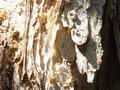
Rubber Leather Polyesterby djbdjComment: take a look at this image... as you can see, there is a sharply focused segment that extends from left to right just slightly below the center of the frame. The foreground in front of this strip and the background behind this strip are out of focus. This area that is IN focus is within your depth of field. This indicates a low F number (wide aperture) setting on your camera. I don't know what kind of camera was used here, but a larger F number (smaller aperture) in the aperture priority mode (or manual mode) would extend this plane of focus through a larger portion of your image. It also appears that the camera lens may be resting close to the surface. If this is the case, raising the camera up a few inches and pointing it down at a slightly lower angle would allow the foreground to be in better focus as well. Your camera has a minimum distance from the lens in which it can focus effectively, regardless of the aperture settings. = 5 - jmsetzler |
| 07/22/2002 02:45:00 PM |
Treeby malapropamComment: good texture but the lighting is a little strong... - 4 - jmsetzler |
| 07/28/2002 05:13:00 PM |
IN VEINby MartinComment: This is nice texture but the exposure seems a little strange on this.. the 'brights' are a touch too bright for my taste... the composition is nice :) = 7 - jmsetzler |
| 07/24/2002 11:21:00 AM |
Prickly Sunsetby Gene L.Comment: This is great... the lighting and shadows cast on this cactus are quite nice... my only critique on this image is that I would have preferred to see a little less darkness across the bottom of the frame. I think that a slightly higher camera angle would have made two improvements here... first, it would have removed the dark band across the bottom of the frame... secondly, it would have kept the top of the cactus from being so close to the top edge of the frame. It is a little too close for comfort at the top... a little breathing room there would be nice :) = 8 - jmsetzler |
| 07/24/2002 11:04:00 AM |
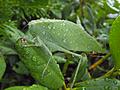
Katydidby skylineComment: excellent macro :) Everyone knows I like 'wet' photos :) This is a great shot... = 9 - jmsetzler |
| 07/25/2002 05:56:00 PM |
Entanglementby amonteforteComment: This is an interesting lesson in how difficult it can be to photograph textures in black... this image looks good, but the lighting has caused a lot of detail washout in the black hair. I also think the perfectly vertical braids could possibly make a higher impact on the viewer if they were diagonal in the frame... = 5 - jmsetzler |
| 07/23/2002 07:06:00 PM |
|
| 07/22/2002 11:26:00 AM |
Rock, Paper, Scissorsby stephanComment: Interesting textures... interesting composition... The lighting on the scissors blade seems a little strong... = 5 - jmsetzler |
 Photographer found comment helpful. Photographer found comment helpful. |
| 07/26/2002 12:40:00 PM |
Ropeby bdshortComment: i like the texture and the lighting in this image... the black and white also works very well. good shot :) = 8 - jmsetzler |
| 07/22/2002 04:41:00 PM |
Bindhiby tonythemonkComment: the contrast in this image is a little flat... more depth of field may have improved the overall impact... = 5 - jmsetzler |
Home -
Challenges -
Community -
League -
Photos -
Cameras -
Lenses -
Learn -
Help -
Terms of Use -
Privacy -
Top ^
DPChallenge, and website content and design, Copyright © 2001-2026 Challenging Technologies, LLC.
All digital photo copyrights belong to the photographers and may not be used without permission.
Current Server Time: 06/21/2026 11:59:10 PM EDT.