| Image |
Comment |
| 10/11/2004 11:37:30 PM |
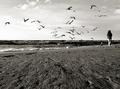
Tall for Her Ageby PaigeComment: Why would you desaturate the color of your subject and leave everything else in color? In this particular case, it doesn't really keep the viewer from focusin on the subject, but the question still remains. I can't determine how this choice helps the overall impact of the photograph. |
 Photographer found comment helpful. Photographer found comment helpful. |
| 10/11/2004 12:24:48 AM |
Famishedby connieComment: I should have known :) *hugs*
Great stuff as usual :) I'm gonna protest that this should have a ribbon :D |
| Photographer found comment helpful. |
| 10/10/2004 11:39:29 PM |
Ibisby jab119Comment: Excellent shot.... great detail :) |
| 10/09/2004 04:55:08 PM |
Interludeby PedroComment: I'm coming back to this photo again after thinking about it for a few more days...
This photo is a good example of where some information to go with the photo is very supportive of what the viewer sees. In my original comment on this shot, I made reference to the 'haunting' sound this instrument creates. After the challenge, when I read your description about it being taken at Ground Zero, it added an entire new level of impact to the image. The haunting sound of the music, coupled with a place on the map where thousands of people died, creates an entirely differen theme.
May I suggest that you change the title of this photo from "Interlude" to "Requiem"? It's just a thought, but you can tie this theme together even better with "Requiem" since a requiem is a musical composition in honor/memory of the deceased.
|
| Photographer found comment helpful. |
| 10/08/2004 12:58:19 AM |
Interludeby PedroComment: :)
Excellent work Peter... Keep it up :) I had hopes this would ribbon... |
| Photographer found comment helpful. |
| 10/07/2004 10:59:10 PM |
Naughty .... but niceby agwrightComment: very nice composition.. the strawberry almost looks like an upside down heart by its positioning... it makes me hungry :) |
| Photographer found comment helpful. |
| 10/07/2004 03:35:42 PM |
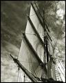
Aloft by BradComment: Very nice study of shape and texture... the sky is phenomenal in support of the subject... excellent work :) |
| Photographer found comment helpful. |
| 10/07/2004 03:35:02 PM |
Rachelby dsa157Comment: Nice natural light portrait... black and white works nicely here... |
| Photographer found comment helpful. |
| 10/07/2004 03:34:35 PM |
|
| Photographer found comment helpful. |
| 10/07/2004 02:54:29 PM |
Lancing Collegeby marboComment: I think this photo has too much negative space in the foreground to be 'strong'. The exposure is nice, but there is just a bit too much 'nothingness' in the composition... |
| Photographer found comment helpful. |
Home -
Challenges -
Community -
League -
Photos -
Cameras -
Lenses -
Learn -
Help -
Terms of Use -
Privacy -
Top ^
DPChallenge, and website content and design, Copyright © 2001-2026 Challenging Technologies, LLC.
All digital photo copyrights belong to the photographers and may not be used without permission.
Current Server Time: 06/12/2026 07:27:29 AM EDT.