| Image |
Comment |
| 08/23/2002 12:47:00 PM |
I still need my pencil.by jenaromComment: This is an interesting shot... It just emphasizes how modern technology can't replace certain things :) - jmsetzler |
| 08/23/2002 12:46:00 PM |
17 across.... BEACHby karen_vComment: This is an excellent shot... the peoplein the background really add a nice element to this... good work :) - jmsetzler |
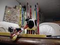
| 08/21/2002 02:54:00 PM |
Pencil Holderby normwComment: this is great :) I love this concept... I can't really offer you any critique.. it looks great! = 9 - jmsetzler |
| 08/21/2002 12:17:00 PM |
Reflectionby shedonistComment: Hmm... I have seen an image like this one done here before ;) I like your concept... great idea and well executed also :) = 8 - jmsetzler |
| 08/20/2002 05:16:00 PM |
Pencilby mscott821Comment: This is a neat interpretation of the challenge.. ;) I understand your intention completely witht this shot, but i fear that you have left yourself open for a lot of 'does not meet the challenge' comments :( I did the same thing last week with my 'Needful Things' photo. I left the voter an opportunity to see an abstract view of the challenge. I did not do well... :( I like your idea and I understand your meaning here :) good shot... = 8 - jmsetzler |
| 08/21/2002 02:17:00 PM |
mechanical free fallby cq107Comment: The motion blur is good, but the image doesn't 'speak' to me. I can't really verbalize why this photo doesn't grab me... - jmsetzler |
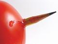
| 08/19/2002 04:56:00 PM |
Poo Mooby MagsCoyoteComment: I have never seen a cow butt pencil sharpener before :) - jmsetzler |
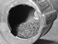
| 08/20/2002 05:03:00 PM |
Storageby MrsKroComment: great capture of detail... This photo alos works well in black and white, even though the pencil loses some of it's contrast. My mind wants to see an eye or something else from the face in this one... but I still love the shot... good work :) = 9 - jmsetzler |
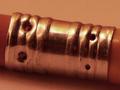
| 08/21/2002 11:26:00 AM |
ferruleby just-marriedComment: This is a nice macro view, but I don't care for the lighting tint here... If your camera has white balance capabilities, you may want to investiage them. The white balance would allow this shot to 'glow' very nicely in the indoor lighting :) - jmsetzler |
 Photographer found comment helpful. Photographer found comment helpful. |
| 08/21/2002 03:26:00 PM |
|
Home -
Challenges -
Community -
League -
Photos -
Cameras -
Lenses -
Learn -
Help -
Terms of Use -
Privacy -
Top ^
DPChallenge, and website content and design, Copyright © 2001-2026 Challenging Technologies, LLC.
All digital photo copyrights belong to the photographers and may not be used without permission.
Current Server Time: 06/23/2026 05:19:01 PM EDT.