DPChallenge: A Digital Photography Contest You are not logged in. (log in or register
 
Browse Settings
Currently viewing:
Memberjmsetzler

Show comments:

Per page:

Order:

Comments:


Comments Made by jmsetzler
Pages:   ... [53] [54] [55] [56] [57] [58] [59] ... [809]
Showing 551 - 560 of ~8082
Image Comment
Stroboscopic Flowers
11/23/2004 01:06:57 AM
Stroboscopic Flowers
by Jacko

Comment:
This is an image that has grown on me more and more over time. Each time I look at it, I like it even more... great shot :)
Photographer found comment helpful.
Seasons of Change
11/21/2004 09:22:53 PM
Seasons of Change
by Momofjoy

Comment:
Greetings...

Welcome to my new 'worst of show' comment :) Please don't take this personally, but take it as an opportunity to improve. I'm sure there are people here who like this photo and find a lot of artistic merit in it, but I'm not one of them. I dislike this image for several reasons and I will list and discuss each of them here...

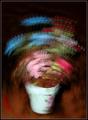
1. The image is too small. There is no reason to submit a photo at less than 640 pixels on the long side. Bigger is better in just about every case when viewing photos online. It brings out the detail in the image and gives the viewer more to look at and think about. I would not recommend ever submitting anything at less than 640 pixels. There is no advantage in it that I can think of.

2. The image quality is poor. This photo looks like it is an elargement of a smaller image, or it has been saved with a very high level of jpg compression. If you are not familiar with your editing software and how to get the most out of each image you edit, that should be your first goal in learning digital photography BEFORE you post images online for comment/critique. If there is something in this image worth looking at, the viewer is never going to see it. If your camera is not capable of producing a better quality image than this, you may want to reconsider entering competitions with it. You will be doomed to eternal failure :) The only people who are going to like this image are those who are extremely fond of 'abstract' which leads me into my next dislike...

3. It's a bit too abstract for my taste. The title indicates to me that I'm probalby looking at some trees with colorful leaves. I would never have been able to draw that conclusion without the title, and that is not a good thing when it comes to challenges. This image has no appeal for me at all other than as an abstract. When a photo has no identifiable features, it usually falls into the abstract category. Here at DPChallenge, abstract does not usually do well at all unless the challenge calls for it.

4. This is a black and white challenge, which your photo 'meets'. However, the black and white presentation of this image does not enhance the image at all in my opinion. The black and white view is not creating any impact for me.

In summary:

1. Always submit something at at the maximum size allowed.
2. Learn how to use your editing software to create the best possible image.
3. Avoid abstract at DPChallenge unless the topic specifically calls for it. Most people don't seem to like it.
4. When the challenge is a technique challenge, make sure that your use of the technique creates the primary impact in the photograph.

I hope you find this comment useful in future challenge preparations :)

John Setzler
Checking
11/21/2004 09:09:05 PM
Checking
by tyrkinn

Comment:
Greetings...

During the course of this week's voting on the black and white challenge, I have come back to this image several times. I always like to pick a 'best of show' photograph from each challenge, and this one is my choice of 'the best' in this massive group of black and white images.

Photos of children, or people in general, require some very special element to have universal appeal. This photo, IMO, has that special element. The photo is not a simple portrait, but it shows some emotion and possibly some amount of personality as well. Children are quite inquisitive and this is obvious in this photograph. The photo is 'cute' and very well executed.

The light you have provided in this image is perfect for creating just the right amount of contrast. There is no harsh light and no area that is too dark. The 'balance' is very nice.

I'm trying to find something to be critical about in this photo and I'm not coming up with much at all. The only possible room for 'change' that could have some effect on this photo would be with the chair in the foyer behind the child. That bit of darkness is eye catching and could possibly be competing with the child for attention. Removing the chair, however, would also remove the feeling of 'home' in this image. The photo doesn't appear to be completely candid because of the point of view taken, so maybe trying some additional opportunities with that chair could have been useful. I don't really think it should be removed. It appears ot have a coat or some other article of clothing draped on it. Maybe removing just that part would clean up the image to a state of complete perfection :) When you 'plan' a photograph and when you have almost complete control over the environment, there is no real reason not to evaluate the purpose of everything in the scene.

At any rate, this is a great image and it is my favorite of the week. I have added it to my favorites list and I really hope to see it in the top scoring photos in this challenge.... Congratulations and good luck :)

John Setzler
Photographer found comment helpful.
Tipycal Iceland
11/17/2004 12:53:31 AM
Tipycal Iceland
by finnz

Comment:
I think you had a really great image here until you added the border :)
Photographer found comment helpful.
Future Star
11/17/2004 12:19:01 AM
Future Star
by nruter

Comment:
Cute snapshot. This will make a nice addidtion to someone's family album.
Photographer found comment helpful.
Body in grey
11/17/2004 12:18:26 AM
Body in grey
by Tiago

Comment:
Nice idea and composition here... the ligh on the knee feels a little out of place...
Photographer found comment helpful.
Boundaries
11/17/2004 12:17:22 AM
Boundaries
by nikon_girl

Comment:
Interesting perpsective and good tonality... I can't really find much meaning or intrest in the subject choice...
Photographer found comment helpful.
Arizona Fence
11/17/2004 12:16:17 AM
Arizona Fence
by jbeazell

Comment:
I believe this photo lacks enough contrast to make it particularly appealing...
Photographer found comment helpful.
On the lookout for dinner.
11/17/2004 12:14:53 AM
On the lookout for dinner.
by Heavy

Comment:
Interesting subject, but the available light on the scene or the exposure/post processing doesn't provide much contrast and the overall image seems rather flat...
Photographer found comment helpful.
Where's Waldog?
11/17/2004 12:14:10 AM
Where's Waldog?
by scalvert

Comment:
Excellent subject and composition for black and white.. the lighting is excellent, as is everything else about this photo. I'm not much of a fan of humorous titles when the image itself has not obvious humor in it though...
Photographer found comment helpful.
Pages:   ... [53] [54] [55] [56] [57] [58] [59] ... [809]
Showing 551 - 560 of ~8082


Home - Challenges - Community - League - Photos - Cameras - Lenses - Learn - Help - Terms of Use - Privacy - Top ^
DPChallenge, and website content and design, Copyright © 2001-2026 Challenging Technologies, LLC.
All digital photo copyrights belong to the photographers and may not be used without permission.
Current Server Time: 04/05/2026 10:39:46 AM EDT.