| Image |
Comment |
| 09/26/2002 10:40:00 AM |
|
| 09/25/2002 10:24:00 AM |
In the Shop with Hammersby whobeeComment: I understand the capture of 'your corner of the world' in this photo, but on the subjectivity scale, there is nothing that really grabs me and says HELLO. I think you have used your lighting very creatively though :) - setzler |
| 09/25/2002 10:26:00 AM |
I left my heart...by RichiComment: I understand the capture of 'your corner of the world' in this photo, but on the subjectivity scale, there is nothing that really grabs me and says HELLO. - setzler |
| 09/30/2002 01:27:00 AM |
|
| 09/23/2002 11:55:00 AM |
awakeningsby robertito777Comment: This is a wonderful sunset. I love the sharp constrast of the silhouetted chain in this image. excellent shot... = 10 - jmsetzler |
| 09/29/2002 09:29:00 PM |
|
| 09/27/2002 01:06:00 PM |
|
| 09/26/2002 08:32:00 AM |
Melbourne Skylineby rstocksComment: This is a nice cityscape... I like the composition of the tallest building on the left... the strip of ? across the bottom of the frame is a bit of a distraction from the overall image.. maybe that could have been cropped out? The horizon is nice and level as well... good attention on that :) - setzler |
| 09/26/2002 10:41:00 AM |
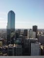
Apt No. 7by Dallas_TXComment: Great interpretation :) I also really like the color here... great work.. = 9 - setzler |
| 09/27/2002 12:14:00 PM |
|
Home -
Challenges -
Community -
League -
Photos -
Cameras -
Lenses -
Learn -
Help -
Terms of Use -
Privacy -
Top ^
DPChallenge, and website content and design, Copyright © 2001-2026 Challenging Technologies, LLC.
All digital photo copyrights belong to the photographers and may not be used without permission.
Current Server Time: 06/25/2026 05:24:11 AM EDT.