| Image |
Comment |
| 09/23/2002 06:25:00 AM |
Front side boardslideby drnxantxComment: I think this is a nice interpretation of the challenge, but the image quality is struggling.... - jmsetzler |
| 09/25/2002 10:21:00 AM |
Garden Bluesby nicowensComment: I understand the capture of 'your corner of the world' in this photo, but on the subjectivity scale, there is nothing that really grabs me and says HELLO. This statue doesn't really relate me to anything. I can't tell anything about 'your' corner of the world unless it is collecting statues or gardening maybe? - setzler |
| 09/27/2002 09:21:00 AM |
Home...Close at heart.by ABatsEyeViewComment: interesting shot :) I like the sun glare on the water quite a bit... compositionally, I think you should have included more of the person on the right side of the frame... having the face sliced as it is here seems a bit odd... good shot :) = 7 - setzler |
| 09/29/2002 09:20:00 PM |
|
| 09/29/2002 09:19:00 PM |
|
| 09/25/2002 09:17:00 AM |
Hot Springs National Parkby jerryComment: I understand the capture of 'your corner of the world' in this photo, but on the subjectivity scale, there is nothing that really grabs me and says HELLO. - setzler |
| 09/27/2002 12:24:00 PM |
|
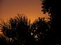
| 09/23/2002 06:27:00 AM |
Back Yard Treetopsby PriestComment: The color here is very nice, but the subject lacks interest... as a study in color and silhouettes, i like it... as an interpretation of this challenge, i think the subject is not supporting you as well... - jmsetzler |
| 09/24/2002 05:06:00 PM |
|
| 09/29/2002 10:56:00 PM |
Boulder, Coloradoby rll07Comment: very nice shot.. i think the blue cast on the mountains looks a little wierd though... warming filter may help some with that :) - setzler |
Home -
Challenges -
Community -
League -
Photos -
Cameras -
Lenses -
Learn -
Help -
Terms of Use -
Privacy -
Top ^
DPChallenge, and website content and design, Copyright © 2001-2026 Challenging Technologies, LLC.
All digital photo copyrights belong to the photographers and may not be used without permission.
Current Server Time: 06/25/2026 06:54:16 AM EDT.