| Image |
Comment |
| 03/24/2011 09:48:12 PM |
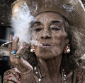
Every Picture Tells a Story by SandyPComment: This is an excellent character portrait for sure :) I love photographing people much in the way you have done here, and early in my decision to pursue that avenue, I had to deal with the issue of photographer 'fear' of people. It seems to me that most photographers I know are too afraid or shy to speak with a stranger and simply ask them if you may make a few photos. Most seem to want to take that candid stealth route. For the last several years, I have been working on a "1000 Faces" series of photographs. I'm a long way from finishing it, but each person in the series is someone I have interacted with in one way or another. Some are candid and some are impromptu portraits on location. But each of them are of a person who I have had some amount of verbal dialogue with... there are even a few celebrities. It really is amazing how you can briefly get to know someone and maybe even learn something by simply talking to them. I most often find my subject and start a conversation before I ask for the photographs and I'm rarely turned down.
This is a worthy pursuit :) |
 Photographer found comment helpful. Photographer found comment helpful. |
| 03/24/2011 09:22:24 PM |
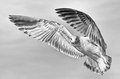
Wingspanby FocusPointComment: This is a really fantastic capture. It's not so easy to get birds in flight from a perspective above the bird. Your photo captures that very well. I really love the way the bird stands out against the simple background also. The slight bits of motion blur on the wingtips also show a good sense of motion to add to the overall theme of this shot... nice work :) |
| Photographer found comment helpful. |
| 03/23/2011 09:03:36 PM |
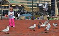
A Joyful Childby sjshafComment: This is a cute photo. It even has a bird in flight. However, that bird in flight is not the focal point of the image and it probably should be where birds in flight is the theme of the challenge. |
| Photographer found comment helpful. |
| 03/23/2011 08:59:45 PM |
chased the shouting wind along by vawendyComment: This is really an excellent image. The composition is fantastic and that's nicely highlighted by the bird looking in your direction for the shot. It also makes a nice black and white, and would be even stronger if the background was a bit darker to really set the bird off against it. This photo is one of my top ten in this challenge... good luck :) |
| Photographer found comment helpful. |
| 03/23/2011 04:24:18 PM |
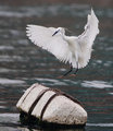
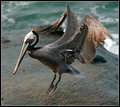
Prepare for landingby howardsComment: This is a fantastic capture. I can't really imagine having caught this at any better peak of action. The spread of the wings and the anticipated landing on the block is just about perfect in every way. Excellent job with the focus and timing... You might also want to explore some possibilities with this image in black and white. This is one of my top 4 photos in this challenge and I hope to see it somewhere near the top of the heap at the end of the week... great work! |
| Photographer found comment helpful. |
| 03/23/2011 04:22:01 PM |
landingby edmengComment: This is a fantastic image and one of my favorites of the week. The texture of the pelican's feathers really make this image pop nicely for me. The slight motion blur at the tips of the wings also add a nice feeling of motion to the image. Seeing this photo makes me wish I lived in an area where pelicans were available to me! Excellent work... I hope to see this one near the top of the list at the end of the week... |
| Photographer found comment helpful. |
| 03/23/2011 04:20:06 PM |
I Catch Youby kannewurfComment: This is a great shot and one of my favorites in this challenge. The action provided here adds a lot to the sometimes mundane idea of birds in flight. The low camera angle you chose also adds significantly to the sense of urgency in this photo :) This photo reminds me of some comedian I have seen in the past who always said... "There's gonna be an ass whoopin'!" Excellent shot... Hope to see this one at the top of the pile at the end of the week. |
| Photographer found comment helpful. |
| 12/15/2010 11:17:39 PM |
Give Peace a Chance by LaMasComment: I'd have given this one an 11 if you had used the Union Jack rather than the American flag in terms of this challenge. This is a fantastic photo. |
| Photographer found comment helpful. |
| 12/05/2010 02:08:53 PM |
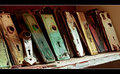
Vintage Platesby Ja-9Comment: Greetings from the Critique Club...
This photo definitely fits the challenge. The door plates have an excellent 'vintage' quality about them in their state of decay and disrepair. The mood and textures are excellent as well. 5.47 is not a 'bad' score for this photo but I'm sure a higher score would have been more interesting for you. As I browse your comments, as brief as they may be, one does stand out for me. The one that mentions getting closer would be my primary goal in this setting as well. One of my personal goals in photography is to examine the parts of the whole that create the interest in any given scene rather than the entire scene itself if that makes sense. The detail in this image that creates interest for me is on the left side where the one plate is cocked diagonally between the other two upright plates. That little bit of off-center imbalance strikes me as the most interesting part of this scene. Maybe focusing on that area a little more closely would create a more dynamic view :)
Good luck in the future...
|
| Photographer found comment helpful. |
| 12/01/2010 02:46:42 PM |
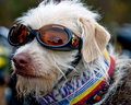
Dogglesby neophyteComment: This is a fantastic photo. It's my favorite of this challenge :) Good luck! |
| Photographer found comment helpful. |
Home -
Challenges -
Community -
League -
Photos -
Cameras -
Lenses -
Learn -
Help -
Terms of Use -
Privacy -
Top ^
DPChallenge, and website content and design, Copyright © 2001-2026 Challenging Technologies, LLC.
All digital photo copyrights belong to the photographers and may not be used without permission.
Current Server Time: 07/16/2026 03:40:47 PM EDT.