| Image |
Comment |
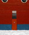
| 02/02/2003 04:56:49 PM |
Come Inby justineComment: beautiful play of light and shadow on this image. The sharp contrasts really create nice impact here... excellent work :) - setzler |
 Photographer found comment helpful. Photographer found comment helpful. |
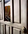
| 02/02/2003 04:55:37 PM |
Door #13by zadoreComment: excellent work with this shot... I like the way you have centered the door and clipped the windows at the top in this image. It looks like a face :) Nice work.. - setzler |
| Photographer found comment helpful. |
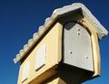
| 02/02/2003 04:54:29 PM |
Untitledby hardwaybetsComment: I really like the blue saturation in the sky on this shot.. the yellow of the mailbox really contrasts well with that blue also. You caught an excellent combination of light and shadow with this shot.. nice work :) - setzler |
| Photographer found comment helpful. |
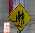
| 02/02/2003 01:49:12 PM |
Kennedy Crossing Washington DCby 3boyzMomComment: Greetings from the Critique Club :)
I particularly like the crosswalk sign in this image. It's off-center composition seems to work really well. I also consider that sign to be the 'subject' of this shot. That being the case, the 'no standing or parking' sign seems to be creating a minor problem for me. It is catching some light from somewhere that is making it much brighter than your 'subject' sign. I'm not sure if these two signs are supposed to be related in some way... I can't see it though.
Unfortunately, I believe that the banner behind the crossing sign is also somewhat distracting from the composition as well. I can't really offer any suggestions for improvement on this image. Not knowing the environment, I would not want to try to suggest different angles. There is probably a lot of clutter looking from other perspectives on this sign...
John Setzler
|
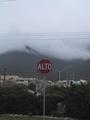
| 02/02/2003 01:28:51 PM |
ALTOby bmarquezComment: Greetings from the Critique Club :)
I think this photo could be much stronger. My primary problem with this image is that the colors are flat. There is not much of interest above the sign either. Maybe a tighter crop that cuts out most of the sky and wires above the sign would improve the overall image. Once that has been done, you will be dealing with the clutter behind the sign. The buildings and the wires directly behind the sign are still going to create distraction for the viewer in this photo.
Compositionally, I believe that the dead centering of the sign doesn't really offer a strong image. I believe that making the sign a much larger part of the image would have created more impact with this photo.
John Setzler
|
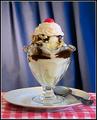
| 02/02/2003 12:04:17 PM |
Sundae Bestby DougPazComment: Greetings from the Critique Club :)
Hi Doug...
I think you did a great job with the setup on this shot. The spoon on the plate offers just the right amount of balance upset to make this image work very well. The blue background and the red tablecloth seem to compliment each other well in this shot :) It appears that this shot is lit more strongly from the right side of the frame. I believe that was a good choice :)
I can't really offer a lot of suggestions for improvement. The wrinkle in the background could possibly be vertical to improve it some, but other than that, I think you did a great job with this photo :)
Keep up the good work :)
John Setzler
|
| 02/01/2003 04:21:44 PM |
Paved with good intentions.by RuchartComment: Greetings from the Critique Club :)
I like the composition of this shot. The sign makes a good strong statement in this image. The color is a bit flat overall, but I can see in your description that you have desaturated everything except the two channels. This is probably a good option for making your sign stand out in the image, but I think the sign already stands out since it fills most of the frame.
Did you try this in black and white? I think your sign offers enough contrast to do a very nice b/w here as well.
The sharpness seems a little weak overall. Maybe a pass with the sharpen filter would fix that up some. When I shoot an image at an angle like this, I usually try to use a little deeper depth of field also. In this instance, I probalby would have composed the shot the same way you did, but I would have backed up and used maximum zoom to help blur out the background some more. Your depth of field here is pretty strong for an F2.8 shot.
Keep up the good work :)
John Setzler
|
| Photographer found comment helpful. |
| 02/01/2003 01:47:29 AM |
Once Upon A Timeby mariomelComment: very nice work with the exposure and perspective on this photo.. the black and white really works well here :) - setzler |
| Photographer found comment helpful. |
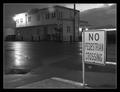
| 01/31/2003 10:42:20 AM |
No Pedestrian Crossingby bdshortComment: Greetings from the Critique Club :)
I particularly like black and white photos. This one is nicely exposed as well. The tonal range is excellent and the positioning of your road sign also works very well in this shot.
As for your comment on lens flare, I don't think that is much of a problem at all in this photo. I don't believe anyone even commented on it :)
I don't think I can really suggest any real improvement on this shot. I like the mood it presents to the viewer... This looks like a storm near dusk possibly. I don't think it's really moonlight. The moon would not be visible during a storm :)
Excellent shot and keep up the good work!
John Setzler
|
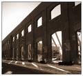
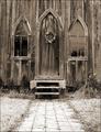
| 01/31/2003 10:32:39 AM |
Garden Churchby ShiiizzzamComment: This is beautiful.. I love the 'rustic' look and the sepia tone adds quite a bit to that here... great shot :) - setzler |
| Photographer found comment helpful. |
Home -
Challenges -
Community -
League -
Photos -
Cameras -
Lenses -
Learn -
Help -
Terms of Use -
Privacy -
Top ^
DPChallenge, and website content and design, Copyright © 2001-2026 Challenging Technologies, LLC.
All digital photo copyrights belong to the photographers and may not be used without permission.
Current Server Time: 07/18/2026 05:31:15 AM EDT.