| Image |
Comment |
| 10/24/2005 12:16:23 PM |
Antiquityby lwkimagesComment: Beautiful work... excellent subject and toning choice for grain :) |
 Photographer found comment helpful. Photographer found comment helpful. |
| 10/19/2005 12:26:47 AM |
The Minstrelby aerogurlComment: Dale Brook from Gastonia, NC :) You must have been to the renaissance festival... I haven't made it out there yet but I hope to go the last weekend of this month :) |
| Photographer found comment helpful. |
| 10/06/2005 01:10:16 AM |
Anniversaryby rwouthuisComment: Greetings from the Critique Club...
Hi woutje...
I press the 'give me an image to critique' button around here occasionally. I'm usually immediately blasted with some lame photograph that appears to have no rhyme or reason to it other than meeting the challenge. Sometimes the challenge is even sketchy in the image. I actually voted on this challenge, and I gave this photo a 10. I liked it just as much as the photo that got first place.
I can't really offer you much critique. I like the image just the way it is. All I can do is offer you some ideas that you may not have thought about. I like to evaluate post processing choices. When I modify a photograph, I do it for a reason usually. I am also a fan of black and white. I think removing the color from this image was probably a strong choice. When you can have a successful image with the color removed, you know you have a strong subject and composition. Color often distracts a viewer from the subtleties of a photo that actually create the impact of the image.
This image is about love. The image projects the feeling of love very nicely. Black and white, in most cases, projects a cool or cold feeling. In your case, it doesn't really do that so much because of the subject. I believe you could warm the image up somewhat with a little additional color toning such as a sepia or a very faint red. It may be worth some experimenting :)
Congrats on a great score...
John Setzler
|
| Photographer found comment helpful. |
| 10/04/2005 11:51:58 PM |
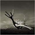
64° 09' North 21° 58' Westby arngrimurComment: This is an excellent photo and one of my few tens for this challenge. This object has appeared in challenges here before and I know it's some sort of modern sculpture in Iceland. I would love to find out what/why it is. If you could tell me or link me to some information about it's origin and purpose, I would appreciate it. It's truly a beautiful work. I have yet to see a photo of this that creates a perspective to show it's true size. I imagine that it's rather large... |
| Photographer found comment helpful. |
| 10/03/2005 12:35:25 AM |
Friendship by Travis99Comment: This is a beautiful and captivating photo... well deserved blue ribbon on this one for sure :) I really enjoy great black and white images, and this one is no exception. It's one of the few photos in this challenge that really stirred emotion for me when I viewed it. Congratulations :) |
| Photographer found comment helpful. |
| 09/24/2005 07:39:20 PM |
The battle ... the beginning!!!by Manolo NavarroComment: Greetings from the Critique Club...
Hi Manolo...
I particularly like 'chess-scapes' and I have done a few of them myself. I find it intriguing and the pieces come to life when photogrpahed in certain compositions. I think this composition could be improved somewhat by shifting your angle of view to the left just slightly where the pieces in the foreground fall inbetween the pieces facing us in the back. This would possibly create some interesting separation within the image. I believe this photo may have scored below average in the challenge because of the particular perspective you chose. The perspective itself doesn't provide enough impact to sway the voter.
Keep up the good efforts :)
John Setzler
|
| 09/24/2005 06:40:13 PM |
winkby whiteroomComment: I think the border works here also. I love the square presentations anyway and the border sets that in motion nicely. This is an excellent capture of childhood... It makes me smile :) It would also look good with a slightly heavier black stroke around the image... Message edited by author 2005-09-24 18:42:35. |
| Photographer found comment helpful. |
| 09/22/2005 10:27:47 PM |
Alluraby Napalm NymphComment: Greetings from the Critique Club...
Hi Napalm Nymph...
I think the pose in this photograph has some nice potential. There are several items that bother me here... 1 - The composition with the model's arm clipped/cropped out of the frame on the right feels extremely uncomfortable and cramped. 2 - the lighting creates an unnaturally warm background along with an uneven light temperature on her face. One side of her face is cooler than the other. 3 - the final issue is the lack of sharpness, probably due to camera shake or motion blur with the length of exposure you had (1/10") for this photo. This says that you need more available or artificial light to create a situation where you could get a faster shutter speed. At 1/10", a tripod won't help much because if your model moves in the least, it will create the same problem...
Keep up the good efforts :)
John Setzler |
| Photographer found comment helpful. |
| 09/22/2005 12:41:38 PM |
Naturalby olimarComment: Greetings from the Critique Club...
Hi Olimar...
I think this is an excellent composition. The pose and subject choices blend nicely to create a nice sense of warmth and beauty within this image. The only issue that I can't seem to understand myself is the choice for the depth of field. The focus falls off on the right side of your model's face, and I can't really understand the purpose of not having both eyes in focus. Since both of her eyes are playing an equal role in the composition, I don't think it's a good idea to try to shift attention to one or the other. There is not a lot of natural front to rear depth in this photo, so having only a portion of it within depth of field seems a bit strange to me. There is also a significant color shift of skin tones on her face. As I read your notes, I can assume that this was caused by the silver reflector. The light on the left seems cooler than that on the right, which would make sense. You introduced a different color of light into the scene with that reflector. Light bouncing off another surface will take on the color of that surface, in this case it was the silver (cooler colored light).
All in all, this is an excellent presentation... nice work :)
John Setzler
|
| Photographer found comment helpful. |
| 09/20/2005 04:25:07 PM |
A tree branchby AntoninoComment: Greetings...
I spent about 5 minutes looking at this image trying to determine what it is that you are trying to show me. The only conclusion that I can draw is that you are showing me a photo that meets the challenge. The image appears to have no subject and no coherence. It's a bit to random for my taste to have any significant impact as a photograph. |
Home -
Challenges -
Community -
League -
Photos -
Cameras -
Lenses -
Learn -
Help -
Terms of Use -
Privacy -
Top ^
DPChallenge, and website content and design, Copyright © 2001-2026 Challenging Technologies, LLC.
All digital photo copyrights belong to the photographers and may not be used without permission.
Current Server Time: 06/11/2026 12:16:52 AM EDT.