| Image |
Comment |
| 03/27/2003 08:26:48 PM |
|
| 03/27/2003 07:59:59 PM |
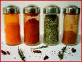
Kitchen Artby bcncrazyComment: Greetings from the Critique Club :)
Hi Bncrazy...
I really like this composition... Spices.. vibrant color... some amount of randomness to the environment... I can 'smell' what I see in this photo.
The lighting on this photo is pretty good. I don't think you could improve it very much, but possibly just a little longer exposure would saturate the white area just a tiny bit more. I believe this would punch up the visual impact just a bit. I wouldn't want the surroundings completely white at all, but just a tad brighter would suit my taste a little better overall.
Another idea that could possibly create a nice composition here would be to put one of the two center bottles on its side with the lid off and let some of the contents spill into the foreground. This would help upset the balance a little more and it would also give a good strong focal point in the image. As this image is presented, it has multiple subjects and doesn't really have a single strong resting place for the eye.
Keep up the good work :)
John Setzler
|
| 03/27/2003 12:11:14 PM |
Tissue Boxby ruthiekComment: Greetings from the Critique Club :)
Hi Ruthiek.....
The 'from above' theme is ok in this photo... The only real issue I have with this photo is the small size. It's quite difficult to view the detail of this image at the small dimensions. In a situation like this, the light and shadow play in important role in the image, but the small size makes it very difficult for the viewer to work out those details.
I don't know much about your camera, but I would also suggest that the on-cam flash is almost always a bad idea for still life photography. The flash casts harsh shadows in many cases and causes some elements of your image to be over exposed or washed out...
Keep up the good efforts :)
John Setzler
|
| 03/27/2003 09:39:00 AM |
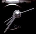
clock with reflectionby john22132Comment: This photo has a really neat quality to it... the composition is excellent. I seem to really like the way I can see your camera reflection in this image... just as a side note, I think working the 'camera' into the title of this shot could have been fun also... nice work :) - setzler |
| 03/27/2003 09:37:05 AM |
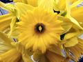
Springtime Yellowby PHOTOCHlXComment: I love the yellow in this photo, but the focus on your main flower is a bit soft... this is an interesting problem because it seems that the woodwork under the flower is in good sharp focus... - setzler |
 Photographer found comment helpful. Photographer found comment helpful. |
| 03/27/2003 08:55:33 AM |
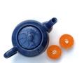
Tea with Orangeby gerardComment: Greetings from the Critique Club :)
Hi Gerard...
This is a lovely composition... It's simplistic but still very appealing to my eye. Your choice of composition with the strong diagonals and by positioning your subjects low in the frame really creates a strong image in my opinion. The color contrast created between the blue and orange on the white background is also very strong, yet not overpowering.
One of my favorite aspects of this photo is the abstract element provided by the reflections on the top of the teapot. That little bit of added 'extra punch' really seems to give this photo much stronger appeal overall.
I can't really offer you any criticism on this shot... It's beautiful and I wouldn't change anything about it at all....
Keep up the great work :)
John Setzler
|
| Photographer found comment helpful. |
| 03/26/2003 10:06:37 PM |
18th honeymoonby kandyjComment: This is a good capture of emotion, but the image seems to be a bit over exposed... Shooting into the sun also produces the lens flare that you see here in teh upper right.... - setzler |
| 03/26/2003 03:17:47 PM |
|
| Photographer found comment helpful. |
| 03/26/2003 01:58:57 PM |
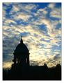
Heavenly Skiesby mariomelComment: This is a beautiful landscape shot... Thw silhouetted building against the sky is very powerful... great shot :) - setzler |
| Photographer found comment helpful. |
| 03/26/2003 09:04:44 AM |
Old and Newby AllenComment: I believe I understand your interpretation of the challenge in this photo... the tonal range, however, is very flat and the image is quite dark overall... maybe a different exposure or some level and contrast adjustment would bring it up nicely... - setzler |
Home -
Challenges -
Community -
League -
Photos -
Cameras -
Lenses -
Learn -
Help -
Terms of Use -
Privacy -
Top ^
DPChallenge, and website content and design, Copyright © 2001-2026 Challenging Technologies, LLC.
All digital photo copyrights belong to the photographers and may not be used without permission.
Current Server Time: 06/26/2026 10:34:27 PM EDT.