| Image |
Comment |
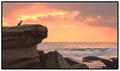
| 04/08/2003 10:47:25 PM |
Sunrise Spectacular by andrewlrComment: This is beautiful... the exposure is perfect and the color is gorgeous... great work :) - 10 - setzler |
 Photographer found comment helpful. Photographer found comment helpful. |
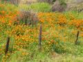
| 04/08/2003 06:53:50 PM |
Wildflowersby bobgaitherComment: This is a nice photo, but the color is rather bland and it's not creating much wow factor in the image. - setzler |
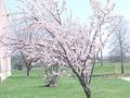
| 04/08/2003 06:52:54 PM |
Blooming Spring Colorby BeckyComment: This is a nice photo, but the color is rather bland and it's not creating much wow factor in the image. It seems to be a bit overexposed... - setzler |
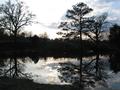
| 04/08/2003 06:52:27 PM |
Golden Sunsetby mperez74Comment: This is a nice photo, but the color is rather bland and it's not creating much wow factor in the image. - setzler |
| 04/08/2003 06:51:19 PM |
|
| 04/08/2003 06:48:31 PM |
Guards Redby joebarComment: I like the creative lighting on this photo.. excellent work :) - setzler |
| Photographer found comment helpful. |
| 04/08/2003 06:29:19 PM |
Black and Blueby RgoldComment: This is my favorite shot in this challenge. The color is phenomenal... great work :) = 10 - setzler |
| 04/08/2003 06:28:28 PM |
|
| Photographer found comment helpful. |
| 04/08/2003 06:27:55 PM |
|
| 04/08/2003 06:27:26 PM |
A Colourful Snackby jimmythefishComment: This is a great macro... the color is indeed phenomenal and the detail and composition are great as well... nice work :) = 10 - setzler |
| Photographer found comment helpful. |
Home -
Challenges -
Community -
League -
Photos -
Cameras -
Lenses -
Learn -
Help -
Terms of Use -
Privacy -
Top ^
DPChallenge, and website content and design, Copyright © 2001-2026 Challenging Technologies, LLC.
All digital photo copyrights belong to the photographers and may not be used without permission.
Current Server Time: 06/26/2026 07:24:16 AM EDT.