| Image |
Comment |
| 12/10/2025 10:49:40 AM |
another page in their storyby glad2badadComment: In regards to your 'photographer's comments....
what do you stand to lose by letting those bots scrape your 'data' from this site? I think fighting data mining on the interwebs is futile as long as you are a participant in any of it, including your web-provided email. Every service provider you interact with is scraping data on you and selling it to the highest bidder. Your phone and your social media accounts are the main culprits. The simple fact of the matter is that you should not share anything electronically in any manner that you don't want anyone else to see or hear.
In regards to your forum post about the interpretation of the 'balance' topic...
The platform in your frame does a great job of splitting the frame into two equal halves, but *I* find a majority of the visual interest to be in the top half of the image. That being the case, the description of 'so that everything in the image has equal visual weight' is a miss for me. How do you interpret your approach to this challenge?
Cheers!
|
 Photographer found comment helpful. Photographer found comment helpful. |
| 12/03/2025 10:57:23 AM |
Summernight approachingby OligamliComment: Greetings... I found it interesting that this photo scored 6.3 and was a mid-pack image in this challenge. I rated this photo a 5 in the context of the challenge. It's a well-executed photo. In my personal view of this image, I do not find a strong point of focus/attention in terms of feeling or subject. The small building in the frame is almost a 'serendipity' element that could be more in a different context. I also struggle just a bit with the colors. This photo reminds me of some early attempts I made in my days of film photography using graduated color filters to achieve this effect. In terms of the challenge itself, I believe the fog & mist elements are more of a secondary element of this photo.
|
| 11/27/2025 05:09:37 AM |
glimmerby kanajComment: I didn't find a whole lot of creativity in this challenge. This photo, however, landed in my best of show category. Just being able to notice this scene and having the ability to capture it so nicely is the mark of a good photographer :) This photo hits upon quite a few characteristics that I look for in great images. The strong interaction of shapes and symmetry is dominating this scene while the chaos of the web and water droplets creates a fascination and imbalance to add so much more interest... great shot! |
| Photographer found comment helpful. |
| 11/26/2025 05:00:01 PM |
Break timeby UrfaKComment: This is an excellent photo. It's my second favorite in this challenge. In terms of 'documentary' value, it's strong. It's telling me something about the project at hand and it's gonna lead me nicely into the accompanying story. The composition of this is beautiful. The lines and textures are fascinating at all levels. Nice work! |
| Photographer found comment helpful. |
| 11/26/2025 04:57:55 PM |
Religious Celebrationby GeorgesBogaertComment: Best of show... great shot. From a guy who spent a lot of time doing local news and sports photography, this one captures this challenge's theme best for me. Most photographers are afraid of people and don't wanna get involved in the action of the moment. They fail miserably at capturing the essence of the event. Watching and shooting it from a distance as a voyeur is never as impactful as getting in the middle of it. I guess since I'm a big fan of street photography in general, this photo also strikes a chord with me. It makes me wanna know more about what I'm seeing. That makes it a perfect 'documentary' shot. It's the click bait that's gonna get me to read the whole story. Be proud of this one. |
| Photographer found comment helpful. |
| 04/06/2011 12:08:54 AM |
|
| Photographer found comment helpful. |
| 04/06/2011 12:06:46 AM |
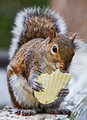
Breakout by DistantColoursComment: I wish I had taken the time to look at the photos in this challenge. This is a fantastic concept and I guess everyone else agreed... nice work :) |
| Photographer found comment helpful. |
| 04/06/2011 12:05:06 AM |
H20verdriveby MattOComment: Top 10! Nice finish... The comments you received here are quite entertaining.... lol |
| Photographer found comment helpful. |
| 04/05/2011 01:37:22 PM |
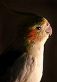
Gentle Spiritby KristinaGComment: Birds make such great subjects for photos... This is definitely one of the more unique bird photos I have seen in a while. I love the composition and I suppose the element of this image that grabs me the most is the lighting. The warmth of that light is what makes this shot unusual... 10 from me :) |
| Photographer found comment helpful. |
| 04/05/2011 01:33:43 PM |
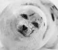
Harp Seal in the Wildby KarenNfldComment: Great photo... here's a perfect example of a well-executed square composition with the point of interest dead center in the frame. The tilt of the seal's head creates a fantastic dynamic for this composition. I had originally voted this shot a 9 but upon further inspection I can't find anything that should keep it from being a 10. Great work :) |
| Photographer found comment helpful. |
Home -
Challenges -
Community -
League -
Photos -
Cameras -
Lenses -
Learn -
Help -
Terms of Use -
Privacy -
Top ^
DPChallenge, and website content and design, Copyright © 2001-2026 Challenging Technologies, LLC.
All digital photo copyrights belong to the photographers and may not be used without permission.
Current Server Time: 07/16/2026 02:53:06 AM EDT.