| Image |
Comment |
| 03/13/2006 03:51:24 PM |
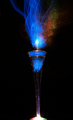
Effervescenceby MQuinnComment: Greetings from the Critique Club...
Hi MQuinn :)
If you request a critique from the critique club, you should always fill out your 'Photographer's Comments' field when you submit your photo. When you don't include your own thoughts on the image, you can't really expect someone else to give their time and effort to give you a critique. It makes me think that you don't care enough about your own photo to take the time to post your thoughts on it...
This image doesn't really require much of a critique. It scored well in the challenge.
I personally didn't care much for this image. The composition is rather uninteresting and there is a bit too much negative space in the frame for my personal taste. The overall idea is very interesting but I think you could have been more creative with the 'painting' :)
John Setzler
|
 Photographer found comment helpful. Photographer found comment helpful. |
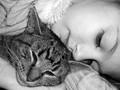
| 03/13/2006 03:48:35 PM |
A Cozy Catnapby joycobbComment: Greetings from the Critique Club...
Hi joycobb :)
This photo doesn't seem to require much of a critique. It scored rather well. This photo meets the challenge very well overall. The only critique that I can possibly offer is that the lighting is a bit harsh and flat with the flash. Some directional light or natural light would have possibly produced a much more moody image. Some warm toning to the black and white would have also added an extra sense of 'comfort' to the image :)
John Setzler
|
| Photographer found comment helpful. |
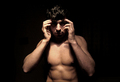
| 03/10/2006 04:02:26 PM |
I can't take my mind off youby MardukulComment: Greetings from the Critique Club...
Ni Mardukul :)
If you request a critique from the critique club, you should always fill out your 'Photographer's Comments' field when you submit your photo. When you don't include your own thoughts on the image, you can't really expect someone else to give their time and effort to give you a critique. It makes me think that you don't care enough about your own photo to take the time to post your thoughts on it...
This is an interesting photo, to say the least. Your creative use of lighting works very nicely by creating light/shadow detail. This photo, in my mind, doesn't emit any sense of comfort though. The contrasty light and darkness in the image create more tension for me than anything else... |
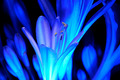
| 03/10/2006 12:23:28 PM |
Agapanthus by LEDby realpdmComment: Greetings from the Critique Club...
Hi realpdm :)
This is an interesting display of shape and texture, but I think it probably missed the challenge theme to some degree. The painting with light theme suggests a moving light source, which normally creates a different sort of lighting on your subject. The motion of the light creates a major part of the impact within the image. The light itself doesn't create as much of that impact here other than by the color cast that it gives.
John Setzler
|
| 03/10/2006 11:19:19 AM |
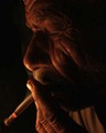
we both r comfortby L o S TComment: Greetings from the Critique Club...
I think this is an excellent photograph. Giving it any critique is going to be difficult for me because I like the image and understand your motive behind it as well. The cigarette and the warm light both contribute to your theme of comfort very nicely. His eyes being closed also add to that feeling of comfort and relaxation.
Nice work :)
John Setzler
|
| Photographer found comment helpful. |
| 03/09/2006 01:51:46 PM |
Like Father Like Daughterby ingibComment: Greetings from the Critique Club...
Hi ingib :)
This is a cute photo and it probably got a few points in the vote for that, but based on the overall score it received, it did not do particularly well overall. Photos of people require something extra special when trying to achieve public accolades. There is nothing in this photo that really draws an outsider into the image. As a viewer, I can't find any particular connection with these people, so I can't really get into the image for more than what it is. This image is technically nice but maybe a half stop or so underexposed.. nice work :)
|
| Photographer found comment helpful. |
| 03/09/2006 12:12:35 AM |
Forbidden Loveby ericpiComment: Greetings from the Critique Club...
Hi ericpi :)
This photo scored rather well in the challenge. I think you did a decent job of creating and executing a complete idea. Being able to formulate and execute a cohesive idea isn't always easy. Compositionally, this photo could probably use some help. It may have been more appropriate to include the full cans rather than cutting them off at the bottom. I can't really offer you much more critique on this one. You could have gone really overboard with this idea by cutting out a couple cans, flattening them out, and creating the male/female figures with the logos visible to add some real personality to the love affair that you are portraying in the image :)
John Setzler
|
| Photographer found comment helpful. |
| 03/08/2006 12:33:12 PM |
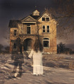
Their Dream Homeby ColeyComment: Greetings from the Critique Club...
Hi Coley :)
This photo scored rather well and doesn't require much of a critique, if any. Well done technique shots always do well on DPC. I can't really offer you much in the realm of improvement.
John Setzler
|
| Photographer found comment helpful. |
| 03/07/2006 02:50:48 PM |
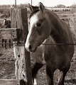
The Corralby pumaComment: Greetings from the Critique Club...
Hi Puma :)
If you request a critique from the critique club, you should always fill out your 'Photographer's Comments' field when you submit your photo. When you don't include your own thoughts on the image, you can't really expect someone else to give their time and effort to give you a critique. It makes me think that you don't care enough about your own photo to take the time to post your thoughts on it...
This photo meets the challenge but I still fail to find something particularly special about it to make it stand out. It looks like the sun may have been too bright to create an image with a little less contrast. I more confined view of your subject may have also created less clutter in the background...
|
| Photographer found comment helpful. |
| 03/07/2006 01:57:08 AM |
Why Can't I Be You?by melismaticaComment: Greetings from the Critique Club...
This photo didn't score very well for several reasons. First of all, I am not completely sure the subject and technique lend themselves well to the duotone theme. The toning choices you chose don't seem to add to the subject or the mood of the photo. The second issue is that it's a character portrait that very few people will find a connection with. Any photo of a person posted for public consumption needs some element of universal understanding, either in the subject itself or in the presentation of that subject. The high contrast portion of your composition is nice, but I don't care much for the motion blur from the long exposure. I will say that the motion blur may be adding an extra sense of tension in the image, but it's just not my favorite way to present things. |
Home -
Challenges -
Community -
League -
Photos -
Cameras -
Lenses -
Learn -
Help -
Terms of Use -
Privacy -
Top ^
DPChallenge, and website content and design, Copyright © 2001-2026 Challenging Technologies, LLC.
All digital photo copyrights belong to the photographers and may not be used without permission.
Current Server Time: 06/10/2026 06:48:48 PM EDT.