|
|
|
Showing 221 - 230 of ~8082 |
| Image |
Comment |
| 05/11/2006 02:52:57 PM | Don't Mess With Texasby seebrownComment: Greetings from the Critique Club...
Hi seebrown :)
The 'heron' is definitely a gorgeous bird. They are quite large and make excellent subjects for photographs. We have great blue herons around here also, but they are very difficult to approach. I can't even get close enought to one often enough with my 300mm lens to get a decent shot. They are quite skittish. ONe of these days I plan to go set up in a blind and wait for one to show up.
This photo didn't score particularly well in the challenge. Only one of your comments was critical and it was regarding the focus. The image does seem just a tad soft, but not terribly soft. I believe that the environment was more of a factor in the score than the softness. The background is bright and contrasty rather than smooth and subtle. I know you have no control over that, but it still plays a role in the viewer perception of the image. In a free study, you really need something that is absolutely perfect in every way to stand out from the crowd...
I can't draw a conclusion on your title and how it integrates with the image either... It's not supportive of the image and it gives no insight (that I can determine) to your theme...
John Setzler
|
| 05/10/2006 04:22:10 PM | Gay Marriage: Adam and Steveby Sunshine86Comment: Greetings from the Critique Club...
Hi Sunshine86 :)
This is a type of photojournalism that is less popular than most other types. This is called a photo illustration. Photo illustrations differ from most other forms of photojournalism in the fact that they are contrived rather than candid. Most reputable photojournalists have these images labeled as photo illustrations in print as well. The cut line with the image will have the context followed by "Photo Illustration by John Doe." I notice that a couple of your comments don't see this piece as photojournalism. A more mainstream type of photojournalism may have fared better here on DPC. Everyone likes to talk about being 'outside the box' but when they vote, they don't give that much leeway from their own interpretation of the theme.
As for the image itself, it does support the theme you chose to represent. I think that it could have been stronger though. When I first looked at the image, I had to look fairly closely to catch your theme. The fact that there are two people in the photo is not dominant in the composition. In a photo illustration, or any photojournalistic image for that matter, the theme needs to be dominant and jump out at the viewer. As I look more closely at your image, I can see that you have dodged out the ring area on the hand to draw attention to it, but it's not a strong enough focal point within the context of the entire image to make your point with strength. If you wanted the ring to be the center of attention, it may have been worthwhile to do a photo that focused on two men's hands rather than the embrace. This theme has lots of possibilities.
Photo illustrations are a lot like still life photography. Since the photographer has all the control of the scene, situation, and lighting, There should be no issues that come up short. Everything should be perfect, and there is no excuse for it not being. Personally, this is one thing I take into consideration when voting or critiquing a shot of this nature. The technical standards are much higher in this situation.
Subject choices also play a role in the results you get on this site. There are some subjects that touch nerves and create reactions that have nothing to do with the image itself. You always have to be prepared for those votes...
"I know the background bothersome- but i got to a point where I did not want to mess with it anymore."
Giving up shouldn't be an option. If you commit to the task, you should give it the time and effort it deserves. If you fail, you may want to consider not submitting it. If you aren't completely happy with the result, how would you expect anyone else to be?
John Setzler
|  Photographer found comment helpful. Photographer found comment helpful. |
| 05/09/2006 10:12:00 PM | |
| 05/09/2006 03:27:29 PM | Untitledby TejComment: Greetings from the Critique Club...
Hi Tejinder :)
I agree that the black spots on the photo are annoying. When shooting for a basic editing challenge, you have to take those things into consideration. Regardless of the rules, the image you present has to be at its best. You can't expect the voters to be lenient on an image because the rules did not allow you to finish the image properly. It's unfortunate, but it's true.
This is one of the few high key images with a completely white background I have seen that I actually liked. The photo is a nice study of shape and contrast. Even though it is done in 'negative', I believe it's actually hard to tell that it's negative. I can look at this image and see it either way. I'm not familiar with the inversion process using curves, primarily because I never invert images.
The voters seem to like the image. 5.9 is a good score these days. The only critical comment you received follows along the same idea as in my last paragraph.
Nice work :)
John Setzler
| | Photographer found comment helpful. |
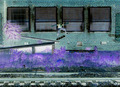
| 05/06/2006 02:43:36 PM | Reflectingby moniepennyComment: Greetings from the Critique Club...
Hi Moniepenny :)
This is an intereresting scene and the silhouetted ducks really make it work nicely. Your subject standing on the pier is visible but he's too dark to really stand out enough to be 'noticed' on a site like this where the photo probably gets very little viewing time. The composition is nice, but I would have probalby framed out the skyline at the top. Personally, I don't think it's adding anything to the theme and it's creating an eye-pulling contrast away from the subject(s) of the image. That tree line is also pretty soft. Maybe some additional depth of field would have improved that area. I see that your camera doesn't support that level of manual control though... When you are limited by the camera, you have to work within it's strengths. I have a camera similar to this (S410) and it does make nice photos :)
John Setzler
| | Photographer found comment helpful. |
| 05/03/2006 11:33:59 PM | Ghost of the lighthouseby HauxonComment: Greetings from the Critique Club...
Hi Hauxon :)
I think this is a very well thought out image, and you did catch a nice reflection and the essence of the challenge as well. The idea is great.
Compositionally, I believe there could possibly be room for improvement. Unfortunately, I can only guess at what lies outside the shown image area though. The dark area in the upper right corner is a bit of an eye-grabber. It creates a sharper contrast that is rather far from the subject area of the image. I don't know if you could have composed that element out or not by moving to one side or the other... it's hard for me to tell... I also don't know if you could have elevated the camera a little more to make it more of a face-on photo... low enought to keep yourself out of the reflection but high enough to eliminate that corner...
At any rate, it's a good shot... I think it's a little underrated :)
John Setzler
| | Photographer found comment helpful. |
| 05/03/2006 02:19:30 PM | Beauty in an Ordinary Neighborhood Windowby Sunshine86Comment: ** Original Critique Revised and Re-Posted **
Greetings from the Critique Club...
Hi Sunshine86 :)
You may not like this critique, but it is one of the best ones you will receive if you take it the proper way. "Self Critique" is a very important concept. When you enter a photo into a challenge here at DPC, it is very useful to YOU and ME if you put your own thoughts about the image in the Photographer's Comments box when you submit. Doing this benefits you in two ways.
1. If you write down your own thoughts about the image, you will know more about what to expect in the voting here. If you become critical of your own image, you will begin to understand why it will or won't do well in a challenge. You should also include why you like the image and how you feel about it when writing this 'self critique'.
2. It gives me (or anyone else who should draw your image for a critique club in-depth critique) some basic information about your goals and ideas with the photo. If I critique your image, the image itself is all I have to go on. I can write about technicals, composition, et al, but I may be writing a bunch of things you already know or realize. I would rather write about your idea or goals, neither of which I have a clue about :)
Try this on your next entry if you check the 'in depth critique' box and see if you get a better result :)
John Setzler Message edited by author 2006-05-07 01:41:15. |
| 05/03/2006 02:09:49 PM | Medieval Viewby loveComment: Greetings from the Critique Club....
It's really unfortunate that a lot of photographers don't bother to fill in the "Photographer's Comments" section when they submit a photo to a challenge... especially when they check the box to request an in-depth critique. I have stopped offering in-depth critique on photos when the photographer chooses not to include his/her own thoughts on the image when they submit it... You might want to consider this in the future.
John Setzler |
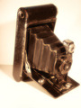
| 05/03/2006 12:11:58 AM | Grandpa's Cameraby Spartan151Comment: Greetings from the Critique Club...
Hi Spartan...
The subject you chose here meets the challenge without a doubt. Antique cameras fascinate me quite a bit and I have a small collection of them myself. Your score on this photo is rather mediocre, and I think there are a couple reasons why.
1. You took an old subject (the camera) and put it in a clean, sterile, and bright environment.
You aren't trying to sell this camera on ebay or make a cataloge page to describe it. This camera has a specific character. It's character is old, textured, worn, used, and historical, just to name a few things. In an antique environment, this camera would feel more at home and possibly stir more artistic emotion in the viewer.
2. Your lighting is rather poor.
I'm not sure if you were attempting to have a purely white background and surface, but if that was the case, don't waste your time. That would further push your antique camera into a modernized 'clean room' environment and further contradict the theme of the image.
Sometimes photographers will get wrapped up in the technical aspects of photography and simply forget about WHAT they are photographing and HOW it integrates into an environment. In art photography, an emotion is what you are looking for most of the time. On DPChallenge, you have to look for 'eye candy' or simple visual appeal. You need something that will attract the viewer visually rather than emotionally. Occasionally you can get both, but without the first, the viewer won't give it enough time to stir an emotion...
John Setzler
|
| 05/03/2006 12:11:18 AM | Grandpa's Cameraby Spartan151Comment: Greetings from the Critique Club...
Hi Spartan...
The subject you chose here meets the challenge without a doubt. Antique cameras fascinate me quite a bit and I have a small collection of them myself. Your score on this photo is rather mediocre, and I think there are a couple reasons why.
1. You took an old subject (the camera) and put it in a clean, sterile, and bright environment.
You aren't trying to sell this camera on ebay or make a cataloge page to describe it. This camera has a specific character. It's character is old, textured, worn, used, and historical, just to name a few things. In an antique environment, this camera would feel more at home and possibly stir more artistic emotion in the viewer.
2. Your lighting is rather poor.
I'm not sure if you were attempting to have a purely white background and surface, but if that was the case, don't waste your time. That would further push your antique camera into a modernized 'clean room' environment and further contradict the theme of the image.
Sometimes photographers will get wrapped up in the technical aspects of photography and simply forget about WHAT they are photographing and HOW it integrates into an environment. In art photography, an emotion is what you are looking for most of the time. On DPChallenge, you have to look for 'eye candy' or simple visual appeal. You need something that will attract the viewer visually rather than emotionally. Occasionally you can get both, but without the first, the viewer won't give it enough time to stir an emotion...
John Setzler
|
|
Showing 221 - 230 of ~8082 |
Home -
Challenges -
Community -
League -
Photos -
Cameras -
Lenses -
Learn -
Help -
Terms of Use -
Privacy -
Top ^
DPChallenge, and website content and design, Copyright © 2001-2026 Challenging Technologies, LLC.
All digital photo copyrights belong to the photographers and may not be used without permission.
Current Server Time: 06/10/2026 04:42:31 AM EDT.
|