| Image |
Comment |
| 05/19/2003 09:17:19 AM |
I'm watching youby MusicmanComment: very interesting bird... good composition and use of complementary colors as well... The shallow depth of field also isolates the bird from the environment nicely... = 7 |
 Photographer found comment helpful. Photographer found comment helpful. |
| 05/19/2003 09:10:35 AM |
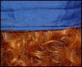
Vintage Ladyby giseleComment: I see the complementary colors in the ribbons, but the exposure on this shot doesn't let those colors stand out and play much of a role in the photo... = 4 |
| 05/19/2003 09:07:09 AM |
Come Togetherby friscaComment: very nice work... I think you did an excellent job of lighting and exposing this shot. I also think that it would have made a good symmetrical 'vertical' composition as well... = 8 |
| Photographer found comment helpful. |
| 05/19/2003 08:54:52 AM |
Natures Purple, Man's Yellowby K-RobComment: interesitng shot... lightinging isn't very easy to photograph... the complementary colors are here, but I feel that, in my interpretation of the challenge, that the colors need to play some sort of role in the photo. the challenge topic requested using two complementary colors to compose the photograph... = 5 |
| Photographer found comment helpful. |
| 05/19/2003 08:38:45 AM |
Meeting of Red and Greenby GraciousComment: interesting abstract.... the colors here don't look natural at all and the noise level in the image is quite high... = 4 |
| Photographer found comment helpful. |
| 05/19/2003 08:17:13 AM |
Red Hat Green Hatby jab119Comment: I believe the focus is a bit soft on this photo. the red hat seems to be the dominant item in the photo and the focus on it is too weak for my taste... = 5 |
| 05/19/2003 08:12:11 AM |
|
| Photographer found comment helpful. |
| 05/19/2003 07:59:19 AM |
Shelley in a Blue Hatby sagestudioComment: complementary colors are evident, but this is one of those photos that gives me no inspiration from the subject choice... I also think that a slightly diagonal composition could make this particular shot a little stronger... = 5 |
| Photographer found comment helpful. |
| 05/19/2003 07:56:20 AM |
Morning Lightby falveyComment: beautiful calla lillies... i think the lighting on this shot is pretty good also... I think the part that is missing here is the complementary color theme. purple and green aren't complementary... purple and yellow are however... the yellow insides of the blossoms are not holding their color in this photo because of the angle of lighting... = 6 |
| Photographer found comment helpful. |
| 05/19/2003 07:54:10 AM |
Cosmic Bowlingby AnachroniteComment: good complementary color here... interesting composition as well... subjectively, it leaves me asking for more... = 5 |
| Photographer found comment helpful. |
Home -
Challenges -
Community -
League -
Photos -
Cameras -
Lenses -
Learn -
Help -
Terms of Use -
Privacy -
Top ^
DPChallenge, and website content and design, Copyright © 2001-2026 Challenging Technologies, LLC.
All digital photo copyrights belong to the photographers and may not be used without permission.
Current Server Time: 06/22/2026 09:11:22 PM EDT.