| Image |
Comment |
| 05/27/2003 08:25:46 AM |
Fragility in Blueby moodvilleComment: this is a beautiful shot... the detail and lighting are excellent... compositionally, i don't care much for the left to right orientation... i think a diagonal would really enhance this quite a bit :) = 8 |
 Photographer found comment helpful. Photographer found comment helpful. |
| 05/27/2003 08:23:23 AM |
Golf Ballby STEINRComment: good setup here for a product shot... it's a bit over exposed... = 4 |
| Photographer found comment helpful. |
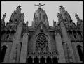
| 05/27/2003 08:21:27 AM |
Tibidabo´s churchby AlexysComment: This is a very interesting architectural scene. There appears to be a lot of detail in this structure... It could also work well as a vertical composition where the door would also be visible. This photo seems to be either under exposed or shot in poor lighting. The tonal range is rather flat and the contrast is weak... a different lighting situation may possibly improve this quite a bit :) = 5 |
| Photographer found comment helpful. |
| 05/26/2003 05:07:45 PM |
Z-sunby justineComment: nice work... simplicity at its best here.. noticing something like this was good :) excellent abstract... = 7 |
| Photographer found comment helpful. |
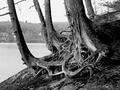
| 05/26/2003 05:06:20 PM |
Rootsby mariomelComment: excellent shot :) very nice exposure as well... the tonal range here is great and this makes a nice duotone. The curves and chaos of the roots are a strong element in this photo... = 8 |
| Photographer found comment helpful. |
| 05/26/2003 05:05:10 PM |
Above The Rimby greenem2Comment: I like the perspective you chose on the back side of the basketball goal... the strong lines work well here as a duotone... nice work :) = 9 |
| Photographer found comment helpful. |
| 05/26/2003 02:45:36 PM |
|
| 05/26/2003 02:43:45 PM |
Booh !by ewebComment: interesting shot... doesn't seem to hold much value for me though.. = 2 |
| 05/26/2003 02:40:46 PM |
|
| Photographer found comment helpful. |
| 05/26/2003 02:40:15 PM |
|
Home -
Challenges -
Community -
League -
Photos -
Cameras -
Lenses -
Learn -
Help -
Terms of Use -
Privacy -
Top ^
DPChallenge, and website content and design, Copyright © 2001-2026 Challenging Technologies, LLC.
All digital photo copyrights belong to the photographers and may not be used without permission.
Current Server Time: 06/22/2026 10:32:12 AM EDT.