| Image |
Comment |
| 08/11/2003 09:17:53 PM |
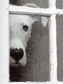
Peek by AleciaComment: This is great. It's what I would call a 'perfect photo' if i had taken it myself. I commented on another pet photo today that was excellent also. Pets are 'cliche' and everyone takes photos of their pets at one time or another. Most of them look like they would make good additions to the family album rather than a piece of art worthy of framing and hanging on the wall. This photo falls into the 'hang the friggin thing on the wall' category. The old window frame really makes this shot for me. Maybe this is an old house and this window has seen more than its fair share of paint coats over its history... The window not being clean also adds a wonderful element to that overall effect. I don't know anything about the dog since it's not my pet, but this one is speaking to me. When I get an image of a dog in my mind, I'm thinking about that tongue hanging out and the dog is ready to go... come on.. lets' go.. hurry up.. i'm ready.. lets go :) This dog, however, isn't saying that to me. This dog may be sad. He (or she) may also be 'curious' about something outside the window... like the guy with the camera :D The ear seems perked up in such a way that the dog is intrigued by whatever is in his field of view... I can't really say much more here other than DAMN.... I wish this was part of my own portfolio :) Kudos on a great piece of photography... this is my fav of the week... = 10 |
 Photographer found comment helpful. Photographer found comment helpful. |
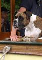
| 08/11/2003 01:33:33 PM |
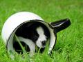
Inside Looking Out by connieComment: Well..... Hmmm.... another pet photo... yadda yadda yadda yadda and so on and so forth...... Pet photos are so common and cliche these days, but every once in a while, someone will catch something great as you have here. This is an amazing photo. I want to give this photo a 10 so bad I can taste it. The only thing that is holding me back is your title :( I really wish this photo had some really creative title to go along with it like "Timid" or "My Hideout" or "Taking Cover" or " Cozy" or something else that integrates well with the mood that this photo conveys to me. This little dog looks frightened... I probably put too much emphasis on titles, but they are important to me. Great photo and good luck in this challenge... This is worthy of a ribbon :)
|
| Photographer found comment helpful. |
| 08/11/2003 01:20:06 PM |
Nightly Waitingby moodvilleComment: excellent shot... I love the softness and the glow of the light in this photo. I also have this little soft spot in my heart for these wooden mannequins. I have seen quite a few really great photos using these as props. I have to make a trip to the art supply store after work today and I may just pick up a couple of these for myself :) I have been wanting to try some of this.... good work :) = 9 |
| Photographer found comment helpful. |
| 08/11/2003 12:19:09 PM |
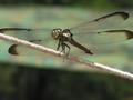
Helloby anggComment: good macro but the focus is just a bit soft for my taste. I also struggle with the challenge topic on this particular photo... |
| 08/11/2003 12:08:55 PM |
|
| 08/11/2003 12:08:15 PM |
view from kitchen windowby camelotnorthComment: This image is somewhat interesting, but the desaturation here doesn't seem to work for me. There is too much leftover red here and there to let the bird feeder remain the center of interest in the photo... |
| Photographer found comment helpful. |
| 08/11/2003 12:06:46 PM |
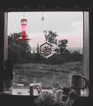
Looking for the Lightby dphillipsComment: I like this photo quite a bit... It is, however, a bit of a stretch on my interpretation of what this challenge should be... |
| Photographer found comment helpful. |
| 08/11/2003 12:01:34 PM |
Looking Out Over Troubled Watersby groganComment: Cute dog... composition is fairly interesting here also... I'm confident that this photo is gonna be a bit of a 'stretch' in this challenge because I don't understand your interpretation very clearly here. I think that that dog is 'inside' the boat looking 'oustide' the boat probably....
I think, based on that, you meet the challenge, but the THEME of the photo doesn't seem to represent the challenge topic with much strength for me... |
| Photographer found comment helpful. |
| 08/07/2003 11:42:47 AM |
Togetherby jimmythefishComment: Beautiful photo and my favorite of this challenge... The black and white goes well with the exposure on this photo... phenomenal shot... = 10 |
| Photographer found comment helpful. |
| 08/07/2003 11:31:24 AM |
|
Home -
Challenges -
Community -
League -
Photos -
Cameras -
Lenses -
Learn -
Help -
Terms of Use -
Privacy -
Top ^
DPChallenge, and website content and design, Copyright © 2001-2026 Challenging Technologies, LLC.
All digital photo copyrights belong to the photographers and may not be used without permission.
Current Server Time: 06/22/2026 01:04:16 AM EDT.