| Image |
Comment |
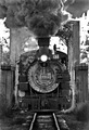
| 10/23/2006 05:03:21 PM |
The Morning Runby vxpraComment: I like the feel of this photograph. The subject, perspective, and processing all create a very nice antique sense to support the theme of the image. The billowing black smoke really creates a sense of volume and movement in the scene also. As a big fan of railroad images, I really love this one. I can smell the environment and feel the rumble in the scene. I love the smell of a coal-fired locomotive :) |
 Photographer found comment helpful. Photographer found comment helpful. |
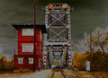
| 10/23/2006 03:15:18 PM |
Ghost Stationby bmartuchComment: I find it very difficult to comment on a photo where the post processing is being used to create the subject or idea that the photographer is trying to show. I don't really have anything against it, but I often have a difficult time understanding the chosen methods. |
| Photographer found comment helpful. |
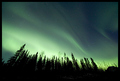
| 10/21/2006 06:38:25 PM |
Aurora Borealis by samchadComment: This is magnificent. I'm jealous of all you folks who live in a part of the world where this can be seen. I'm too far south :( I just find these scenes to be magical. This one has a particularly interesting foreground to anchor that magic into reality. Very nice work... |
| Photographer found comment helpful. |
| 10/19/2006 09:37:30 AM |
All I have.by Dan_CottleComment: This is a great portrait, especially in black and white. Your lighting and exposure are both excellent for the theme. We probably share a common love for our cats :) + favorite |
| 10/17/2006 10:23:02 AM |
Foggy Sunday Morningby phylsy7Comment: This is a beautiful photo. I can hear the silence and feel the cool air. It makes me think of the "end of summer" when the water is too cold to swim in and the kids have all gone back to school. This photo also represents a great 'eye' for an image. The lines and shapes here are strong and the time of day along with the conditions nicely isolated the subject and created a really nice mood for the photo... great work :) |
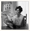
| 10/16/2006 11:55:18 PM |
Another Day in Paradiseby JutildaComment: This is what I would expect to see if Normal Rockwell got some inspiration from Larry the cable guy and Jeff Foxworthy. This photo tells a great story :) The look on her face, especially with the cigarette hanging off her lip, tells me she's just pissed off and ready to tell the world to go to hell :)
I like the square crop. It might even add to the 'americana' theme a little if you created a thicker border area at the bottom to make this look like a polaroid instant print :)
Great stuff... top score from me :)
John Setzler |
| Photographer found comment helpful. |
| 10/16/2006 11:43:55 PM |
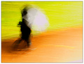
Morning Rainby glodaComment: I love photographic art that leaves me speechless. I find it most difficult to express my feelings on images like this one. Lots of great photographs I encounter allow me to write volumes. This proverbial cat has my tongue though.
I love impressionism and surrealism in photography. This feels like a painting in which I could easily get lost. Under my normal MO, I would prefer this in black and white, but the color in this image creates some additional tension that elevates the sense of urgency in the image.
This is the first challenge I have voted on in a long time and I'm glad I did. I cleaned out my favorites list a long time ago also, but I have decided to re-populate it, with this being my first selection.
Excellent work. I love it :)
John Setzler |
| Photographer found comment helpful. |
| 10/01/2006 02:13:23 AM |
A look to chill the bonesby lentilComment: that guy is leaning to the right.. looks like he is gonna fall over. he also looks like he might kick your ass for takin his pitcher. |
| Photographer found comment helpful. |
| 07/03/2006 12:46:17 AM |
|
| Photographer found comment helpful. |
| 07/03/2006 12:45:32 AM |
|
| Photographer found comment helpful. |
Home -
Challenges -
Community -
League -
Photos -
Cameras -
Lenses -
Learn -
Help -
Terms of Use -
Privacy -
Top ^
DPChallenge, and website content and design, Copyright © 2001-2026 Challenging Technologies, LLC.
All digital photo copyrights belong to the photographers and may not be used without permission.
Current Server Time: 06/10/2026 04:42:23 AM EDT.