| Image |
Comment |
| 11/19/2003 08:17:47 PM |
Saint Josaphat's Ukranian Catholic Churchby wdebeau1Comment: Greetings from the Critique Club :)
Night lighting on nice architecture can often produce lots of nice photos. The darkness of the sky helps to remove a lot of possible unwanted elements like grey skies, poles, and wiring that often clutter the urban landscapes. The night lighting also helps to produce textures and contrasts that are not always visible in the daylight.
In your photo, there is one element that I particularly don't like. I'm sure there is a reason you chose this composition, but there is no 'base' or 'footing' for this building. The ground is not visible and there is no path for me to 'walk' into this scene. As I look at this photo, the most interesting part of it that I see is the domes/crosses on top of the church. I personally believe that your best photo opportunity is in that segment of this building.
Keep up the good work :)
|
| 11/19/2003 01:49:53 PM |
|
 Photographer found comment helpful. Photographer found comment helpful. |
| 11/19/2003 01:45:59 PM |
|
| 11/19/2003 01:45:03 PM |
|
| Photographer found comment helpful. |
| 11/19/2003 01:42:35 PM |
Be yourself, Be different, Stand out! by KINGComment: This is an excellent shot and a great idea for this challenge. I'm wondering what this would look like with some different white balance or possibly in black and white.. This would have been an excellent opportunity for a single color via desaturation. Maybe color that pawn blue or red and then desaturate all the other channels... great shot :) = 10 |
| Photographer found comment helpful. |
| 11/18/2003 09:53:17 PM |
Studyby RegoComment: Greetings from the Critique Club...
Hi Rego...
I think the composition on this particular image is not bad. The primary problems you have here are related to the focus most likely. I can't really offer you any suggestions since you did not post any information about the photo. In the future, when you check the box to get an in-depth critique, you should consider posting the requested information and providing a photographer's comment to go along with it.
|
| 11/18/2003 02:56:51 PM |
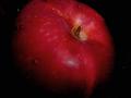
Juicy appleby mecfcostaComment: Greetings from the Critique Club :)
This is a decent attempt at a popular theme with the apple. I believe there is a bit of room for improvement overall though. It appears to be just a tad underexposed. I would like to see that red color pop out with a bit more strength. The color, overall, is just a tad dull because of this. You may also want to work on some alternative compositions to help enhance this theme as well. This is one of the drawbacks I have when viewing photography... I have seen so much stuff that, when I come across an image like this that I have seen many variations of, it makes me compare them mentally with those from the past.
If I were you, I would work on this particular theme until you feel you have mastered your own vision of what you want it to be. Try some variations in the direction of the lighting... sidelighting usually works well with a theme like this.
Welcome to DPChallenge :) I look forward to seeing more of your work in the future :)
John Setzler
|
| Photographer found comment helpful. |
| 11/17/2003 10:48:27 PM |
|
| Photographer found comment helpful. |
| 11/16/2003 10:23:49 PM |
Sweeping it clean.by doginroomComment: Greetings from the Critique Club :)
I can't say much about this photo other that there is plenty of room for improvement :) My general view of this is:
1. It's out of focus
2. The subject is a bit on the boring side.
You have posted no comment to go along with it so I have no idea what your intent is. The topic doesn't really fit as a 'still life' because the motion of the broom is understood.
Better luck next time :)
|
| 11/16/2003 07:46:23 PM |
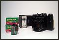
B. (D.) C. - Before Digital Cameraby vadviragComment: Greetings from the Critique Club :)
This still life is decent, but I think your depth of field may have been too shallow. The exposure level on the black camera is also a bit weak. A lot of the detail in that area is lost. The film canister on the left is also a bit out of focus. The 'depth' of the setup is fairly flat also. There is not much 'dimension' to the image. Maybe a different arrangement would have worked well. Your lighting is good.
Keep up the good work :)
|
| Photographer found comment helpful. |
Home -
Challenges -
Community -
League -
Photos -
Cameras -
Lenses -
Learn -
Help -
Terms of Use -
Privacy -
Top ^
DPChallenge, and website content and design, Copyright © 2001-2026 Challenging Technologies, LLC.
All digital photo copyrights belong to the photographers and may not be used without permission.
Current Server Time: 06/20/2026 01:22:52 AM EDT.