| Image |
Comment |
| 11/28/2003 08:54:55 PM |
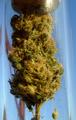
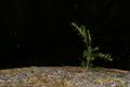
purely medicinal...:)by dc broughtonComment: This is in poor taste. Why didn't you just photography yourself smoking it? The burning aroma is much stronger and would meet the challenge a lot better. |
| 11/28/2003 10:49:01 AM |
|
 Photographer found comment helpful. Photographer found comment helpful. |
| 11/28/2003 10:47:56 AM |
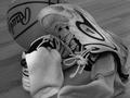
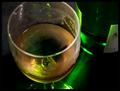
In the Gymby karmatComment: Good work here... I like what I see, but for some reason, this shot begs for color :) |
| 11/28/2003 10:47:02 AM |
|
| 11/28/2003 10:46:12 AM |
|
| 11/28/2003 10:45:55 AM |
|
| Photographer found comment helpful. |
| 11/28/2003 10:45:04 AM |
|
| Photographer found comment helpful. |
| 11/28/2003 10:43:13 AM |
|
| Photographer found comment helpful. |
| 11/28/2003 10:42:50 AM |
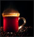
Morning aromasby aKiwiComment: I love the composition and the colors on this one. I think there may be a bit of room for improvement with the lighting... |
| Photographer found comment helpful. |
| 11/26/2003 09:36:04 PM |
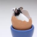
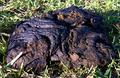
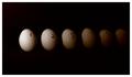
Don't Count Your Chickens Before They Hatchby Spanish_GreaseComment: Greetings from the critique club :)
This photo meets the challenge but it lacks any particular visual interest. I really wish I had more to say, but the composition and the overall presentation doesn't grab my attention very much.
|
| Photographer found comment helpful. |
Home -
Challenges -
Community -
League -
Photos -
Cameras -
Lenses -
Learn -
Help -
Terms of Use -
Privacy -
Top ^
DPChallenge, and website content and design, Copyright © 2001-2026 Challenging Technologies, LLC.
All digital photo copyrights belong to the photographers and may not be used without permission.
Current Server Time: 06/19/2026 09:14:45 PM EDT.