| Image |
Comment |
| 09/05/2012 01:00:02 PM |
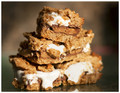
Peanut Butter Cup Smoresby Tommy_MacComment: Answer: Yes
Question: Did you really eat the whole thing?
I find the uneven dof bothersome - esp. the right side of the snack. Also, lots of brown variations, and not much other color in the shot. |
 Photographer found comment helpful. Photographer found comment helpful. |
| 08/31/2012 09:25:38 AM |
|
| Photographer found comment helpful. |
| 08/31/2012 09:18:14 AM |
Dragon Hunterby HarveyGComment: That's all you got for comments? What a shame! I really liked this - contrasting the black of earth with a fire-y sky hinting at a dragon lurking just over the horizon, the castle (or maybe a tree, but it looked like a castle to me), and the young boy with a backpack and a sword - to me this represents the essence of a fairy tale (where do all the adults disappear to in most of these stories?). Most of all, this releases the imagination by providing just the framework, and leaving the viewer free to fill in the details.
|
| Photographer found comment helpful. |
| 08/22/2012 11:57:03 AM |
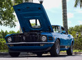
American Architecture by Ford - Built from the ground upby FourPointXComment: Very nice shot of a 1970 Ford Mustang! I think you basically got hammered by the DNMC vote, but I think it fits quite nicely.
I find the light pole being visible through the hood opening distracting - don't know if you had any option in positioning the car, but trying to minimize distractions in the background would improve the shot, IMO.
The angle of the car is spot on - very nice.
|
| Photographer found comment helpful. |
| 08/22/2012 10:15:22 AM |
the forumby tangueraComment: Well, if it isn't a giant birthday cake! Happy birthday!
Could you get a more normalized - looking bell curve on your votes?
|
| Photographer found comment helpful. |
| 08/20/2012 12:57:05 PM |
la giacondaby tangueraComment: Awesome! You do magic. Even without the original, this would be special. |
| Photographer found comment helpful. |
| 08/13/2012 05:00:17 PM |
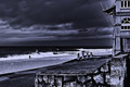
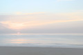
The only oneby NeatComment: Forgive me if I repeat others' comments - I deliberately didn't read them so as to not be influenced by them.
Two things pop out at me - the four concrete pillars, and the ocean/sky line being dead center in the picture. The four pillars don't make any visual sense to me - the foreground looks like a retaining wall, but the pillars themselves look like they are at beach level, and there is no edge or transition between a raised area and the beach. The other thing that emerges after looking at it a bit is that the upper left 2/3 of the shot is pretty dark and lacking in features - dark sky, dark sea. I would suggest trying more contrast - about the only real white in the shot is the waves. The windows in the building are interesting, but blend into the rest of the shot too much.
The person adds some perspective as to size, etc. but is a bit far from the camera.
Emotionally, this is kind-of a "downer" shot - no spot of color, just all greys and darker greys - almost oppressive or depressive. |
| Photographer found comment helpful. |
| 08/10/2012 12:18:53 AM |
|
| Photographer found comment helpful. |
| 08/10/2012 12:11:51 AM |
Little Darlingby dtremainComment: Yes, since this is a shot of a sunrise over the Atlantic Ocean, I was going for "Here Comes the Sun" by The Beatles |
| 08/09/2012 10:01:07 AM |
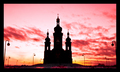
Dawn at the Templeby LanndonKaneComment: That's a low score?
I would suggest doing perspective correction on this. Either the side lamp posts should be straight, or you could lose them altogether. |
| Photographer found comment helpful. |
Home -
Challenges -
Community -
League -
Photos -
Cameras -
Lenses -
Learn -
Help -
Terms of Use -
Privacy -
Top ^
DPChallenge, and website content and design, Copyright © 2001-2026 Challenging Technologies, LLC.
All digital photo copyrights belong to the photographers and may not be used without permission.
Current Server Time: 07/22/2026 06:51:02 PM EDT.