| Image |
Comment |
| 05/29/2013 10:09:43 PM |
|
 Photographer found comment helpful. Photographer found comment helpful. |
| 05/29/2013 10:08:59 PM |
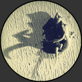
circa 1924by dswannComment: Really like the subject - great lighting, great detail, simple almost two color image - black and gold. |
| Photographer found comment helpful. |
| 05/29/2013 10:07:08 PM |
My bookshelfby dougi555Comment: No. See this too much at my own house. Now, you've got me wanting to read all the titles... |
| 05/29/2013 10:05:49 PM |
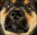
Puppy Dog Eyesby StrikeslipComment: The angle doesn't work for me - makes the nose too short. Also, the dog isn't looking at the camera, and it feels like he/she should be. Great lighting. Great detail. Definite bonus for "cute". |
| Photographer found comment helpful. |
| 05/29/2013 10:03:55 PM |
|
| Photographer found comment helpful. |
| 05/29/2013 10:03:18 PM |
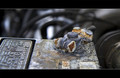
Baby and the Hatby IAmEliKatzComment: What a cutie! Interesting lighting. Not convinced this is fill the frame, but an adorable shot nonetheless. |
| Photographer found comment helpful. |
| 05/29/2013 12:27:29 PM |
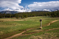
High Country Decisionsby hahn23Comment: Great image. To me, it is fascinating that the trails do not diverge quicker - there appears to be time to change your mind on the road you take. But, diverge they do, and one can never know where a road may go, or what may have happened had you picked the other. |
| Photographer found comment helpful. |
| 05/29/2013 12:17:02 PM |
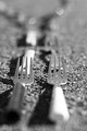
Splitting tinesby SweetiepieComment: FWIW - DOF could be greater - enough to at least make most of the next fork away from the camera to be blurry but recognizable. Great concept, but I feel like the line of forks leading away from viewpoint needs to be a bit more obvious.
I scored lower than you in this challenge, and I've been here for years, so don't worry about the scores, and congratulations on your first score being over 5. I try to keep in mind that in order to get anything over a 5.0, folks have to be voting 6 or higher on your entry. Same thing for a 6 - folks have to be voting 7 or higher. Plus, there will always be a few (looks like you've already found them) who will vote 1 - 3 on entries (probably those who whine the loudest about people giving them low scores).
Welcome. I'm looking forward to seeing more of your work - especially if it is as creative as this concept. |
| 05/16/2013 08:55:05 AM |
T E R M I N A Lby Art RoflmaoComment: To me, in the thumbnail this looked like part of a face in profile with an eye and the top part of a nose. Cool effect - was very surprised when I saw it full sized. |
| Photographer found comment helpful. |
| 04/10/2013 03:39:39 PM |
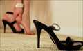
High Heels Hurt!by ladyComment: Side note - nice alliteration in the title!
Look at that vote distribution - almost a perfect bell curve! No 1's at all, but one 10. Very nice.
Great subject, use of DOF.
To me, the shoe is a bit too close to the bottom of the frame - a bit more carpet below the front of the shoe would help. Also, the black (strap?) behind the shoe is distracting and a bit ambiguous as to how it fits into the image. Not sure what to do with it. Having it cropped off on the right side is also quite distracting.
The great thing about this image is that the distractions do not obscure the main message of the image - they are very minor. But, at the same time, attention to removing them or minimizing them would improve the image. |
| Photographer found comment helpful. |
Home -
Challenges -
Community -
League -
Photos -
Cameras -
Lenses -
Learn -
Help -
Terms of Use -
Privacy -
Top ^
DPChallenge, and website content and design, Copyright © 2001-2026 Challenging Technologies, LLC.
All digital photo copyrights belong to the photographers and may not be used without permission.
Current Server Time: 07/18/2026 08:56:54 PM EDT.