| Image |
Comment |
| 05/25/2007 08:29:15 PM |
|
 Photographer found comment helpful. Photographer found comment helpful. |
| 05/25/2007 08:28:31 PM |
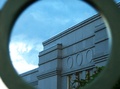
tick tack unstopby alwin_tanasComment: Picture looks a bit grainy. It is disturbing that the brightest part of your picture is the non-descript background while the focal point of your shot - the watch face languishes in shadow. Nice focus. Framing could have been better (center top-bottom, left-right for this shot). The reflection at the top of the bezel also distracts from the photo. I like the idea, but think these things robbed you of a great shot. |
| 05/25/2007 08:24:17 PM |
|
| Photographer found comment helpful. |
| 05/25/2007 08:20:11 PM |
Who knows??????by DiComment: One of these times... This one works because of the lighting, silhouette, blocks and arch. |
| Photographer found comment helpful. |
| 05/25/2007 08:14:36 PM |
Hmm Biscuitsby simontaylorphotoComment: Colors are dull (not your shot - your subject) - I think you could've done with with the center 8 biscuits... |
| 05/25/2007 08:12:56 PM |
|
| Photographer found comment helpful. |
| 05/25/2007 08:11:49 PM |
Shell on whiteby GautiComment: Interesting shot. I find the foreground a little too dark - not sure what you could've done about that, though. |
| Photographer found comment helpful. |
| 05/25/2007 08:10:29 PM |
|
| 05/25/2007 08:07:21 PM |
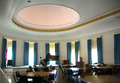
Musical notes, bars, ovals, stripes, and 3 starsby ShrinkComment: I like the idea of this picture a lot. I think you could have cropped it just right of the dome, about the middle of the 1st table on the left, and at the near side of the dome (maybe even into the dome slightly) and had an even more effective shot. For me, there is just too much clutter in the foreground that isn't needed to convey the concept of "empty room". If possible, the curtain at the right of the stage should be hanging straight. |
| Photographer found comment helpful. |
Home -
Challenges -
Community -
League -
Photos -
Cameras -
Lenses -
Learn -
Help -
Terms of Use -
Privacy -
Top ^
DPChallenge, and website content and design, Copyright © 2001-2026 Challenging Technologies, LLC.
All digital photo copyrights belong to the photographers and may not be used without permission.
Current Server Time: 07/17/2026 11:53:36 PM EDT.