| Image |
Comment |
| 08/23/2007 06:37:23 PM |
|
 Photographer found comment helpful. Photographer found comment helpful. |
| 08/23/2007 06:33:33 PM |
Is Nothing Sacredby codfishComment: Evidently not - and they can't even spell. The photo could use more light on the right 1/2. |
| Photographer found comment helpful. |
| 08/23/2007 06:31:10 PM |
|
| Photographer found comment helpful. |
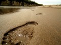
| 08/23/2007 06:30:16 PM |
God's footprints in the sandby KelseeComment: Argh! Nice shot, but you chopped off his big toe and next one... I like the framing, although I might have tried to crop out the tree on top of the hill - not sure though, because it helps draw the eye along the line of footprints. Nice reflections on the water & water's edge. |
| 08/23/2007 06:27:29 PM |
sacred churchby unknowndeathComment: What a great sky! I hate wires - they ruin the best shots and not as easy to edit out as one might think (which of course would not be allowed in Basic Editing). |
| 08/23/2007 06:26:22 PM |
Sacred Wedding Ringsby scknmaComment: Nice idea & nice rings. Your shot is center composition and nicely lit. The focus, however, is not on the rings, but on the near edge of the ring box with its strong pink color and vertical lines. I think tilting the box forward would have put more focus on the rings and reduced the emphasis on the front of the box. |
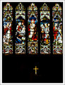
| 08/23/2007 06:24:19 PM |
cruxby alexgarciaComment: Normally I'd comment on the bottom 1/3 being too dark, but in this shot it works because of the very strong cross. It makes it look like the dark band is very deliberate and chosen specifically to highlight the cross. This very strong bottom 1/3 is nicely balance by the colorful stained glass windows in the top 2/3. No distractions & nicely framed. I wish the windows were a little sharper / clearer, but not sure if that is possible. Very nice shot. |
| Photographer found comment helpful. |
| 08/23/2007 06:21:34 PM |
|
| 08/23/2007 06:20:30 PM |
Sacred Songby fancypantsComment: Depth of field is too narrow. Virtually all that is in focus in this shot is the ship II on the book, and maybe the foreground wood. You might consider cropping this just above & to the right of the foreground book. |
| Photographer found comment helpful. |
| 08/23/2007 06:16:48 PM |
Memories last 4everby evaComment: Nice subject. Nice lighting. I think the strong shadows add to the mood of the picture and are contemplative. I'd like to see a little more depth of field. |
| Photographer found comment helpful. |
Home -
Challenges -
Community -
League -
Photos -
Cameras -
Lenses -
Learn -
Help -
Terms of Use -
Privacy -
Top ^
DPChallenge, and website content and design, Copyright © 2001-2026 Challenging Technologies, LLC.
All digital photo copyrights belong to the photographers and may not be used without permission.
Current Server Time: 07/18/2026 09:53:38 AM EDT.