| Image |
Comment |
| 09/15/2007 10:31:40 PM |
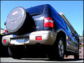
My Ride by scwalshComment: Another Fujifilm FinePix camera user! Interesting angle on this. Nice reflection in the side doors. |
 Photographer found comment helpful. Photographer found comment helpful. |
| 09/15/2007 10:23:01 PM |
Love in a Brass Band Climateby raishComment: I like the "blues" theme. The shadow on his face is distracting in the thumbnail, and a bit so in the larger version, but at least all his face is in shadow and relatively evenly lit. I'd like to think of this as a father giving his daughter encouragement or advice. From an US mores point of view, there is definitely something more of a relationship than acquaintances or associates between them. |
| Photographer found comment helpful. |
| 09/15/2007 10:19:54 PM |
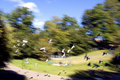
Messengers from Iraqby raishComment: Normally I'm not a fan of blurry pictures. However, the motion in this is nice, and there's nothing that looks like it should be in focus and isn't. A nice bonus with this shot is that you have birds in white against a dark background AND birds in black against a light background - not to mention the shadows! |
| Photographer found comment helpful. |
| 09/15/2007 10:17:27 PM |
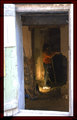
Planning the theatre of her dreamsby raishComment: There are so many elements working together that make this a great shot. Normally, it would be too dark, but the lady's red shirt adds enough color to keep your interest. The work light at her feet provides just enough illumination. The succession of walls on the left leads you eye into the shot. The white / pale blue on the outside, the pale yellow in the interior and wooden beam all combine nicely. Very, very nice. |
| Photographer found comment helpful. |
| 09/15/2007 10:09:41 PM |
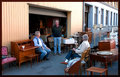
If you can't sell it, at least you can sit on it.by raishComment: This is a great shot. It has a very candid feel to it, and makes the furniture look great. Don't laugh - we have a lady in our neighborhood that has a recliner in her garage. When the weather is nice, she opens the garage door, sits there and watches the world go by. |
| Photographer found comment helpful. |
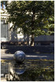
| 09/15/2007 10:06:59 PM |
Egg in a pond 2by raishComment: I like the reflection in the water. Think I'd have been tempted to do a closer crop on just the ball and the reflection. The tree, which makes up most of the top part of the photo is in shadow, and makes the picture look pretty dark. |
| Photographer found comment helpful. |
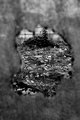
| 09/15/2007 09:48:19 PM |
Secret Gardenby ordinaryangelComment: BTW - just what are you using as the frame? It has a really cool effect - a ragged edge, but it also looks like it is partially see-through. That wouldn't be a nylon stocking, would it? |
| Photographer found comment helpful. |
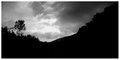
| 09/15/2007 09:45:09 PM |
Day 15: Skyby EstimatedEyesComment: ... unless you like skies & clouds. And what is that tree doing leaning over almost a full 90 degrees? The darker sky on the right side does take the photo too dark. Maybe it is being hill-starved in NE Indiana that makes me like this shot. |
| Photographer found comment helpful. |
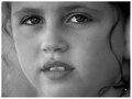
| 09/15/2007 09:42:38 PM |
Day 14: Curlsby EstimatedEyesComment: Nice. I like the ringlets of hair on either side acting as a micro frame. The hair on the left side near the eye is a bit distracting (or it adds some down-home feel to it, depending on your point of view). |
| Photographer found comment helpful. |
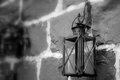
| 09/15/2007 09:39:32 PM |
Day - 14 Old lamp on an old rock home.by JLCComment: Nice old lamp, and nice shot. If this is where you grew up, you probably have walked by that lamp many, many times and not even noticed it. I think a little more above & below the lamp would improve the shot. |
| Photographer found comment helpful. |
Home -
Challenges -
Community -
League -
Photos -
Cameras -
Lenses -
Learn -
Help -
Terms of Use -
Privacy -
Top ^
DPChallenge, and website content and design, Copyright © 2001-2026 Challenging Technologies, LLC.
All digital photo copyrights belong to the photographers and may not be used without permission.
Current Server Time: 07/22/2026 04:13:16 PM EDT.