| Image |
Comment |
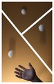
| 10/21/2009 07:27:17 PM |
iJuggleby MartyComment: I like the unorthodox divisions of the panes. You've done a very good job of continuity and motion through the panes. The counterclockwise motion of the ball path is opposite of what Western culture expects to see - not sure if that is a deliberate distraction. IMO, this could have been a bit brighter / well lit overall - the top is almost too dark. |
 Photographer found comment helpful. Photographer found comment helpful. |
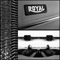
| 10/21/2009 07:23:52 PM |
machine à écrire classiqueby LN13Comment: Nicely done. Even lighting, some added grain. Nice arrangement, and putting Royal and the chrome strip at an angle adds interest and relief from the otherwise almost exclusive vertical / horizontal lines. |
| Photographer found comment helpful. |
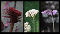
| 10/21/2009 07:21:44 PM |
Hooray for the Red, White and Blueby GeneralEComment: Nice idea. IMO, the left pane is a bit out of synch with the other two - flower appears closer, larger. It having water drops on it where the other two either don't (or nor obviously so) also bothers my sense of "flow". Maybe part of it is lighting - right two panes are lit from the front, but the left pane appears to be lit from behind & to the right, putting the near / left side of the flower in shadow (dark). Regardless, this still has a compelling feel to it. |
| Photographer found comment helpful. |
| 10/21/2009 07:13:02 PM |
Honeyed Wineby wyverndragonComment: Very interesting shot. I find it quite "artsy" with the tarnished cup upside down, bottle in the center pane, and shiny cup right side up at the right - gives a progression to lead you through the panes. Somehow it feels to me like the bottle top chopped off is a problem - bothers me for some reason. Nice to offset the bottle from dead center, though. |
| Photographer found comment helpful. |
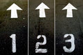
| 10/21/2009 07:09:33 PM |
123by tvsometimeComment: Interesting find. Something a bit too wall-mounted straight-on perspective about this. Perhaps a perspective closer to the base of the numbers to give it a feel of motion (aided by the arrows). |
| Photographer found comment helpful. |
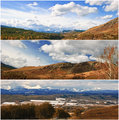
| 10/21/2009 07:07:15 PM |
Fall in the Foothillsby CitadelComment: Very nice shot of the mountains. IMO, the shots are too similar - basically three bands of roughly the same coloration side to side. Also, the road through the center of the bottom pane is very distracting. |
| Photographer found comment helpful. |
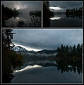
| 10/21/2009 07:03:52 PM |
Morning open by cogeroxComment: Spectacular! Love the ripples on the water, the faint color in some of the trees, and the skys. |
| Photographer found comment helpful. |
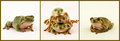
| 10/21/2009 07:02:34 PM |
One big happy familyby ShutterPugComment: Cute. The Froggy Family, with a stack o' kids in the middle. Nice lighting, colors and composition. IMO, right pane is a shade too green. |
| Photographer found comment helpful. |
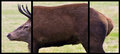
| 10/21/2009 07:00:34 PM |
Crop Factor Explainedby bialas88Comment: I find this humorous! Very nice job of presenting three panes of a single image, with enough variation between them to be truly disturbing! Very nice lighting and detail in all 3 panes. |
| Photographer found comment helpful. |
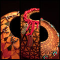
| 10/21/2009 06:58:21 PM |
Gourd Artby dahvedComment: I like the Orange & Black theme. Not sure about the alignment of the openings - especially between middle and right panes. Also, something about the differing DOFs in the three shots bothers me. |
| Photographer found comment helpful. |
Home -
Challenges -
Community -
League -
Photos -
Cameras -
Lenses -
Learn -
Help -
Terms of Use -
Privacy -
Top ^
DPChallenge, and website content and design, Copyright © 2001-2026 Challenging Technologies, LLC.
All digital photo copyrights belong to the photographers and may not be used without permission.
Current Server Time: 07/26/2026 11:33:27 PM EDT.