| Image |
Comment |
| 10/21/2009 07:45:20 PM |
|
 Photographer found comment helpful. Photographer found comment helpful. |
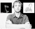
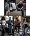
| 10/21/2009 07:44:56 PM |
Spectrumby spiritualspatulaComment: Interesting use of black and white backgrounds. Not sure I'd have had the smaller poses oriented to the edges of the image, rather than towards the central subject. Normally arrangements like this leave a too large gap in the lower sides of the main image, but you've avoided that nicely. |
| Photographer found comment helpful. |
| 10/21/2009 07:42:11 PM |
Inverary, Scotlandby Rainbow-Coloured-SoulComment: Great! I love the continuity between the mountains, shore, and boat. A bit bluish cast, but the overall impression is of somewhere I'd love to visit. |
| Photographer found comment helpful. |
| 10/21/2009 07:41:09 PM |
|
| Photographer found comment helpful. |
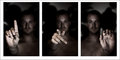
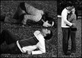
| 10/21/2009 07:39:28 PM |
D P C, can you hear me?by InsomniacComment: Nice even lighting and composition. Not sure what the hand positions mean, so I'm left with three pictures of hand positions and not much meaning. Overall the feeling is dark and distant (the background face, looking like it is holding back intentionally). |
| Photographer found comment helpful. |
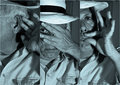
| 10/21/2009 07:36:37 PM |
Showerby IraklisComment: Interesting - not much in focus, but it conveys the concepts pleasingly and well. Probably least recognizable is his hand washing his head. Each of these shots could stand on its own, but combined they have even more impact. |
| Photographer found comment helpful. |
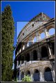
| 10/21/2009 07:34:43 PM |
COLOSSEUM by soonComment: Interesting. Different, but it works well. |
| Photographer found comment helpful. |
| 10/21/2009 07:33:15 PM |
This is a men worldby OdedComment: Is it always that obvious? Nice captures. Nice job of similar lighting, and continuity between panes. |
| Photographer found comment helpful. |
| 10/21/2009 07:31:23 PM |
Together at Lastby VitaminBComment: Wow. Excellent job of keeping images with similar lighting, similar backgrounds, placement. Great concept. Very, very nice. I could see this framed and hanging in their home. |
| Photographer found comment helpful. |
| 10/21/2009 07:29:51 PM |
Breaking the Stereotypeby loveComment: Very well done. Love the monochrome to color - blank to smile transition. The "humanization" of the grim cowboy. Great job of keeping background almost uniform, and definitely in a non-distracting role. |
| Photographer found comment helpful. |
Home -
Challenges -
Community -
League -
Photos -
Cameras -
Lenses -
Learn -
Help -
Terms of Use -
Privacy -
Top ^
DPChallenge, and website content and design, Copyright © 2001-2026 Challenging Technologies, LLC.
All digital photo copyrights belong to the photographers and may not be used without permission.
Current Server Time: 07/26/2026 10:38:36 PM EDT.