DPChallenge: A Digital Photography Contest You are not logged in. (log in or register
 
Browse Settings
Currently viewing:
Memberfrisca

Show comments:

Per page:

Order:

Comments:


Comments Made by frisca
Pages:   ... [90] [91] [92] [93] [94] [95] [96] ... [141]
Showing 921 - 930 of ~1402
Image Comment
glass ball
05/12/2003 06:54:14 PM
glass ball
by katiedid270

Comment:
marvelous, too bad the focus isn't a shade crisper!
Nature's Fire (Abstract)
05/11/2003 04:48:46 PM
Nature's Fire (Abstract)
by LeahStephen

Comment:
very neat effect, I think I would have preferred if the little tile pattern was bigger. :)
Photographer found comment helpful.
Dandelion Wine
05/11/2003 04:44:09 PM
Dandelion Wine
by OneSweetSin

Comment:
I would have liked more saturation on the dandelion. :)
Photographer found comment helpful.
Romantic Glass
05/11/2003 04:42:31 PM
Romantic Glass
by SKatragadda

Comment:
nice composition and lovely purple tones.
Photographer found comment helpful.
Wild Blue
05/10/2003 08:26:58 PM
Wild Blue
by #1 Bronco Fan

Comment:
i like how you've lit this. I'm not high on the glass object you chose, but you lit it well! :)
Photographer found comment helpful.
Thunderbird
05/10/2003 12:41:45 PM
Thunderbird
by willtata

Comment:
Hello from the Critique Club, Tara!

I think this is a great abstract view, which I appreciated in a challenge like transportation.

Colour Composition and Contrast:

I wonder if the car is actually white, and if so, whether it is your white balance that is giving it that blue cast? If it is the case that your white balance was a bit off, I think a bit of hue correction in some photo editing software could fix that up for you without much trouble. That would also give the image a bit more contrast I think, and work out well!

I like the blue of the sky, but I think it was not necessary for the mood of the shot. As a number of the comments below mentioned, I think a little more grill, or backing off the car just a bit to fit more of it into the frame would have worked well too.

The overall perspective you have on the shot is great. Gives off a very "powerful" sort of presence to the car, which is fitting I think. :)

Focus, lighting:

I don't think you have any problems with your focus or depth of field, seems spot on to me here, and its very well done.

The only nit about lighting is the glare from the sun. If this was a car that was not going to go anywhere for a while, I would have waited until the sun was in a different spot in the sky to avoid the harsh glare and bright spot it creates!

overall:

Good perspective on your subject, and a nice abstract view. You've met the challenge and created a feeling with your picture, which is not always easy to do! Happy shooting. :)

Pam
Photographer found comment helpful.
Modern Country Station
05/09/2003 10:05:46 PM
Modern Country Station
by autool

Comment:
Hello hello from the critique club, Richard!

Its funny I should be doing this CC considering I just spent a fair bit of time looking through your portfolio. :) I'm green, forgive my impertinent comments!

composition colours and contrast:

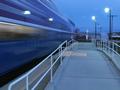
The lines of the railings mimic the train's direction and help lead our eyes to where the train is going, and you've captured enough of the landscape to give the train somewhere to go.

I love the blue. Someone wrote a comment on my transportation challenge that said "blue is the favourite colour of dpc voters" I don't know if that is true, but I love the colours you chose here.

I think I might have tried to up the contrast or something a bit just to make the whole photograph "pop" a bit more. Though the tones are nice, it lacks bite, and I think the subject needs that to really get your message across.
Focus and lighting

There were a number of motion blur sort of pictures in this challenge, but this one was among the nicer ones for me because the still objects are still and clearly in focus, and there isn't SO much motion that we've lost the presence of the train.

Brave to not do a night shot and try to get something more spectacular, I think this is far more dramatic. I really like the twightlight feel. The streetlights add interesting reflections yet are not totally blown out and massive such that they dominate the picture.

overall

I think this is a good shot with some beautiful colours and interesting elements. My only (minor) critique came in the form of a question about the contrast, which I'm not entirely satisfied is really the issue with this shot. But I'll hang my hat there, and if anyone can add more constructive comments to these, I'd welcome them!

If you have any questions about this CC, let me know!
Photographer found comment helpful.
Longhorn Ranch
05/09/2003 08:11:58 PM
Longhorn Ranch
by Anachronite

Comment:
I don't like the italics on the title for the postcard, but I think these cows are very cute, I like the way they're all just "hanging around". 8 - Pam
Photographer found comment helpful.
Garden of the Gods
05/09/2003 08:10:46 PM
Garden of the Gods
by K-Rob

Comment:
really love the shape of these red rocks cutting into the light blue sky. Has a very rough and tumble "wild west" feel to it, and very natural! well done. 9
Photographer found comment helpful.
Kalaloch Lodge Sunset
05/09/2003 08:07:57 PM
Kalaloch Lodge Sunset
by wsargen

Comment:
very serene and warm mood created by the sunset and the silohuettes, I like the way you've framed the sun using the archway.
Photographer found comment helpful.
Pages:   ... [90] [91] [92] [93] [94] [95] [96] ... [141]
Showing 921 - 930 of ~1402


Home - Challenges - Community - League - Photos - Cameras - Lenses - Learn - Help - Terms of Use - Privacy - Top ^
DPChallenge, and website content and design, Copyright © 2001-2025 Challenging Technologies, LLC.
All digital photo copyrights belong to the photographers and may not be used without permission.
Current Server Time: 09/09/2025 07:46:51 PM EDT.