| Image |
Comment |
| 05/19/2003 07:22:49 PM |
The Great Escape by wayne9232Comment: oh I love it! This is hilarious, and brilliantly executed. I hope you have shared how you managed it in your photographer's notes, and if not, I hope you will, its absolutely awesome! :) Those jellybeans have got a lot of character, and they're brave too. Good story here with that red one holding open the lid. Great stuff! |
| 05/18/2003 11:07:29 PM |
save the worldby sanandanComment: this was my absolute favourite of the challenge. A very well done shot! I had hoped it would win a ribbon too. You ought to be extremely proud of this shot. |
 Photographer found comment helpful. Photographer found comment helpful. |
| 05/18/2003 10:27:03 PM |
Primary Friendsby sagestudioComment: I love the candid "childhood" feel to this. The colours are strong, and despite it being the backs of these girls, its still got a lot of emotion and happiness to it. 9 |
| Photographer found comment helpful. |
| 05/17/2003 01:14:40 PM |
The Hardest Timesby DavidLevinComment: this is a really great shot, might the over exposed concrete and the slight tilt, but it has nothing to do with secondary colours. |
| Photographer found comment helpful. |
| 05/17/2003 12:58:24 AM |
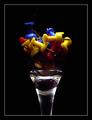
Drink to colorsby BeckyComment: nice colours...not the fondest of the post processing, but it is a unique effect that does add something to the shot. |
| 05/16/2003 06:41:28 PM |
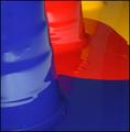
Primary Paintby marboComment: I love how these colours are sharing the frame without mixing colours. Those defined lines are great! |
| Photographer found comment helpful. |
| 05/16/2003 06:40:47 PM |
Water Colorsby crabappl3Comment: I like the white space starting to the right of the blue vase.. just wish there was more of it. Otherwise, totally crisp, clear and flawless with beautiful colour. |
| Photographer found comment helpful. |
| 05/16/2003 02:14:57 PM |
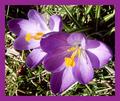
Spring Colours Are Second To Noneby rogerspaulComment: this would have been lovely for complementary colours too. The border is too heavy and distracts from your subject quite a bit, perhaps try something thinner? As well, there seems to be more grass in focus than the petals themselves, which makes the whole shot seem very busy, exacerbated by the heavy shadows. Perhaps shooting with a more shallow DOF and keeping the focus on the flowers and shooting later in the day when the sun is lower in the sky and creating softer shadows? |
| Photographer found comment helpful. |
| 05/16/2003 01:52:20 PM |
|
| Photographer found comment helpful. |
| 05/16/2003 01:49:08 PM |
primary curvesby shutterflyComment: I would have liked a little more light on the curved to bring out more colour, but great composition and I like the negative space up to the left. 8 |
| Photographer found comment helpful. |
Home -
Challenges -
Community -
League -
Photos -
Cameras -
Lenses -
Learn -
Help -
Terms of Use -
Privacy -
Top ^
DPChallenge, and website content and design, Copyright © 2001-2026 Challenging Technologies, LLC.
All digital photo copyrights belong to the photographers and may not be used without permission.
Current Server Time: 04/30/2026 05:17:03 AM EDT.