| Image |
Comment |
| 05/20/2003 02:00:29 AM |
|
 Photographer found comment helpful. Photographer found comment helpful. |
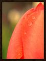
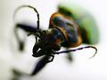
| 05/20/2003 01:59:52 AM |
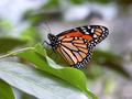
Charge!by dadas115Comment: cool macro, but I would like to see more of the bug. the DOF is too shallow I think. :) Great colours, however! |
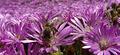
| 05/20/2003 01:59:01 AM |
Pollinatorby simkinComment: wee oversharp but nice composition and crop. I like the endless purple. |
| Photographer found comment helpful. |
| 05/20/2003 01:58:09 AM |
painted handsby tiffComment: i actually find this composition a bit disturbing. The brush strokes look almost violent in nature, but in a cartoonish and twisted way without telling a story about why. Seems chaotic. |
| 05/20/2003 01:56:20 AM |
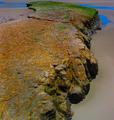
Green Livingby GinaRothfelsComment: some of the highlights are blown, causing loss of detail in the building, and the hue shift is causing some of the elements to look very unnatural. Also seems there is some strange compression sort of thing happening to the trees in the background left. |
| Photographer found comment helpful. |
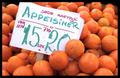
| 05/20/2003 01:52:32 AM |
At the market!by pollonosComment: i wish there were more oranges all around the sign and the sign wasn't cut off. Cool shot anyway, love the colour! |
| Photographer found comment helpful. |
| 05/19/2003 09:27:42 PM |
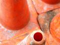
Close Perimeterby cmrk74Comment: I don't agree with your focus/DOF here. I think the lines where the cones meet are very interesting and would have benefitted from being in focus. |
| Photographer found comment helpful. |
| 05/19/2003 09:23:56 PM |
Orange Into Greenby bobgaitherComment: lovely! I wish it was a bit brighter though, whole thing seems a bit dark. Not sure if that is exposure or lighting though. |
| 05/19/2003 09:23:13 PM |
polka dotsby patriciaannComment: dsidwell has a lovely post in the forums about how to size your image for the web. This is a nice picture, but its a bit small to really see the details. |
| 05/19/2003 09:22:34 PM |
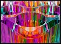
Prism²by crabappl3Comment: radiant colours. Crisp and fascinating abstract composition! :) I like that you've filled the frame with colour, since the reflections are so interesting. |
| Photographer found comment helpful. |
Home -
Challenges -
Community -
League -
Photos -
Cameras -
Lenses -
Learn -
Help -
Terms of Use -
Privacy -
Top ^
DPChallenge, and website content and design, Copyright © 2001-2026 Challenging Technologies, LLC.
All digital photo copyrights belong to the photographers and may not be used without permission.
Current Server Time: 04/30/2026 06:42:27 AM EDT.