| Image |
Comment |
| 06/16/2003 09:03:11 PM |
American Babyby fjComment: very cute child, and I like the scene you've created her, however the focus seems soft, and its a bit grainy, not sure if that is intentional, but I don't see how it is adding to the feel of the image. |
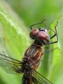
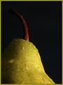
| 06/16/2003 09:02:12 PM |
National Wildlifeby amandolinComment: I love the macro, but this shot seems to not be in focus. I can't tell which part was meant to be the centre of focus here, and that detracts from the shot, sadly. I like the colours and composition though, good choices! |
 Photographer found comment helpful. Photographer found comment helpful. |
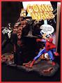
| 06/16/2003 08:59:51 PM |
W i R e Dby miss parkerComment: i like how this looks almost like a scene from a comic book. The focus doesn't seem to be on though, many parts of the scene appear soft or out. |
| Photographer found comment helpful. |
| 06/16/2003 08:56:08 PM |
Sing Out! ( http://www.singout.org/ )by eloiseComment: The composition is so crowded, and the shot is also a bit dark and out of focus. This really detracts from its ability to appear on a cover of a magazine, as there is no pop to the picture and no place to put any text conveniently. Message edited by author 2003-07-21 02:26:38. |
| Photographer found comment helpful. |
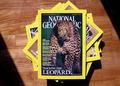
| 06/16/2003 08:53:08 PM |
National Geographicby ashwinComment: like an anniversary issue? I like the interesting composition and lighting, its simple, but has impact. Should have arranged it to be in portrait presentation. |
| Photographer found comment helpful. |
| 06/16/2003 08:51:06 PM |
|
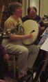
| 06/16/2003 07:12:10 PM |
The Recorderby KoriyamaComment: I like the competition of the light and dark, and the shadow created from the lighting. Simple but effective |
| Photographer found comment helpful. |
| 06/16/2003 07:11:17 PM |
|
| 06/16/2003 03:50:00 PM |
Cakeby Crafty SueComment: that chair in the background is terribly distracting, and the light on the cake is very bright, causing its details to be difficult to see. I would have zoomed in on the cake a little more closely and cropped this so that it was a portrait, not landscape. |
| 06/16/2003 03:48:12 PM |
ARCHAEOLOGY MAGAZINEby BitzComment: The composition with the light and dark background with similar tones against the statue look great, I could see this on a cover. One of my favourites of the challenge. |
| Photographer found comment helpful. |
Home -
Challenges -
Community -
League -
Photos -
Cameras -
Lenses -
Learn -
Help -
Terms of Use -
Privacy -
Top ^
DPChallenge, and website content and design, Copyright © 2001-2026 Challenging Technologies, LLC.
All digital photo copyrights belong to the photographers and may not be used without permission.
Current Server Time: 04/28/2026 05:50:41 PM EDT.