|
|
|
Showing 411 - 420 of ~1402 |
| Image |
Comment |
| 07/24/2003 12:19:36 AM | Maestroby albright1Comment: good job, nice pic. ;) (I always wanted to impersonate Dustin)
Seriously, I think you've done a good job with an unruly subject/model ;) I like the lighting on the right, though its a bit TOO bright on his arm (But I can live with it..it contrasts with his dark side) Great job, A!! :)
I like the idea of a smaller light just to capture the contours of his back, too. |  Photographer found comment helpful. Photographer found comment helpful. |
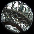
| 07/24/2003 12:04:02 AM | Crystal Worldby cpanaiotiComment: Greetings from the Critique Club, Colette!
I didn't get to vote on this shot (sadly, didn't get to about half the round shots) but I'm happy to take a look at it now and offer some comments I hope you find helpful.
Colour, Composition, Contrast:
The use of the teleconverter at wide angle to create the vignette is a great way to use what can be an annoyance to create your theme. I like your subject, especially as against a window because it adds some interest behind the crystal, though I would have preferred maybe something brighter or something more distinctive that would tie into the theme..not sure what you have around your house for choices in that regard, but its a thought! I would have liked maybe a little more colour in the shot, perhaps from refracted light? It just seems to be missing some pop or major interest and that may be the reason this didn't get as much attention as it could have.
Now, about that finger print... seems from your comments that it was intentional of sorts, but I can't say its distinctive enough to really seem like it was on purpose. Perhaps if you had put a really heavy fingerprint it would look more intentional? In any event, I am not sure what something like that would add to the shot, and think maybe it would be nicer without out? But that's just me.. and I am speculating on something that isn't even in the picture!
Focus and Lighting:
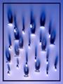
Here is where I think the biggest improvements can be made (not that what you have is bad) but some more light from different angles would catch the cuts in the crystal bowl and give the shot more light and more colour. :) Plus, the straight lines of refracted light might contrast nicely with the prevailing round theme and offer some balance? :)
Overall, lovely technique to make a very prominent round shot! :) A few little adjustments and this is a very fun and cool photo. | | Photographer found comment helpful. |
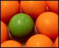
| 07/23/2003 07:03:45 PM | Dare to Be Differentby karmatComment: hi Karma!! Greetings from the Critique Club
Sadly, I didn't get to finish voting on round, so I didn't get to vote on your picture, but I'm glad to have the opportunity to comment on it now.
Colour, Composition, Contrast:
I like this composition, its a simple, repeating pattern and the placement of the odd coloured ball is pleasing. However, I think the oranges could be a bit more saturated, as could the green. They just seem a tiny bit washed out. Maybe a little post-processing would have make them pop? :)
Focus and Lighting:
A lot of your comments picked up on the fact that the focus is off. Its not soft enough for any sort of emotive effect (nor do I think a soft focus would have been an effective choice for this particular composition unless just the green ball was in focus) and its not sharp enough to give us crisper lines and colours.
Overall: I like the idea, and your composition, it just need a bit more focus, and maybe something different with the lighting...perhaps a bit of a spotlight? or maybe a bar of light going across the shot? I am not sure, but just something a little different as what you have looks a tad uninspired (I hope that is not too harsh!!) I like this shot, and I think you scored quite respectably! :) | | Photographer found comment helpful. |
| 07/23/2003 12:28:29 PM | Political Centsby friscaComment: The shot for dyslexia was so my idea. Don't even start. And so, in my defence, and to own the truth, the idea WAS mavrik's. :) |
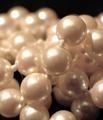
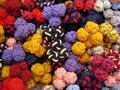
| 07/22/2003 11:34:53 PM | Grains of Sandby jillzComment: (I won't tell your secret that cultured pearls aren't made from a grain of sand..) I like the full frame of this, and the rich lustre of the pearls. well done. | | Photographer found comment helpful. |
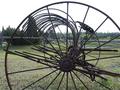
| 07/22/2003 12:54:07 PM | Been round a long timeby Dim7Comment: I like the shape and the composition you have created with this old piece of equipment, but the background seems very faded and without enough colour, and the sky is not very inspiring. I understand we can't control the weather, but it does make for a washed out shot. |
| 07/21/2003 04:16:57 PM | | | Photographer found comment helpful. |
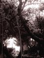
| 07/21/2003 04:15:58 PM | The Light Houseby swaroskjiComment: Unique framing! The roundness is all in the framing of the lighthouse, but the curves of the trees remind us what the theme of the photo is as well. What a great find and nice shot. | | Photographer found comment helpful. |
| 07/21/2003 04:14:48 PM | Ballroomby casualguyComment: I see you've kept this (or made it) grainy, which I can appreciate, but I think I might have preferred this a little less noisy because the balls are so smooth and might look better if the shot of them was equally slick and smooth. Lighting is intriguing as well. I like creation of shadows to emphasize the roundness. (would have liked a little more light in the back too though..seems too dark there) |
| 07/21/2003 04:10:56 PM | Saver Lifeby SonifoComment: very neat! At first I was trying to figure out if this arrangement meant anything, or was in some special code, but then I gave up my aspirations of John Nash and just admired the use of light and shadow to create a feeling of round times two! | | Photographer found comment helpful. |
|
Showing 411 - 420 of ~1402 |
Home -
Challenges -
Community -
League -
Photos -
Cameras -
Lenses -
Learn -
Help -
Terms of Use -
Privacy -
Top ^
DPChallenge, and website content and design, Copyright © 2001-2026 Challenging Technologies, LLC.
All digital photo copyrights belong to the photographers and may not be used without permission.
Current Server Time: 04/28/2026 05:01:05 AM EDT.
|