|
|
|
Showing 401 - 410 of ~1402 |
| Image |
Comment |
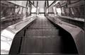
| 08/03/2003 09:53:07 PM | Chrome Descentby magnetic9999Comment: I'm very fond of the lines in this, I like shots of escalators. Your choice of bw really does justice to the shiny chrome, and I like how the shot is balanced. |  Photographer found comment helpful. Photographer found comment helpful. |
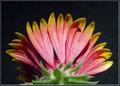
| 08/02/2003 10:06:16 PM | From the Backby falveyComment: I like the colours here, but I think the way the flower is lit has really taken away from it. It seems flat, and we are losing a lot of the texture and mystery of the flower with such direct, flash-like light. The colours are washed out some as well. I think your composition is great though and I like this unique angle! |
| 08/02/2003 08:28:34 PM | Jonah Skylar!by smellyfish1002Comment: great catchlights in the eyes! What method did you use to make this bw? Whatever method it was, it seems to have taken away a lot of the contrast in the shot. I would have liked a bit more tonal range, but that's a nit. Nice shot for sure! | | Photographer found comment helpful. |
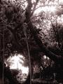
| 08/02/2003 08:25:05 PM | a root from an old cypress treeby grigrigirlComment: I really like that shape in the centre, I woul have cropped off the bottom to let that particular abstract fill the frame, but this is still really cool. You have captured details and textures well, and I like the focus too. | | Photographer found comment helpful. |
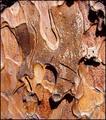
| 08/02/2003 08:22:40 PM | Ponderosa Pine Barkby ArtifactsComment: I like this..the curves and texture are amazing. However I think the light might be a tad harsh. It almost makes me want to squint while I look at the shot. :) | | Photographer found comment helpful. |
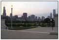
| 08/02/2003 08:21:38 PM | City in twilightby pitsamanComment: this isn't what I'd traditionally think of as "fill the frame" but I don't think it fails to meet the challenge. However, I think its really missing a strong point of interest. The skyline just isn't popping against your sky..its oclours are nice, but not strong enough to really force the image to fly out at us. :) | | Photographer found comment helpful. |
| 07/30/2003 08:53:00 PM | HM: Art Deco in architecture and decorationby eloiseComment: Eloise,
I noticed that you predicted a few of the most "common" comments. I am curious then, why you didn't share why you chose this shot, with these colours from this angle?
I am not fond of the angle, I don't think its adding anything to the picture, the colours are indeed very washed out without enough contrast and I don't see why the doors were included. You could have gotten a much more abstractly "art deco" feel from the photo if you had just included the windows (and the wings, but I don't feel those are particularly "art deco", because I usually think of clean lines and weird angles when I think of art deco)
Just a few of me "hit me" thoughts! I hope they help.
|
| 07/30/2003 12:22:18 AM | The Light Houseby swaroskjiComment: I'm shocked at how poorly this one fared. It was and is one of my absolute favourites from the challenge. Very very well done, and excellent interpretation of round. Just brilliant! I hope you are proud, and pay no mind to the score, it means nothing with respect to your photo. | | Photographer found comment helpful. |
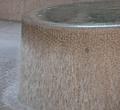
| 07/25/2003 08:30:04 PM | Fountain Roundby geminiwbComment: Hi Wesley.
I was poking around old challenges and I noticed you only received two comments on this photograph, and as it is your first entry, I thought some more comments would be helpful to you.
I didn't score this shot high for a number of reasons:
The composition: the roundness wasn't obvious in this shot, and though I don't deduct a lot of points for that, there wasn't anything compelling enough about what I did see to warrant overlooking this aspect. The curve takes up only the top third of the shot while the rest is dominated by the motion of the water and straight lines.
The colours: they are a bit washed out, without a lot of range in tones or contrast. There is no obvious poitn of interest and that can really hurt a shot when only being viewed for a few seconds, as happens in voting.
Some things to try on a shot like this:
1. zoom out..maybe the whole circle is interesting, or something in the background will help play up on your themes. I recognize that since I don't know what is outside what you have shown us here, this suggestion may be total bunk.
2. Include people or some other element that will "play" with your subject or theme.
3. Try taking the shot during a more favourable light time of day...early morning and around sunset give a beautiful glowing light with soft shadows that can add some nice effects to a shot!
Keep shooting, and welcome to DPC!
Pam
| | Photographer found comment helpful. |
| 07/24/2003 07:06:13 PM | Nude in the shadowby AlexysComment: Ahh.. Alexis! Hello from the Critique Club!
This picture is great, and I'm so pleased to get a chance to comment on it further.
Colour, Composition and Contrast:
Nudes of women were abundant this challenge, I guess its hard to find a willing male model. Too bad for the girls, but I think your nude is one of the most interesting ones.
I like the portrait presentation and the shadow cut against the left side. The repetitive presentation really brings out the theme of the photograph and emphasizes her beautiful curves.
Though its beautiful as it is, one suggestion I offer is trying this same sort of a shot as a full body, or at least, more of her legs, I think with the shadow that would really have some impact. Also, have her take off her ring next time so it doesn't catch the light and reflect it back. Its a odd looking hotspot on her head that is distracting and can be easily avoided. Or you could just clone it out in post-processing.
I would also like to see a greater tonal range here. Basically, more whites and more blacks instead of the narrower range of greys you have currently.
I adore the choice of black and white and think it was the perfect one to make for this shot.
Focus and lighting:
Here is where most of your comments arose. There was a variety of ideas about the lighting and focus, but I think I agree most with the notion that the focus on the subject is just a tiny bit too soft. Its not bad, and I like the softness, but perhaps its the lack of contrast that make this look a little too soft. But as I said..its still very pleasing!
I agree with KevinRigg's comment about the lighting..its not wholly even down her whole body, and maybe an additional light to fill around her legs would have helped? Though I point this out, I don't think its a major flaw at all.
Overall:Fabulous shot and excellent placement in the challenge! I look forward to seeing more of your work. :)
Pam | | Photographer found comment helpful. |
|
Showing 401 - 410 of ~1402 |
Home -
Challenges -
Community -
League -
Photos -
Cameras -
Lenses -
Learn -
Help -
Terms of Use -
Privacy -
Top ^
DPChallenge, and website content and design, Copyright © 2001-2026 Challenging Technologies, LLC.
All digital photo copyrights belong to the photographers and may not be used without permission.
Current Server Time: 04/28/2026 05:01:22 AM EDT.
|