|
|
|
Showing 371 - 380 of ~1402 |
| Image |
Comment |
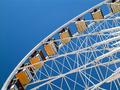
| 08/23/2003 12:57:26 AM | State Fairby ChrisW123Comment: the sky works well to accentuate the curves and lines of the wheel. Great colour as well, and cool perspective. |  Photographer found comment helpful. Photographer found comment helpful. |
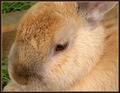
| 08/18/2003 11:15:20 AM | My Garden Friendby JonatanComment: jonatan! This is a technically beautiful shot, and a great interpretation of the challenge. I think it ought to have placed higher, but this is still a great score. :) You did a great job making us able to feel the fuzziness of this bunny. |
| 08/15/2003 03:22:39 PM | |
| 08/13/2003 03:27:50 PM | Inside Looking Out by connieComment: awwww...you cot me. that's way too cute. And I like the out of focus foreground. the framing of the shot is nice too, the green grass contrasts well. | | Photographer found comment helpful. |
| 08/13/2003 03:24:50 PM | hacker of the futureby SeanachaiComment: oye, now that is really creepy! I love the the unsaturated colours and shades, and I can't even begin to tell you how great the subject is. Nicely done! | | Photographer found comment helpful. |
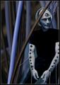
| 08/11/2003 03:13:22 AM | Upwardsby tyrkinnComment: hi Haraldur! Greetings from the Critique Club!
I didn't finish voting on this challenge, so this is the first time I've seen your shot, and I must say its very nice!
Colour, Composition, Contrast:
The placement of the cross in the right part of the frame was a good choice. This shot has several leading lines, all which take us from the bottom of the frame up, which is a doubly powerful effect given your spiritual subject matter.
The contrast is great, though I do think I see some jpeg artifacts around the cross...it seems a bit jagged in parts.
I also like the simple, solid tones in this shot, with just the dark black and shadows and the yellowy green glow, its especially great around the cross which seems to itself be glowing..how spooky!
Focus and Lighting:
Again, I really like the lighting in this shot. Was it original or did you hue shift and saturate to get it? Either way, its very well done and I like the contrast it brings as against the cross.
You mentioned in your notes that you used a tripod, I am left wondering, then, why the cross seems out of focus. It might be that the light was simply too low, but I think the real problem is that your aperature was set to F2.8, which is a very shallow DOF. So you got the top (and maybe middle) of the cross in focus, but not the bottom as it was closer to you and thus, on a different plane for the focus. For a shot like this, I would try a bigger f-stop to give you a greater DOF.
Overall:
Neat shot, with wonderful clean lines and some decent impact. Despite all the nice elements, I still think its lacking some real "wow" (I hate using that cliche, but it works) factor. Elusive thing that wow, but really it translates to, for me, that there just isn't enough or the right elements in the picture to make me fall out of my chair. :) Keep up the solid work though! | | Photographer found comment helpful. |
| 08/10/2003 12:52:44 PM | Dr. Dolittle (the original with Rex Harrison)by MorganComment: I just watched this on television the other day! highlights are a bit blown out, but I like the difusion sort of glow it has, the print of the old movie was coloured much like this, you've done a good job! 8 | | Photographer found comment helpful. |
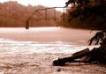
| 08/10/2003 12:51:48 PM | The Bridge on the River Kwaiby wetlandComment: I remember watching this movie with my dad years ago. He really liked war movies and history films..I remember the colouring of the movie being very much like this, and the images in it are echoed well in this shot. There is a peacefulness on the surface, but you can sense some tension just below. Very well done. 10 | | Photographer found comment helpful. |
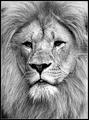
| 08/10/2003 12:30:44 PM | I am watchin' youby AnastasiaComment: Hi Anastasia! Greetings from the Critique Club!
I never did finish voting on this challenge, and I'm sorry I missed your picture, being a Leo myself I have a special fascination with lions! Good thing I get the chance to comment on it now!
Colour, Composition and Contrast:
The first two things I notice about this shot are that it is both very contrasty and its in bw. It works in black and white, but I also found myself wondering what it looks like in colour, and whether the golden shades of fur would not add to the royal feeling one gets from the expression on his face.
I like the high contrast, but I'm not fond of the blown out highlights around his mouth. We have lost some of the detail of the fur in those areas.
Compositionally, this totally meets the challenge and is a great idea for it. I like the placement of your subject with his eyes along a thirds line, and his mouth along the other. Those are two great points of interest! Very well done.
Focus and Lighting:
Did you use a zoom lens, or was this a serious crop job? :) I ask because I too would have liked some catch lights in his eyes, and the flash might have helped to eliminate some of the shadows near his eyes, however, it also could have blown out more of his fur..soo..I have no beef with the choice you made in that regard!
As for focus..the shot does seem a little soft around the edges, what made you choose F2.8 as your aperture? I think a great DOF would have suited this picture a bit better, though its not really a prominent problem with this shot given that its a fairly shallow plane, though I miss the fact that the hair and fur around the edges isn't as crisp as it could be!
Great score, and awesome picture! Congratulations. :) | | Photographer found comment helpful. |
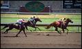
| 08/09/2003 09:06:25 PM | Sea Biscuitby kebmod54Comment: a bright shot, and maybe (maybe!) just a touch oversharp, but I could be wrong about that. I like the composition a lot though, especially the inclusion of the sign which is mimicked by the pose of the horses! 10 | | Photographer found comment helpful. |
|
Showing 371 - 380 of ~1402 |
Home -
Challenges -
Community -
League -
Photos -
Cameras -
Lenses -
Learn -
Help -
Terms of Use -
Privacy -
Top ^
DPChallenge, and website content and design, Copyright © 2001-2026 Challenging Technologies, LLC.
All digital photo copyrights belong to the photographers and may not be used without permission.
Current Server Time: 04/28/2026 05:01:03 AM EDT.
|