| Image |
Comment |
| 07/09/2008 07:50:58 AM |
Eternalby mcieslakComment: she looks like she might topple forward and I think more contrast would have improved it. |
 Photographer found comment helpful. Photographer found comment helpful. |
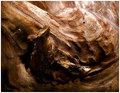
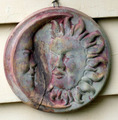
| 07/09/2008 07:49:26 AM |
Polished by Timeby BudyaComment: really like the subject, texture and color....my one criticism would be tha the image would benefit from a greater depth of field. I would like to "see it all" and I can't do that. |
| Photographer found comment helpful. |
| 07/09/2008 07:37:40 AM |
|
| Photographer found comment helpful. |
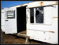
| 07/09/2008 07:35:24 AM |
not aloneby Ragga2000Comment: really like the light on the left side, the concrete pad in the front distracts |
| Photographer found comment helpful. |
| 07/09/2008 07:34:33 AM |
|
| Photographer found comment helpful. |
| 07/09/2008 07:32:51 AM |
|
| 07/09/2008 07:32:04 AM |
|
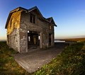
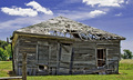
| 07/09/2008 07:31:04 AM |
This old house......by TruegshtComment: The qualities of the image are very good, I like the sky and the house is definitely weathered. My sense is that a different composition (not centered) might improve the image |
| Photographer found comment helpful. |
| 07/09/2008 07:29:32 AM |
|
| Photographer found comment helpful. |
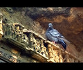
| 07/09/2008 07:28:45 AM |
Ancient Archby LadyKComment: to my eye, the focus is soft. I also think a softer light would improve the image. |
| Photographer found comment helpful. |
Home -
Challenges -
Community -
League -
Photos -
Cameras -
Lenses -
Learn -
Help -
Terms of Use -
Privacy -
Top ^
DPChallenge, and website content and design, Copyright © 2001-2026 Challenging Technologies, LLC.
All digital photo copyrights belong to the photographers and may not be used without permission.
Current Server Time: 07/17/2026 10:18:11 PM EDT.