| Image |
Comment |
| 11/17/2008 02:05:22 PM |
Love Dripsby LonzComment: Great idea, I really like the double reflection of the heart. I find it a little dark and not as crisp as I would like (perhaps the material involved) and the light to the right needed a shoot through umbrella and maybe a double mask. |
 Photographer found comment helpful. Photographer found comment helpful. |
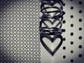
| 11/17/2008 02:00:13 PM |
... heart ..by shoggyComment: The multiple layers of hearts are very nice, although I think single rings might have been better than the spiral. I also not sure where the pattern in the paper fits, finally a tighter crop without the vignette would have been better. |
| 11/17/2008 01:48:10 PM |
At the Heart of Natureby SandyPComment: Where are the legs....strikes me as a little odd without legs. I like the idea and a nice image, but a little flat....but the heart might not come out in color. |
| Photographer found comment helpful. |
| 11/17/2008 01:47:07 PM |
Cuore Dolceby h2Comment: nice image, well exposed, well light, it strikes me as a little dark, but other than that it is great. |
| Photographer found comment helpful. |
| 11/17/2008 01:04:08 PM |
Now and forever with all my heart :)by FocusPointComment: Had this been an image of a statue, it would not have scored well, but converting it into a shadow was a novel idea and it comes off very well. I like the red background as well. A little more DOF might have helped, but this is being really picky. |
| Photographer found comment helpful. |
| 11/17/2008 01:02:37 PM |
Heart full of colorsby sekarmalathyComment: Unique idea, wonderful color, good composition, good lighting.....no complaints from me on this one (and I have had improvement comments on every image except this one so far) |
| Photographer found comment helpful. |
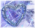
| 11/17/2008 01:01:30 PM |
Mirror Heartby naomikComment: having seen others try to photography sparkling objects...very good job on the light management. The thing that hurts it for me is the background...a colored cloth, black cloth, a loving face or something like that in the background would have pumped this up. |
| Photographer found comment helpful. |
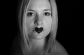
| 11/17/2008 12:59:49 PM |
the voice of my heartby magenmarieComment: Technically a strong image, good lighting. For me somehow and I can't define it, the placement of the subject in the image doesn't feel right. I don't have problems with cropped heads, but somehow this doesn't work for me. Maybe an angle on the face or a vertical image would have appealed to me more. |
| Photographer found comment helpful. |
| 11/17/2008 12:57:52 PM |
Heart of Darknessby chaliceComment: The play of dark and light and the extent of the contrast between them is very nice. It would have been stronger if the heart image were more evident. I might have cropped it a little tighter. |
| Photographer found comment helpful. |
| 11/17/2008 12:56:40 PM |
The Prisonerby PrashComment: Use of the shadows and the idea of a jail is cute, although the cup's role is only as carrier of the heart....somehow it isn't singing to me. I would have liked the cup further down in the image...there is a lot of area that is out of focus in the image. |
| Photographer found comment helpful. |
Home -
Challenges -
Community -
League -
Photos -
Cameras -
Lenses -
Learn -
Help -
Terms of Use -
Privacy -
Top ^
DPChallenge, and website content and design, Copyright © 2001-2026 Challenging Technologies, LLC.
All digital photo copyrights belong to the photographers and may not be used without permission.
Current Server Time: 07/22/2026 04:30:35 PM EDT.