| Image |
Comment |
| 12/05/2003 07:41:27 PM |
You play, you pay.by keoneComment: I like the tightness of the composition. Just enough elements to get the message across. Wish the "GO" were lined up with the edge better, would feel better and have more impact. |
 Photographer found comment helpful. Photographer found comment helpful. |
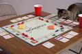
| 12/05/2003 07:36:15 PM |
Catopolyby Ram21Comment: cute. I sense yor careful set-up is about to be rearranged. You've done a good job of making the background unobtrusive, but natural. The composition doesn;t feel well reasoned out - perhaps cropping in so that the "monopoly" is coming down into the bottom left corner? Would bring attention to the important elements - what the game is, and the cat looking on. |
| Photographer found comment helpful. |
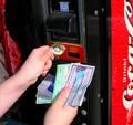
| 12/05/2003 07:32:52 PM |
Exact Change Only!by drgsoellComment: A frustrating situation, recognized by all. lots of money, but not ON you. A little soft on focus, composition is busy - maybe cropped in to the hands and the change slot ? |
| Photographer found comment helpful. |
| 12/05/2003 07:28:09 PM |
Gold Rolex = $$$ at pawn shops - world wide.by jimsappComment: Well lit and sharp. Composition could be more interesting...with it tilting to the left it is hard to look at the face, I'd rather have it tilting up on the left and down on the right - the way ot would be when you twist your wrist to look at it. |
| 12/05/2003 07:26:23 PM |
I Feel Lucky Todayby fisheyeComment: Cute idea to have the ticket in a money clip, having it crumpled a bit gives it some texture and dimension. I'm not sure what the circular stack is on the right - it is distracting. I do like the worn counter top for a background. Wish the color of the background were a little "richer" no pun intendid |
| Photographer found comment helpful. |
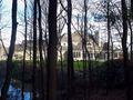
| 12/05/2003 07:23:23 PM |
Big Bucks!by basia03Comment: A valid idea, a large house means big bucks. Taken from this point of view, though the trees, gives a feeling of exclusion which works with the subject. Howver the exposure is too dark on the trees and two light on the house. Perhaps if you exposed for the house and let the trees be in silouette. You should crop in on the house to make it clearer that os the subject. |
| Photographer found comment helpful. |
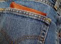
| 12/04/2003 04:18:22 PM |
Pocket Moneyby willemComment: fantastically sharp! Fresh lighting, nicely balanced composition without being too obvious |
| 12/04/2003 04:01:56 PM |
Caviar dreams and Champagne wishesby JasonComment: I'd crop in on the left and right - the sign would be even more dramatic looming over a vertical composition. If you could get a stronger sense of the street stretching out infront of you it would be great. |
| Photographer found comment helpful. |
| 12/04/2003 03:59:42 PM |
|
| Photographer found comment helpful. |
| 12/04/2003 03:57:28 PM |
In the Shadowsby kualguComment: Interesting to look at - strong diagonal. interesting light. However it just doesn't come together for me, I don't know what it is, which isn't such a big deal, but I don't understand what its saying either. |
Home -
Challenges -
Community -
League -
Photos -
Cameras -
Lenses -
Learn -
Help -
Terms of Use -
Privacy -
Top ^
DPChallenge, and website content and design, Copyright © 2001-2026 Challenging Technologies, LLC.
All digital photo copyrights belong to the photographers and may not be used without permission.
Current Server Time: 07/23/2026 10:54:33 AM EDT.