| Image |
Comment |
| 01/22/2004 11:36:38 AM |
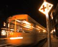
Beware of Runaway Tramsby muur88Comment: Nice action, good composition. I like how the sign glows in the darkness and the train zooms at us. The diagonals work very nicely. |
 Photographer found comment helpful. Photographer found comment helpful. |
| 01/22/2004 11:35:20 AM |
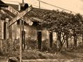
Sign of Oldby RgarciaComment: Nice old feel with the color. Wish you'd included more of the tracks and bottom of the sign or cropped the out entirely. Nice textures, very different feel than all the bright and glaring modern roadsigns. |
| Photographer found comment helpful. |
| 01/22/2004 11:32:38 AM |
arrowby undieyatchComment: Great detail. You've come in close enough to make up see the things we never notice tho we'd drive by the sign every day. Yet you've included enough of the sign that it is ovious what it is. |
| 01/22/2004 11:30:44 AM |
|
| Photographer found comment helpful. |
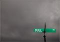
| 01/22/2004 11:28:45 AM |
"Sign of a Dulled Existence"by Nowhere_ManComment: Funny. Glad my address isn't "Dull Rd." It is a nice idea - those thick blank clouds, and -pop- at the bottom the green sign. Still, I'm made curious what is beneath the sign. |
| Photographer found comment helpful. |
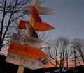
| 01/22/2004 11:26:50 AM |
Homeward boundby jmritzComment: Very rustic - I like how the red of some signs is repeated in the sky. The bare trees make a nice backdrop. Wish the houses and telephone lines weren't there, it would be so much more powerful without them. The lighting is nice - feels natural and glowing like the setting sun. |
| Photographer found comment helpful. |
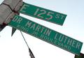
| 01/22/2004 11:24:23 AM |
Happy Birthday MLK!by RoosterComment: Hear! Hear! Happy b-day MLK! I like your creative angle - almost like the sign is reaching down to touch us. The lighting could be better - hard to get it right with the bright sky behind - a flash might reflect off the sign nicely? |
| Photographer found comment helpful. |
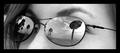
| 01/22/2004 11:21:27 AM |
Pots, backwardsby eaphelpsComment: I like the relection (the intverted bit works well) the trees on one side the sign on the other. I like the horizontal composition, the b&w simplfies it and allow the glasses frame to frame the picture. Nice tones and range. Good work with the focus too. Looking close I realize you can see her eyelashes and eye a bit through the lense, make it look like she is looking out of the sky. I only wish for a bit more "meaningful" title. 9 |
| Photographer found comment helpful. |
| 01/22/2004 11:17:12 AM |
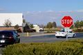
California Stopby Ram21Comment: This feels a bit too much of a snap shot, not planned or composed. It is nicely lit and the colors are vivid. There are just to many subjects scattered about - I don't know what to focus on - the white car? the black car? The building? The truck? Perhaps if you let the shuttere open a long time and got the blur of cars going past that would carry more of a "California" message - cars constantly going from here to there? Or made the back drop o the sign just the lovely trees and sky - a message to californians -"Stop and enjoy this lovely place you live".... |
| Photographer found comment helpful. |
| 01/22/2004 11:13:29 AM |
No dogs allowedby hordursvComment: Poor poochies! It loks like alovely place. Having the sign dead center really adds to the feeling of being forbidden - even keeps the viewer from seeing the whole scene. Works thematically. Wish there were more light onthe sign - a brighter flas (it looks like you has some flash on it) Its just that with the brigh reflection of the sun in the water you get distracted from the sign. |
Home -
Challenges -
Community -
League -
Photos -
Cameras -
Lenses -
Learn -
Help -
Terms of Use -
Privacy -
Top ^
DPChallenge, and website content and design, Copyright © 2001-2026 Challenging Technologies, LLC.
All digital photo copyrights belong to the photographers and may not be used without permission.
Current Server Time: 07/22/2026 09:02:53 PM EDT.