| Image |
Comment |
| 01/22/2004 12:02:37 PM |
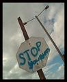
Bummer!by charlotteComment: I like the gritty texture you;ve got here. How the blue of the spray paint mirrors the blu of the sky. The agnle of the sign and light post fit with the feeling of how unexpected and intrusive the sign is. Perhaps just a tad brighter? |
 Photographer found comment helpful. Photographer found comment helpful. |
| 01/22/2004 11:59:01 AM |
|
| Photographer found comment helpful. |
| 01/22/2004 11:55:57 AM |
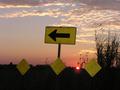
Off Sunset Laneby SamuelComment: I like the silouetted grasses, the line of yellow diamonds that follow the horizon and the directions of the taller sign. Great clouds, color. 8 |
| Photographer found comment helpful. |
| 01/22/2004 11:54:31 AM |
|
| Photographer found comment helpful. |
| 01/22/2004 11:49:33 AM |
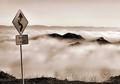
Cloudy Corners by GringoComment: So lovely! The fluid clouds and the curves in the sign work well together. The stark grasses poppong out against the clouds are great contrast. The dark hill tops in the foreground, the lighter ones on the horizon makes a nice progression. Wish there wasn;t any glare on the sign. 9 |
| Photographer found comment helpful. |
| 01/22/2004 11:46:35 AM |
The Green Man (Trafficlight)by terjeComment: Creative. I've never looked at a walk sign this closely. Perhaps a bit too simple? Some more context? Perhaps a bit of motion in the camera to make the walking man look like he's moving? |
| Photographer found comment helpful. |
| 01/22/2004 11:44:42 AM |
A Pelican Partyby mlekanneComment: Funny and fun. Wish the sign were better lit - those shadows are distracting. Wish you could have gotten in closer so you didn't need to crop and lose resolution. |
| Photographer found comment helpful. |
| 01/22/2004 11:43:04 AM |
Stop sign close-upby bormicComment: Interesting detail - almost Escher-like. creative idea, but still seems out of focus. |
| Photographer found comment helpful. |
| 01/22/2004 11:42:01 AM |
(Pay attention to) Datailsby qwerty_314Comment: How nice! All roads lead to Milan? No matter which way you go you'll get there in 50km. The composition is a bit cluttered, and I might not look at the details without the title. Perhaps cropping in on both sides would draw the eye to the sign better? |
| 01/22/2004 11:39:34 AM |
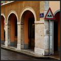
Warning!by jjbeguinComment: I like the comparison between the pointy sign and the row of arches. I might try cropping at the top and the left - leaving just two arches and losing the line of the builing second story. Pulls the composition together a bit more. The colors and the textue after the rain are lovely. |
| Photographer found comment helpful. |
Home -
Challenges -
Community -
League -
Photos -
Cameras -
Lenses -
Learn -
Help -
Terms of Use -
Privacy -
Top ^
DPChallenge, and website content and design, Copyright © 2001-2026 Challenging Technologies, LLC.
All digital photo copyrights belong to the photographers and may not be used without permission.
Current Server Time: 07/22/2026 09:03:06 PM EDT.