| Image |
Comment |
| 05/31/2004 11:42:06 AM |
|
 Photographer found comment helpful. Photographer found comment helpful. |
| 05/31/2004 11:39:07 AM |
Price of Freedomby blemtComment: Three? I like the levels of the photo rising to the lincoln mem, Is that the 3? The building behind the licoln are distracting perhaps if you took the shot from a closer/lower angle? The people here are distracting too. I think closer would be better so we could see that there are stars on the wall. |
| Photographer found comment helpful. |
| 05/31/2004 11:36:35 AM |
Happy Memorial Dayby willtataComment: sweet idea - I wish the photo were sharper (could this be a resolution issue?) and if there were sunlight on the chairs it would give more meaning and focus to your theme. |
| 05/31/2004 11:35:12 AM |
Wild Flagby amsmythComment: I like the gray background - is it water? It is very soft and compliments the irises. I like how the stems are almot silouetted. I like the off center composition. Wish the top iris was sharper. |
| Photographer found comment helpful. |
| 05/31/2004 11:32:10 AM |
Angelsby buzzrockComment: I like these faces. Each is individual. Wish the background were just the leafy trees - I'd clone out the umbrellas. |
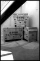
| 05/31/2004 11:30:40 AM |
Burri's Magnum cratesby scribeComment: While the diagonal in the background is dramatic and mirrors the line between the boxes, I'm distracted by it because I don't know what it is and how it fits into the picture. The shadow and light in the forground is interesting too, but likewise does not add meaning. I like the boxes and your choice of black and white - it makes the lettering pop out nicely. |
| Photographer found comment helpful. |
| 05/31/2004 11:27:01 AM |
|
| Photographer found comment helpful. |
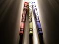
| 05/31/2004 11:25:55 AM |
3 primary colors 2004by dadosComment: I like your lighting - it really moves your eye over the subject. Wish there had been a bounce at the bottom to reflect light back at the tips of the crayons so we could see them better. The crayons themselves are burnt out in spots, but the low light gives nice texture. Maybe crop the sides a bit? |
| Photographer found comment helpful. |
| 05/31/2004 11:23:40 AM |
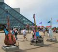
Cleveland Rocks!by rubyrednailsComment: I might crop this at the top - all that bright sky pulls your eyes away from the guitars. The people and umbrellas and flags are distracting too, but one might say they add atmosphere. I'd be interested in seeing a shot that issolates the guitars more at a daring angle. |
| 05/31/2004 11:21:18 AM |
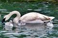
Proud Parent of Threeby flip89Comment: Sweet shot - swans are so lovely. I like the reflected colors in the water. I wish the cignets had posed a bit less radomly for you, but what can you do! |
| Photographer found comment helpful. |
Home -
Challenges -
Community -
League -
Photos -
Cameras -
Lenses -
Learn -
Help -
Terms of Use -
Privacy -
Top ^
DPChallenge, and website content and design, Copyright © 2001-2026 Challenging Technologies, LLC.
All digital photo copyrights belong to the photographers and may not be used without permission.
Current Server Time: 07/21/2026 05:12:03 PM EDT.