| Image |
Comment |
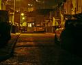
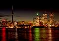
| 10/24/2004 07:39:06 PM |
Back-Street Orangeby peeceeComment: Ilike the sparkling wet texture and this color is perfect for night in the city. The composition works well tho the image is busy - the line of the street and cars leads the eye easily into the picture from the bottom, and the line of the roofs leads you in from the top - creating a nice "x" |
 Photographer found comment helpful. Photographer found comment helpful. |
| 10/24/2004 07:36:57 PM |
midnight at the galaxy bowlby magnetic9999Comment: Ilike the colors - very neon and night-like. I could see going even more abstract here with all the lights and reflections. You needn't include the forground - but perhaps the blur of some moving balls? |
| Photographer found comment helpful. |
| 10/24/2004 07:34:44 PM |
3rd St.by grigrigirlComment: THe street lights have created some interesting shadows - but it feels too bright to be night - okay I know that is a city for you! There are some strange artifacts - as if this were sharpenned too much - odd stark lines of gray. |
| Photographer found comment helpful. |
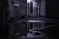
| 10/24/2004 07:32:50 PM |
The Dark Alleyby Spork99Comment: Film Noir feel. I like how the puddle takes up the whole bottom half of the composition as if it were its own world lying next to the real one, |
| Photographer found comment helpful. |
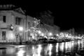
| 10/24/2004 07:31:01 PM |
Small Town on a Rainy Nightby Judith PolakoffComment: This makes me think of old black and white movies - Its a WOnderful Life foreinstance. The way the lights glow gives real atmosphere. The composition is pretty straight forward - as simple as the small town. I"d like to see a bit more to the right, so that vanishing point is really visible. |
| Photographer found comment helpful. |
| 10/24/2004 07:28:07 PM |
Cityscapeby HRoxasComment: This is magical - it has such a golden glow. It really gives a sense of the colors of a city and night. Good subject choice, lovely composition. The building do seem harsh against that gentle sky? Did you sharpen them or blur the sky? Or is it just the contrats of the man-made with nature? |
| Photographer found comment helpful. |
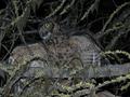
| 10/24/2004 07:26:03 PM |
night hunterby camelotnorthComment: wonderful how you caught this owl with wing spread, I also like how the bend on the wing is mirrored in the loops of the vines on the tree. But the flask really flattens the image - makes it hard to tell what is bird and what is tree. I would like to see the bird contrast more with the tree. |
| Photographer found comment helpful. |
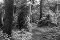
| 09/18/2004 11:26:02 AM |
Bidwell Parkby psartComment: This is one I'd like to see a print of! Again wish this image was larger there are so many details I'd like to see better! I like the sparkle of the light on the leaves. |
| Photographer found comment helpful. |
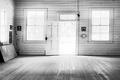
| 09/18/2004 11:22:19 AM |
Forgottenby psartComment: I like the light in the photo - the way it washes in and emphasizes the emtiness of the room. Having the outside almost white but not quite works well - we can only see a few things that tell us that there are trees, perhaps a road - just like we see only the flag in the corner and a few other things to tell us what this empty room was used for. Almost liike the outside world is dissappearing and not the school house. I do wish the image was bigger (seems like all of you images are smaller that the 640 max for the site) I would like to see the image even better. Also seems slightly tilded to the right - a slight rotate left would lines the horzontal board with the edge of the picture - no big deal. |
| Photographer found comment helpful. |
| 08/23/2004 06:11:19 AM |
3-D Botany II [DPC legal]by dsidwellComment: This is certainly more a more daring composition than your 3-D Botany - but that may be why it didn't do as well. The flowers in the original are set up as a traditional botany rpint and viewed in a typical manner, and the 3-D flowers "bloom" out of this composition (very delightful to look at BTW). This composition forces the viewer to be more imaginative - the view is not of a formal picture on a wall, but perhaps a glance at an odd angle of artwork on a table. The composition mirror the viewers surprise - we feel shaken and usure which way is up or down - "are those leaves growing out of the page?!" I wonder if you desaturated the printed leaves leaving the real ones green the viewer would understand more easily? Perhaps having the background a more parchment'like color? You put A LOT of work into this and it shows. When you take the time to look at it and THINK you really enjoy it. |
| Photographer found comment helpful. |
Home -
Challenges -
Community -
League -
Photos -
Cameras -
Lenses -
Learn -
Help -
Terms of Use -
Privacy -
Top ^
DPChallenge, and website content and design, Copyright © 2001-2026 Challenging Technologies, LLC.
All digital photo copyrights belong to the photographers and may not be used without permission.
Current Server Time: 07/17/2026 02:41:37 PM EDT.


![3-D Botany II [DPC legal]](https://images.dpchallenge.com/images_challenge/0-999/247/120/Copyrighted_Image_Reuse_Prohibited_97960.jpg)