| Image |
Comment |
| 06/10/2007 05:38:04 PM |
One Pin by KelliComment: Good subject - two lanes, two balls. But one and a half people, and odd assortment of pins... There is a bit much going on here so it doesn't really focus on the "double" idea to me. Also nothing is really in focus, and the top third of the photo is a boring wall. I shot that closed in more on the action, with a dynamic composition - vertical or diagonal - might convey bowling better. I do light the blue cast - it reminds me of the florescent lighting at a bowling alley. |
 Photographer found comment helpful. Photographer found comment helpful. |
| 06/10/2007 05:33:41 PM |
Same?by KrystleComment: Interesting to see the differences inside the pepper slices - another play on same but different. The focus is not entirely sharp and the lighting is rather harsh with distracting shadows. If your background were very bright white or entirely dark it would make the peppers stand out better. |
| Photographer found comment helpful. |
| 06/10/2007 05:31:37 PM |
Attractionby cpanaiotiComment: Interesting idea to reflect the glass in a curved surface - so it is the same, but not the same all at once. Aside from that the photo is not very interesting. No interesting colors, no dynamic range, the lighting is pretty bland. Perhaps a more contrasting background, or more of a gradient of light, or a more interesting subject to have reflected. |
| Photographer found comment helpful. |
| 06/10/2007 05:28:48 PM |
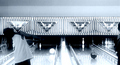
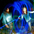
Take 22 (This time for sure)by JonathanJComment: It looks like this was really fun to shoot. I like the idea of the two subjects in the abstract swirl of light, but I wish the subjects were not blurred - better to freeze the action with a flash after you've done the light spinning. The light on the subject to the right has blown out the details of of her face. |
| 06/10/2007 05:26:12 PM |
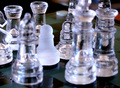
"If Yer Majesties Please, Not Guilty ..."by GeneralEComment: While the stand-out subject seems to be the white pawn, the focus is not really on it, but the two rooks behind. The composition is cluttered - perhaps if it were just the king and queen - is that your double take? - and the pawn. Or is the double take the two pawns, clear and white? Or maybe you meant the two rooks to be the subject - but they are pushed so far to the back. I guess my main advice is you need to use some photographic tool - focus, light, composition - to help the viewer understand better what is going on in the photo. |
| Photographer found comment helpful. |
| 06/10/2007 05:20:40 PM |
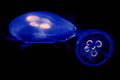
dance of the jellyfishby Elvis_LComment: Jellyfish are a lovely subject. I like the different colors - UV light? However the focus is not very sharp, and the composition -very horizontal- does nothing for these free floating animals - perhaps rotate and crop so they are floating more diagonal or even a 90 degree rotate to vertical might give more of a sense of weightlessness. |
| Photographer found comment helpful. |
| 06/10/2007 12:31:46 PM |
Gentlemen´s Fightby StructorComment: Funny. Surely there is an amusing story behind this. I saw another shot from the take in another challenge. Traditional Icelandic Umbrella Fighting? Some modern take on Glíma? Or maybe someone got married and things got a bit rough at the photo-shoot up at Árbaer? I like the composition with the house to the left, and the fun size difference between the men. The lighting is a bit harsh on the men, though the flash helps them stand out on this gray day. The sky in a bit purple for me. |
| Photographer found comment helpful. |
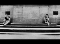
| 06/10/2007 12:17:10 PM |
double callby sevilduvarciComment: Cute candid. Nice range of grays. A bit grainy for me - I'd like to see the women better. |
| Photographer found comment helpful. |
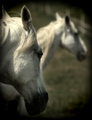
| 06/10/2007 12:15:14 PM |
Shadowfax' dreamby unicumComment: I like your use of depth to show the double. The vignetting is romantic with the green field background - but the dark muzzle of the horse gets lost in it at the bottom. |
| Photographer found comment helpful. |
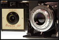
| 06/10/2007 12:13:31 PM |
Old Veteransby ustiebitzComment: A fine juxtiposition. I would crop a little more at top. I don't like the white and black lines inside the frame - they get confused with the lines of the camera. Maybe leave a bit more room at the bottom and the left - space for what the cameras are "seeing?" |
| Photographer found comment helpful. |
Home -
Challenges -
Community -
League -
Photos -
Cameras -
Lenses -
Learn -
Help -
Terms of Use -
Privacy -
Top ^
DPChallenge, and website content and design, Copyright © 2001-2026 Challenging Technologies, LLC.
All digital photo copyrights belong to the photographers and may not be used without permission.
Current Server Time: 07/15/2026 01:02:05 PM EDT.